# Image
This help article illustrates how to put an **image** in a toggle state on a **RadToggleButton**.
To define an image in a **RadToggleButton** you should set the path to the image inside the **Image.Url** property of each toggle state (**Example 1**). You can also show text over the image by simply setting it in the **Text** property.
You can control the image dimensions through the **Width** and **Height** properties, which are exposed globally (the **RadToggleButton** object) as well as in each toggle state (the **ButtonToggleState** objects).
> caption Figure 1: RadToggleButton with image.

> caption Example 1: Configure images inside toggle states of RadToggleButton.
```ASP.NET
```
> tip The Background-size of the image is controlled through the **Image.Sizing** property.
> note If you add toggle states with and witout images, the RadToggleButton control will no longer be considered a button but a custom image. Thus, the borders and default backgrounds of the non-image toggle state will be lost and the appearance of the control will change.
## Hovered, Active (Pressed) and Disabled States
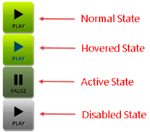
**RadToggleButton** also provides an easy way to show different images when the mouse is hovered over the control, the button is pressed or the button is disabled (see **Figure 2** and **Example 2**). To do this, use the **HoveredUrl**, **PressedUrl** and **DisabledUrl** properties exposed by the **Image** tag of each toggle state.
> caption Figure 2: A RadToggleButton can have different images for its normal, hovered, active (pressed) and disabled state.
> caption Example 2: Setup unique images for the normal, hovered, active (pressed) and disabled state of a RadToggleButton.
```ASP.NET
```
## See Also
* [Select State](https://www.telerik.com/products/aspnet-ajax/documentation/controls/togglebutton/functionality/select-state)
* [Custom Icons](https://www.telerik.com/products/aspnet-ajax/documentation/controls/togglebutton/functionality/icons/custom-icons)
* [Server-Side API](https://www.telerik.com/products/aspnet-ajax/documentation/controls/togglebutton/server-side-programming/properties-and-events)