# Appearance
In this article, you will find information about the styling options and rendering of the WebForms SpeechToTextButton.
For a live example, visit the [Appearance Demo of the SpeechToTextButton](https://demos.telerik.com/aspnet-ajax/speechtotextbutton/appearance/defaultcs.aspx).
## Options
The WebForms SpeechToTextButton supports the following styling options:
* [`Icon`](https://www.telerik.com/products/aspnet-ajax/documentation/controls/speechtotextbutton/appearance#icon) - Configures the icon displayed when the button is in inactive state.
* [`StopIcon`](https://www.telerik.com/products/aspnet-ajax/documentation/controls/speechtotextbutton/appearance#stopicon) - Configures the icon displayed when the button is speech recognition state.
* [`FillMode`](https://www.telerik.com/products/aspnet-ajax/documentation/controls/speechtotextbutton/appearance#fillmode) - Configures how the color is applied to the component.
* [`Rounded`](https://www.telerik.com/products/aspnet-ajax/documentation/controls/speechtotextbutton/appearance#rounded) - Configures the border radius of the component.
* [`Size`](https://www.telerik.com/products/aspnet-ajax/documentation/controls/speechtotextbutton/appearance#size) - Configures the overall size of the component.
* [`ThemeColor`](https://www.telerik.com/products/aspnet-ajax/documentation/controls/speechtotextbutton/appearance#theme-color) - Configures what color will be applied to the component.
## Icon
The `Icon` option determines which icon is displayed when the button is not in the active state. The default is the `microphone-outline` icon.

Example
```ASP.NET
```
## StopIcon
The `StopIcon` option determines which icon is displayed when the button is in the active state (speech recognition in progress). The default is the `stop-sm` icon.

Example
```ASP.NET
```
## FillMode
The `FillMode` option controls how the color is applied to the button.
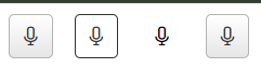
Available values:
* `Solid` - Solid background color (default)
* `Outline` - Outlined border with transparent background
* `Flat` - No border or background color
* `None`
```ASP.NET
```
## Rounded
The `Rounded` option controls the border radius of the button.

Available values:
* `Small` - Small border radius
* `Medium` - Medium border radius (default)
* `Large` - Large border radius
* `Full` - Fully rounded corners (pill shape)
* `None`
```ASP.NET
```
## Size
The `Size` option controls how big or small the rendered button looks.
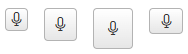
Available values:
* `Small` - Small size
* `Medium` - Medium size (default)
* `Large` - Large size
* `None`
```ASP.NET
```
## Theme Color
The `ThemeColor` option controls the color applied to the button.

Available values:
* `Primary` - Primary accent color
* `Secondary` - Secondary accent color
* `Tertiary` - Tertiary accent color
* `Info` - Informational color
* `Success` - Positive action color
* `Warning` - Attention‑drawing color
* `Error` - Negative action color
* `Base` - Default color based on the current theme
```ASP.NET
```
## Button States
* **Inactive State** - Default state before speech recognition begins
* **Active State** - Indicates that speech recognition is currently in progress
* **Error State** - Displays when speech recognition encounters an error or is not supported by the browser
## Next Steps
* [Accessibility](https://www.telerik.com/products/aspnet-ajax/documentation/controls/speechtotextbutton/accessibility-and-internationalization/overview)
* [Client-side Programming](https://www.telerik.com/products/aspnet-ajax/documentation/controls/speechtotextbutton/client-side-programming/overview)
* [Server-side Programming](https://www.telerik.com/products/aspnet-ajax/documentation/controls/speechtotextbutton/server-side-programming/overview)