# Icons
The Breadcrumb allows configuring the icons of the items and the delimiters. All the built-in icons distributed with Telerik UI for ASP.NET AJAX suite can be used in **RadBreadcrumb**.
In addition, all the [Kendo UI Web Font Icons](https://docs.telerik.com/kendo-ui/styles-and-layout/icons-web#list-of-font-icons) are also available for using in the component.
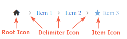
To include a desired embedded icon use the exposed icon properties - `RootIcon`, `DelimiterIcon` of the **RadBreadcrumb**, or `Icon` and `IconClass` of each **BreadcrumbItem**.
> caption Figure 1:
## Root Icon
The root icon is the icon rendered in the RootItem. It is clickable and resets the value of the component when clicked.
> caption Figure 2:

> note By default the RootIcon is visible. It can be hidden by setting the `ShowIcon` property of the RootItem to *'false'*
The icon of the RootItem can be set via the `RootIcon` property of the **RadBreadcrumb** like shown in **Figure 2** above:
```ASP.NET
```
The same result can be achieved by setting the `Icon` property of the respective **BreadcrumbItem**
```ASP.NET
```
In case the `RootIcon` is not set explicitly, it gets its default value - "home"
> note If different icons are set to the `RootIcon` property of the **RadBreadcrumb** and to the `Icon` property of **BreadcrumbItem** with type RootItem, the one set to the Item takes effect.
## Delimiter Icon
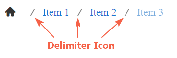
The delimiter icon is the icon rendered between the items in the Breadcrumb. It can be set via the `DelimiterIcon` property of the Breadcrumb. Check out the sample declaration and **Figure 3** below:
```ASP.NET
```
> caption Figure 3:
## Item Icon
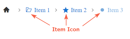
The icons rendered for each item. It is also clickable and can be configured through the `Icon` property of **BreadcrumbItem**.
By default, the Item icon is not visible (despite for RootItems). To show the icon for an item set its `ShowIcon` property to *'true'*, like demonstrated below:
```ASP.NET
```
> caption Figure 4:
## Use Class names to apply icons
In case the name of a desired icon is not part of the predifined built-in icons, you can use the icon properties and set a Class name instead.
> caution
> To set a Class name for the `RootIcon` and `DelimiterIcon` **RadBreadcrumb** properties, or for the `Icon` property of a **BreadcrumbItem** you need to set the desired Class name with a foregoing whitespace character(e.g. RootIcon=" k-i-globe-outline").
We can use that approach to apply a desired Kendo Web Font Icon in **RadBreadcrumb** like demonstrated in the figure below:
> caption Figure 5:

We would need to get the Unicode of the desired icon from the [Kendo Icons page](https://docs.telerik.com/kendo-ui/styles-and-layout/icons-web#list-of-font-icons) and set it as content of the before pseudo-element.
The declaration of the Breadcrumb shown in **Figure 5**:
```ASP.NET
```
For Item icons, another way to achieve the same is to set the *k-icon* class to the `IconClass` property followed by the icon class names:
```
```
Find more about the usage of the `IconClass` property in the next section.
## Use the IconClass
The `IconClass` property of **RadBreadcrumb** defines additional classes that will be applied to the \ containing the font icon. That way each icon can be reached and styled separately.
Sample usage of the `IconClass` property is shown in **Figure 6** below:
> caption Figure 6:

And the code to achieve this appearance:
```ASP.NET
```
Go ahead and test the [Icons live demo](https://demos.telerik.com/aspnet-ajax/breadcrumb/functionality/icons/defaultcs.aspx).
In case you want to replace the built-in icons with external ones, check out \[How to Integrate RadBreadcrumb with FontAwesome icons]\(%slug breadcrumb/how-to/how-to-integrate-radbreadcrumb-with-fontawesome-icons%)
## See Also
* [Icons live demo](https://demos.telerik.com/aspnet-ajax/breadcrumb/functionality/icons/defaultcs.aspx)
* [How to Integrate RadBreadcrumb with FontAwesome icons](https://www.telerik.com/products/aspnet-ajax/documentation/controls/breadcrumb/how-to/fontawesome-integration)
* [Kendo UI Web Font Icons](https://docs.telerik.com/kendo-ui/styles-and-layout/icons-web#list-of-font-icons)