# Appearance
The Badge provides predefined appearance options such as different sizes, border radiuses, fill modes and theme colors.
For a live example, visit the [Appearance Demo of the Badge](https://demos.telerik.com/aspnet-ajax/badge/appearance/defaultcs.aspx).
## Options
The Telerik WebForms Badge supports the following styling options:
* [`Size`](https://www.telerik.com/products/aspnet-ajax/documentation/controls/badge/appearance#size) - Configures the overall size of the component.
* [`ThemeColor`](https://www.telerik.com/products/aspnet-ajax/documentation/controls/badge/appearance#themecolor) - Configures what color will be applied to the component.
* [`FillMode`](https://www.telerik.com/products/aspnet-ajax/documentation/controls/badge/appearance#fillmode) - Configures how the color is applied to the component.
* [`Rounded`](https://www.telerik.com/products/aspnet-ajax/documentation/controls/badge/appearance#rounded) - Configures the border radius of the component.
* [`Position`](https://www.telerik.com/products/aspnet-ajax/documentation/controls/badge/appearance#position) - Configures the position of the component.
* [`Align`](https://www.telerik.com/products/aspnet-ajax/documentation/controls/badge/appearance#align) - Configures the alignment of the component.
* [`CutoutBorder`](https://www.telerik.com/products/aspnet-ajax/documentation/controls/badge/appearance#cutout-border) - Configures the cutout border of the component.
* [`Icon`](https://www.telerik.com/products/aspnet-ajax/documentation/controls/badge/appearance#icon) - Displays an icon.
## Size
The size option controls how big or small the rendered badge looks.
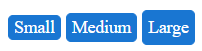
The following values are available for the `size` option:
* `Small`
* `Medium` (default)
* `Large`
Example
```ASP.NET
```
## FillMode
The `FillMode` option controls the way the color is applied to the rendered div.
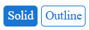
The following values are available for the `FillMode` option:
* `Solid` (default)
* `Outline`
Example
```ASP.NET
```
## ThemeColor
The `ThemeColor` option controls the color that will be applied to the rendered Badge.

The following values are available for the `ThemeColor` option:
* `Primary`
* `Secondary` (default)
* `Tertiary`
* `Info`
* `Success`
* `Warning`
* `Error`
Example
```ASP.NET
```
## Rounded
The `Rounded` option controls how much border radius is applied to the rendered Badge.

The following values are available for the `Rounded` option:
* `Small`
* `Medium` (default)
* `Large`
* `Full`
Example
```ASP.NET
```
# Position
The `Position` option specifies position of the Badge relative to the edge of the container

The following values are available for the `Position` option:
* `Inline`
* `Edge` (default)
* `Inside`
* `Outside`
# Align
The `Align` option specifies position of the Badge relative to its container
Note: when using `Align`, make sure the Badge container has [CSS position](https://developer.mozilla.org/en-US/docs/Web/CSS/position) other than `static` and allows [overflow content](https://developer.mozilla.org/en-US/docs/Web/CSS/overflow).
The following values are available for the `Align` option:
* `TopStart`
* `TopEnd` (default)
* `BottomStart`
* `BottomEnd`
```ASP.NET
```
## Cutout Border
The `CutoutBorder` option specifies whether or not to render additional "cutout" border around the badge.

```ASP.NET
```
The display of the `CutoutBorder` option is controlled by specifying either `true` or `false`.
## Icon
To enable icons for the badge, set the `Icon` property to the **name** of the embedded icon.
Visit the [Progress Design System - List of Icons](https://docs.telerik.com/kendo-ui/styles-and-layout/sass-themes/font-icons#list-of-font-icons) page and find the icon of your choice.

Example
```ASP.NET
```
## Next Steps
* [Client-side Programming](https://www.telerik.com/products/aspnet-ajax/documentation/controls/badge/client-side-programming/overview)
* [Server-side Programming](https://www.telerik.com/products/aspnet-ajax/documentation/controls/badge/server-side-programming/overview)