# Creating Circular Buttons

## Environment

<table>
	<tbody>
    <tr>
      <td>Product</td>
      <td>Progress® Telerik® UI for .NET MAUI Button</td>
    </tr>
  	<tr>
  		<td>Product Version</td>
  		<td>0.2.0</td>
  	</tr>
	</tbody>
</table>

## Description

How can I create a circular Button based on the Button control for my Telerik UI for .NET MAUI project?

## Solution

To create a circular button with the Telerik UI for .NET MAUI Button, adjust its `Width`, `Height`, and `CornerRadius` properties in the following way:

1. Set `Width` as equal to `Height`.
2. Set `CornerRadius` as half of the `Width`/`Height` value.

The following example demonstrates how to implement the suggested approach.

```XAML
<telerik:RadButton WidthRequest="120"
   			   HeightRequest="120"                                
   			   Text="Circle Button"
   			   FontSize="Micro"
   			   TextColor="White"
   			   BackgroundColor="DarkBlue"
   			   CornerRadius="60"  />
```

1. Add the namespace:

```XAML
xmlns:telerik="http://schemas.telerik.com/2022/xaml/maui"
```

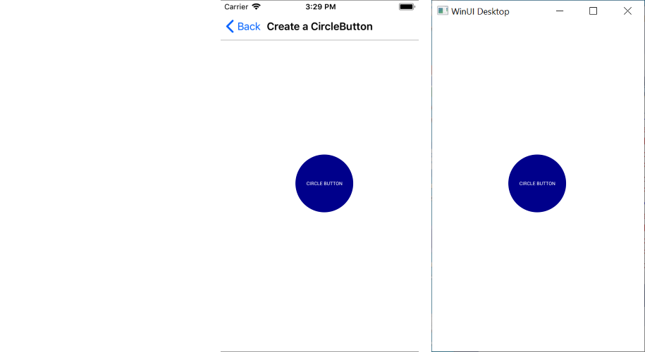
The following image shows the end result.
![A Telerik UI for .NET MAUI Circular Button in iOS, Android, and WinUI desktop environment](https://www.telerik.com/maui-ui/documentation/assets/9b429b2088ed7ab884cc223852fcde53/button-howto-circlebutton.png)
