# .NET MAUI TemplatedButton Content Configuration
The purpose of this help article is to show you the main configuration options of the control.
## Setting Content
Define the content inside the TemplatedButton by setting the `Content` property (`object`) or `ContentTemplate` (`DataTemplate`) property.
The `Content` is responsible for the actual content displayed in the button. It can be set to `string`, `View`, object, etc.
Here are the scenarios for the visualization of `Content` or `ContentTemplate` inside the `RadTemplatedButton`:
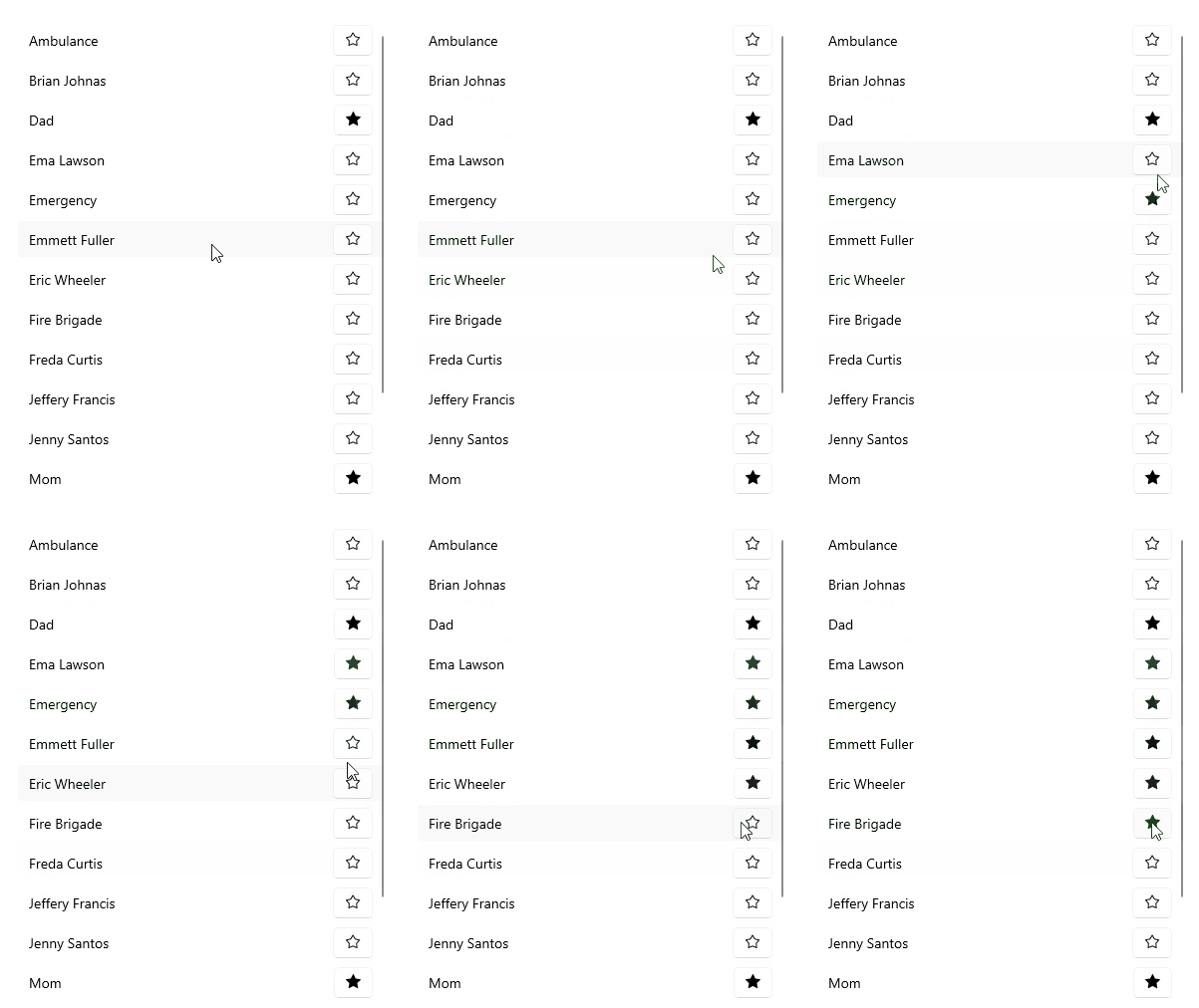
* If `ContentTemplate` is set, the `View` returned from the `ContentTemplate`.`CreateView()` is displayed inside the `RadTemplatedButton.ControlTemplate`, having `Content` as its `BindingContext`.
* If `ContentTemplate` is `DataTemplateSelector`, first the `DataTemplate` is selected and then a `View` is created from the chosen template using `Content` as its `BindingContext`.
* If `Content` is set to a `View` and `ContentTemplate` isn't set, the `View` is displayed inside the `RadTemplatedButton.ControlTemplate`.
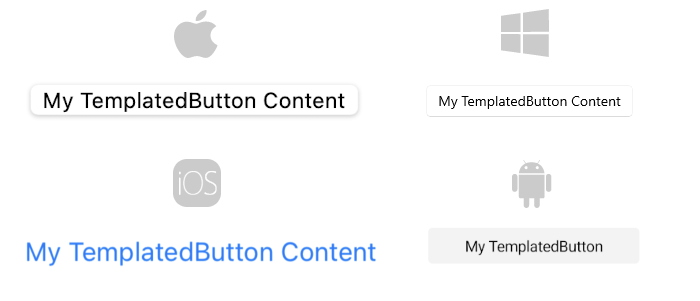
* If `Content` is set to a `string` and `ContentTemplate` isn't set, a `Label` is displayed inside the `RadTemplatedButton.ControlTemplate`.
* If `Content` is set to an `object` and `ContentTemplate` isn't set, the `ToString()` of the `object` is used and converted to `Label` inside the `RadTemplatedButton.ControlTemplate`.
**Setting Content to String**
```XAML
```
**Setting ContentTemplate**
```XAML
```
## Text Alignment
Use the following properties to align the text in the button when `Content` is `string` and `ContentTemplate` is not set.
* `HorizontalTextAlignment` (`Microsoft.Maui.TextAlignment`)—Specifies the horizontal alignment of the `Label.Text`.
* `VerticalTextAlignment` (`Microsoft.Maui.TextAlignment`)—Specifies the vertical alignment of the `Label.Text`.
## Text Decoration
Use the `TextDecorations` (enum of type `Microsoft.Maui.TextDecorations`) property to specify the text decorations of the `Label` created when `Content` is `string` and `ContentTemplate` is not set.
## Font Options
The following properties specify the font options that apply to the content when `Content` is `string` and `ContentTemplate` is not set.
* `FontFamily` (`string`)—Specifies the font family of the `Label.Text`.
* `FontSize` (`double`)—Specifies the font size in pixels of the `Label.Text`.
* `FontAttributes` (`Microsoft.Maui.Controls.FontAttributes`)—Specifies the font attributes of the `Label.Text`.
## See Also
* [Loading Button](https://www.telerik.com/maui-ui/documentation/controls/templatedbutton/loading-button)
* [Set Visual States](https://www.telerik.com/maui-ui/documentation/controls/templatedbutton/visual-states)
* [Events](https://www.telerik.com/maui-ui/documentation/controls/templatedbutton/events)
* [Execute Command](https://www.telerik.com/maui-ui/documentation/controls/templatedbutton/command)
* [Style the TemplatedButton](https://www.telerik.com/maui-ui/documentation/controls/templatedbutton/styling)