# .NET MAUI TabView Header ItemStyle Selector

The TabView control provides the built-in `HeaderItemStyleSelector` property,  which allows you to apply different styles to each TabView header item. The target type of the style must be `TabViewHeaderItem`.

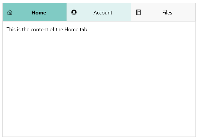
The following example shows how to apply styles to the TabView by using a style selector.

**1.** Define the TabView control:

```XAML
<telerik:RadTabView x:Name="tabView"
                    HeaderItemStyleSelector="{StaticResource HeaderStyleSelector}">
    <telerik:TabViewItem HeaderText="Home">
        <telerik:TabViewItem.ImageSource>
            <FontImageSource Glyph="&#xe85b;"
                             Size="16"
                             Color="Black"
                             FontFamily="TelerikFontExamples" />
        </telerik:TabViewItem.ImageSource>
        <Label Margin="10" Text="This is the content of the Home tab" />
    </telerik:TabViewItem>
    <telerik:TabViewItem HeaderText="Account">
        <telerik:TabViewItem.ImageSource>
            <FontImageSource Glyph="&#xe836;"
                             Size="16"
                             Color="Black"
                             FontFamily="TelerikFontExamples" />
        </telerik:TabViewItem.ImageSource>
        <Label Margin="10" Text="This is the content of the Account tab" />
    </telerik:TabViewItem>
    <telerik:TabViewItem HeaderText="Files">
        <telerik:TabViewItem.ImageSource>
            <FontImageSource Glyph="&#xe847;"
                             Size="16"
                             Color="Black"
                             FontFamily="TelerikFontExamples"/>
        </telerik:TabViewItem.ImageSource>
        <Label Margin="10" Text="This is the content of the Files tab" />
    </telerik:TabViewItem>
</telerik:RadTabView>
```

**2.** Define the `StyleSelector` resources:

```XAML
<ResourceDictionary>
    <Style x:Key="HomeStyle" TargetType="telerik:TabViewHeaderItem">
        <Setter Property="FontAttributes" Value="None" />
        <Setter Property="VisualStateManager.VisualStateGroups">
            <VisualStateGroupList>
                <VisualStateGroup Name="CommonStates">
                    <VisualState Name="Normal">
                        <VisualState.Setters>
                            <Setter Property="BackgroundColor" Value="#E0F2F1" />
                        </VisualState.Setters>
                    </VisualState>
                    <VisualState Name="Selected">
                        <VisualState.Setters>
                            <Setter Property="BackgroundColor" Value="#80CBC4"/>
                            <Setter Property="FontAttributes" Value="Bold"/>
                        </VisualState.Setters>
                    </VisualState>
                </VisualStateGroup>
            </VisualStateGroupList>
        </Setter>
    </Style>
    <Style x:Key="AccountStyle" TargetType="telerik:TabViewHeaderItem">
        <Setter Property="VisualStateManager.VisualStateGroups">
            <VisualStateGroupList>
                <VisualStateGroup Name="CommonStates">
                    <VisualState Name="Normal">
                        <VisualState.Setters>
                            <Setter Property="BackgroundColor" Value="#E0F2F1" />
                        </VisualState.Setters>
                    </VisualState>
                    <VisualState Name="Selected">
                        <VisualState.Setters>
                            <Setter Property="BackgroundColor" Value="#80CBC4"/>
                        </VisualState.Setters>
                    </VisualState>
                </VisualStateGroup>
            </VisualStateGroupList>
        </Setter>
    </Style>
    <Style x:Key="FilesStyle" TargetType="telerik:TabViewHeaderItem">
        <Setter Property="FontAttributes" Value="None" />
        <Setter Property="VisualStateManager.VisualStateGroups">
            <VisualStateGroupList>
                <VisualStateGroup Name="CommonStates">
                    <VisualState Name="Normal" />
                    <VisualState Name="Selected">
                        <VisualState.Setters>
                            <Setter Property="FontAttributes" Value="Italic" />
                            <Setter Property="BackgroundColor" Value="#80CBC4"/>
                        </VisualState.Setters>
                    </VisualState>
                </VisualStateGroup>
            </VisualStateGroupList>
        </Setter>
    </Style>
    
    <local:MyCustomHeaderItemStyleSelector x:Key="HeaderStyleSelector"
                                           HomeStyle="{StaticResource HomeStyle}"
                                           AccountStyle="{StaticResource AccountStyle}"
                                           FilesStyle="{StaticResource FilesStyle}"/>
</ResourceDictionary>
```

**3.** Define the `StyleSelector` class:

```C#
public class MyCustomHeaderItemStyleSelector : IStyleSelector
{
    public Style HomeStyle { get; set; }
    public Style AccountStyle { get; set; }
    public Style FilesStyle { get; set; }

    public Style SelectStyle(object item, BindableObject bindable)
    {
        TabViewItem tabViewItem = (TabViewItem)item;

        if (tabViewItem.HeaderText.Contains("Home"))
        {
            return this.HomeStyle;
        }
        else if (tabViewItem.HeaderText.Contains("Account"))
        {
            return this.AccountStyle;
        }
        else if (tabViewItem.HeaderText.Contains("Files"))
        {
            return this.FilesStyle;
        }
        else
        {
            return null;
        }
    }
}
```

The example produces the following result:
![.NET MAUI TabView Header Item Style Selector](https://www.telerik.com/maui-ui/documentation/assets/34c1837729e42dea632b54d83d5ce545/styling-headeritemstyleselector.png)

> For a runnable example with the TabView `HeaderItemStyleSelector` scenario, see the [SDKBrowser Demo Application](https://www.telerik.com/maui-ui/documentation/demos-and-sample-apps/sdkbrowser-app) and go to **TabView > Styling**.

## See Also

* [Styling the Header](https://www.telerik.com/maui-ui/documentation/controls/tabview/styling/header-styling)
* [Styling the Header Item](https://www.telerik.com/maui-ui/documentation/controls/tabview/styling/header-item-styling)
* [Styling the TabView Content](https://www.telerik.com/maui-ui/documentation/controls/tabview/styling/content-styling)
