# .NET MAUI RefreshView Styling
The RefreshView lets you style the built-in indicator to match the colors and sizes of your app. To fully replace the indicator, use [RefreshView Templates](https://www.telerik.com/maui-ui/documentation/controls/refreshview/templates) instead.
## Apply an Indicator Style
To style the built-in indicator, use the following properties of the `RadRefreshView`:
* `IndicatorStyle` (`Style`)—Specifies the style applied to the built-in indicator selected by `IndicatorType`. The `TargetType` of the style must be compatible with the selected indicator. Otherwise, the RefreshView ignores the style. `IndicatorStyle` doesn't change the indicator type.
The following table lists the indicator class that matches each `IndicatorType` value:
| `IndicatorType` | Style `TargetType` |
| --------------- | ----------------------------------------- |
| `Circular` | `telerik:RadCircularRefreshViewIndicator` |
| `Spinner` | `telerik:RadSpinnerRefreshViewIndicator` |
| `Arrow` | `telerik:RadArrowRefreshViewIndicator` |
## Indicator Styling Properties
All built-in indicators expose the following properties:
* `Color` (`Color`)—Specifies the color of the indicator.
* `WidthRequest` (`double`)—Specifies the requested width of the indicator.
* `HeightRequest` (`double`)—Specifies the requested height of the indicator.
The `RadCircularRefreshViewIndicator` exposes the following additional properties:
* `CircleBackgroundColor` (`Color`)—Specifies the background color of the circle.
* `CircleRadius` (`double`)—Specifies the radius of the circle.
* `StrokeThickness` (`double`)—Specifies the thickness of the progress arc.
* `CircleShadowColor` (`Color`)—Specifies the color of the circle shadow.
* `CircleShadowOpacity` (`double`)—Specifies the opacity of the circle shadow.
* `CircleShadowOffset` (`Size`)—Specifies the offset of the circle shadow.
* `CircleShadowBlurRadius` (`double`)—Specifies the blur radius of the circle shadow.
## Style the Built-In Indicators
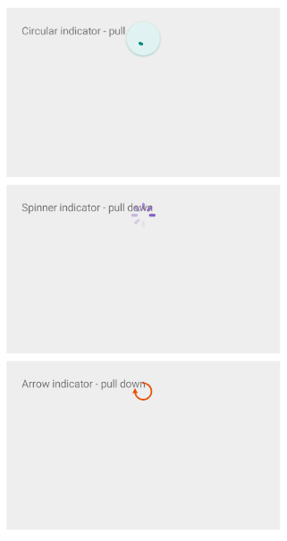
The following example demonstrates how to apply a custom style to each built-in indicator of the `RadRefreshView`.
1. Add the styles to the page resources:
```XAML
```
```XAML
```
```XAML
```
2. Define the RefreshView controls and set the `IndicatorStyle` property:
```XAML
```
```XAML
```
```XAML
```
3. Add the `telerik` namespace:
```XAML
xmlns:telerik="http://schemas.telerik.com/2022/xaml/maui"
```
4. Handle the `Refreshing` event and end the refresh when the data is loaded:
```C#
private async void OnRefreshing(object sender, EventArgs e)
{
await Task.Delay(1000);
((RadRefreshView)sender).IsRefreshing = false;
}
```
The following image shows the result:
> tip For a runnable example demonstrating the RefreshView styling, see the [SDKBrowser Demo Application](https://www.telerik.com/maui-ui/documentation/demos-and-sample-apps/sdkbrowser-app) and go to the **RefreshView > Styling** category.
## See Also
* [Indicator Type](https://www.telerik.com/maui-ui/documentation/controls/refreshview/indicator-type)
* [RefreshView Templates](https://www.telerik.com/maui-ui/documentation/controls/refreshview/templates)