# .NET MAUI ProgressBar Styling
The ProgressBar control for .NET MAUI provides styling options for customizing its appearance.
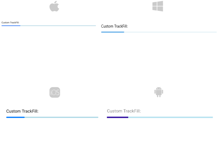
* `TrackFill`(`Brush`)—Specifies the color of the background track.
* `TrackThickness`(`double`)—Specifies the thickness of the background track.
* Define corners to the background track by setting the `TrackCornerRadius`(`Microsoft.Maui.CornerRadius`) property.
```XAML
```
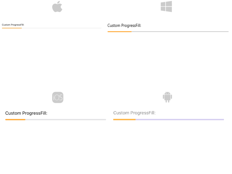
* `ProgressFill`(`Brush`)—Specifies the color of the progress indicator.
* Define corners of the progress indicator by setting the `ProgressCornerRadius`(`Microsoft.Maui.CornerRadius`) property.
```XAML
```
## Styling the text
The following properties are related to the text displayed in the ProgressBar:
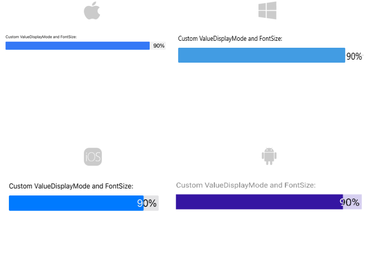
* `TextColor`(`Color`)—Defines the color of the Text which displays the progress value.
* `AlternateTextColor`(`Color`)—Defines the text color when the progress indicator overlaps the label which displays the current progress.
* `FontSize`(`double`)—Defines the font size of the Text which displays the progress value
```XAML
```
## Styling the segments
Style the ProgressBar segments using the following properties:
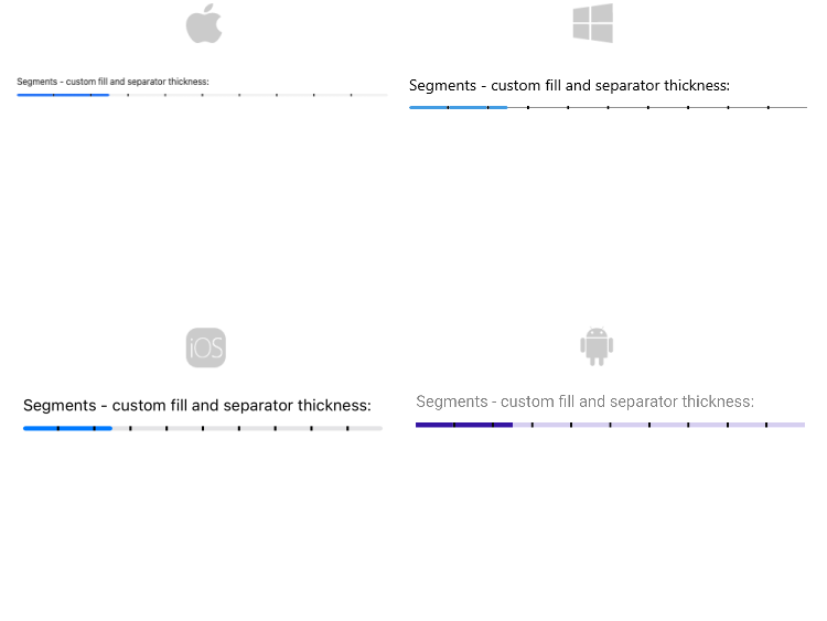
* `SegmentSeparatorFill`(`Brush`)—Specifies the fill of the segments separators.
* `SegmentSeparatorThickness`(`double`)—Sets the thickness of the segments separators.
```XAML
```
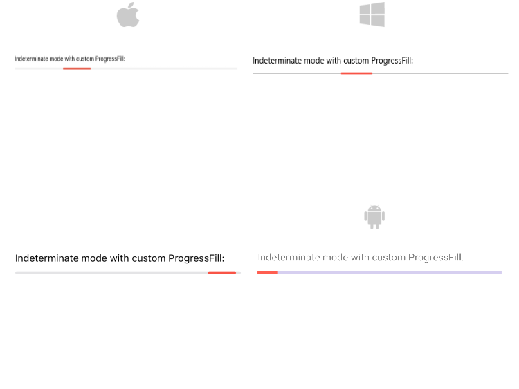
## Styling the indeterminate mode
For indeterminate mode you can style the ProgressBar using the `ProgressFill`(`Brush`) property.
```XAML
```
> important For the ProgressBar Styling example refer to the [SDKBrowser Demo Application](https://www.telerik.com/maui-ui/documentation/demos-and-sample-apps/sdkbrowser-app).
## See Also
* [Configuration](https://www.telerik.com/maui-ui/documentation/controls/progressbar/configuration)
* [Indeterminate Mode](https://www.telerik.com/maui-ui/documentation/controls/progressbar/indeterminate-mode)
* [Events](https://www.telerik.com/maui-ui/documentation/controls/progressbar/events)