# .NET MAUI ProgressBar Configuration
This article will explain all configuration options that ProgressBar control provides.
## Value and Progress
The LinearProgressBar exposes `Value` and `Progress` properties which are used to set and report, respectively, the progress of a task inside the ProgressBar control.
* `Value`(`double`)—Sets the value of the ProgressBar. When `Value` property is updated, this initiates the progress animation of the progress bar.
* `Progress`(`double`)—Reports the current progress of the ProgressBar. `Progress` property is updated internally after `Value` is updated and progress animation is complete.
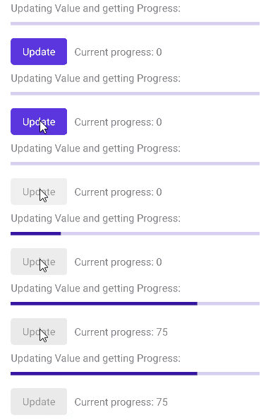
Here is a quick example showing how you can update `Value` and get the `Progress`:
```XAML
```
And the Update button click event handler:
```C#
private void ProgressBarUpdateClicked(object sender, EventArgs e)
{
this.progressBar.Value = 75;
this.updateButton.IsEnabled = false;
}
```
Check the result in the .GIF file below:
## Value Range
`Minimum` and `Maximum` properties are used to set the minimum and maximum values that the ProgressBar can display.
* `Minimum`(`double`)—Specifies the lower limit of the `Value` property, by default its value is 0.
* `Maximum`(`double`)—Defines the upper limit of the `Value` property, default value is 100.
You can define `Minimum` and `Maximum` properties of the ProgressBar as shown below:
```XAML
```
## String Format
The `StringFormat`(`string`) specifies the string format applied to the numeric value showing the progress. You can find detailed information about the supported numeric formats in the [Standard Numeric Format Strings](https://docs.microsoft.com/en-us/dotnet/standard/base-types/standard-numeric-format-strings) Microsoft documentation.
```XAML
```
## Value Display Mode
`ValueDisplayMode` property of enum type `Telerik.Maui.Controls.ValueDisplayMode` can be set to any of the following values:
* (default) Percent—Displays the progress as percent from the range from minimum to maximum;
* Value—Displays the Progress value.
* Text—Shows custom text inside the progress bar label. You need to combine it with `CustomText` property of the ProgressBar.
* None—No text is shown inside the progress bar.
Here is a quick example with `ValueDisplayMode` set to `Value`:
```XAML
```
You can also use `ValueDisplayMode` set to `Text` together with `CustomText`:
```XAML
```
## Segments
Divide the ProgressBar in segments using the `SegmentCount`(`int`) property.
```XAML
```
How to style the segments refer to [Styling the segments](https://www.telerik.com/maui-ui/documentation/controls/progressbar/styling#styling-the-segments) section.
## Label Alignment
The ProgressBar exposes `LabelHorizontalOptions` property of type `Microsoft.Maui.Controls.LayoutOptions` which defines the horizontal alignment of the label showing the progress. By default `LabelHorizontalOptions` is `LayoutOptions.End`.
```XAML
```
## Corners
You can define corners of the progress indicator by setting the `ProgressCornerRadius`(`Microsoft.Maui.CornerRadius`) property.
Define corners to the background track by setting the `TrackCornerRadius`(`Microsoft.Maui.CornerRadius`) property.
```XAML
```
`TrackCornerRadius` on WinUI:

> important For the ProgressBar Configuration example refer to the [SDKBrowser Demo Application](https://www.telerik.com/maui-ui/documentation/demos-and-sample-apps/sdkbrowser-app).
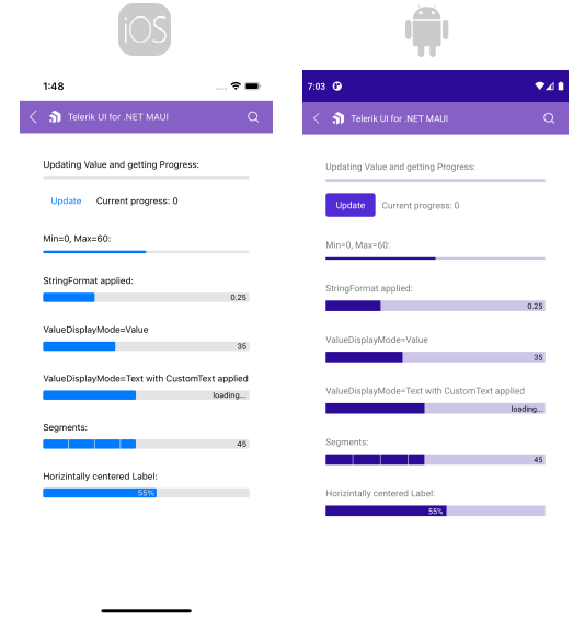
Here is how the Configuration example looks on iOS and Android:
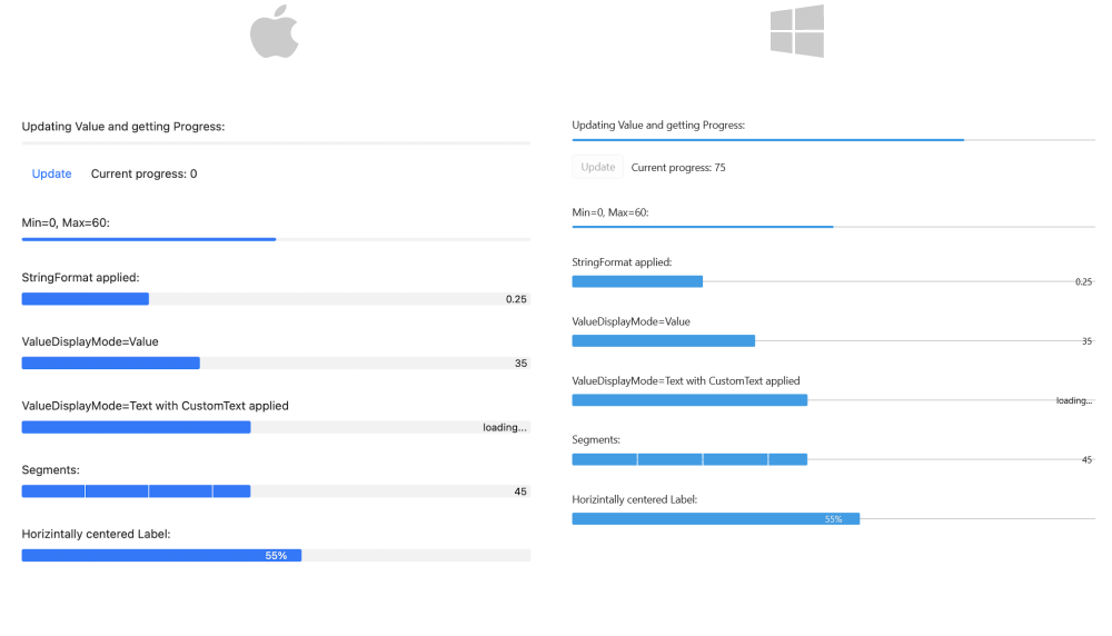
And how the example looks on `MacCatalyst` and `WinUI`:
## See Also
* [Animations](https://www.telerik.com/maui-ui/documentation/controls/progressbar/animations)
* [Indeterminate Mode](https://www.telerik.com/maui-ui/documentation/controls/progressbar/indeterminate-mode)
* [Events](https://www.telerik.com/maui-ui/documentation/controls/progressbar/events)
* [Styling](https://www.telerik.com/maui-ui/documentation/controls/progressbar/styling)