# .NET MAUI Expander Styling

The purpose of this help article is to show you how to style the Telerik .NET MAUI Expander control.

## Border Styling

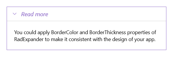
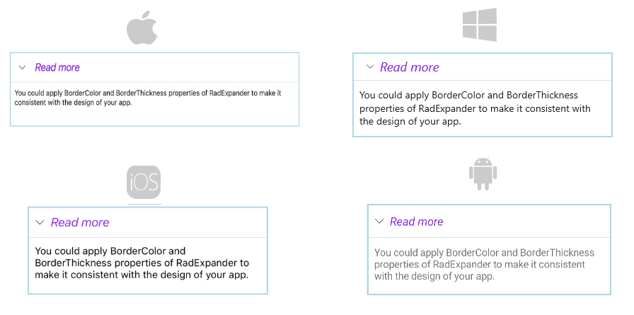
You can apply the `BorderColor` and `BorderThickness` properties of the `RadExpander` to make it match your app's design.

> note `ExpanderHeader` also provides means for customizing its border, you can learn more about this in the [`ExpanderHeader`: Border Styling](https://www.telerik.com/maui-ui/documentation/controls/expander/header#border-styling) article.

Check the example below on how the border settings can be defined:

```XAML
<telerik:RadExpander x:Name="expander"
                     HeaderText="Read more"
                     BorderColor="#8660C5"
                     BorderThickness="1">
    <telerik:RadExpander.Header>
        <telerik:ExpanderHeader IndicatorColor="#8660C5"/>
    </telerik:RadExpander.Header>
    <telerik:RadExpander.HeaderStyle>
        <Style TargetType="telerik:ExpanderHeader">
            <Setter Property="BorderThickness" Value="0,0,0,1"/>
            <Setter Property="BorderColor" Value="LightGray"/>
        </Style>
    </telerik:RadExpander.HeaderStyle>
    <telerik:RadExpander.HeaderTextStyle>
        <Style TargetType="Label">
            <Setter Property="TextColor" Value="#8660C5"/>
            <Setter Property="FontAttributes"  Value="Italic"/>
        </Style>
    </telerik:RadExpander.HeaderTextStyle>
    <telerik:RadExpander.Content>
        <VerticalStackLayout Margin="10">
            <Label Text="You could apply BorderColor and BorderThickness properties of RadExpander to make it consistent with the design of your app." HeightRequest="60"/>
        </VerticalStackLayout>
    </telerik:RadExpander.Content>
</telerik:RadExpander>
```

> For a runnable example with the Expander Styling scenario, see the [SDKBrowser Demo Application](https://www.telerik.com/maui-ui/documentation/demos-and-sample-apps/sdkbrowser-app) and go to **Expander > Features** category.

## Header Styling

To style the header of the Expander control, use the `HeaderStyle` property (of type `Style` with target type `Telerik.Maui.Controls.ExpanderHeader`).

The following code shows how to declare the `HeaderStyle` property in the Expander:

```XAML
<telerik:RadExpander.HeaderStyle>
    <Style TargetType="telerik:ExpanderHeader">
        <Setter Property="BorderThickness" Value="0,0,0,1"/>
        <Setter Property="BorderColor" Value="LightGray"/>
    </Style>
</telerik:RadExpander.HeaderStyle>
```

This is the result:

![.NET MAUI Expander Header Styling](https://www.telerik.com/maui-ui/documentation/assets/b09720bab07afdc892cfa4db1dddc420/expander-header-styling.png "Expander Header Text Styling")

> For a runnable example with the Expander Styling scenario, see the [SDKBrowser Demo Application](https://www.telerik.com/maui-ui/documentation/demos-and-sample-apps/sdkbrowser-app) and go to **Expander > Features** category.

## Header Text Styling

To customize the text inside the header, use the `HeaderTextStyle` property (`Style` with target type `Label`). If `HeaderTextStyle` is not set, the text inside is bold by default.

The following code shows how to declare the `HeaderTextStyle` property in the Expander:

```XAML
<telerik:RadExpander.HeaderTextStyle>
    <Style TargetType="Label">
        <Setter Property="TextColor" Value="#8660C5"/>
        <Setter Property="FontAttributes"  Value="Italic"/>
    </Style>
</telerik:RadExpander.HeaderTextStyle>
```

This is the result:

![.NET MAUI Expander Header Text Styling](https://www.telerik.com/maui-ui/documentation/assets/3f0c8bc4851a069ed2c901c5066a54ef/expander-styling.png "Expander Header Text Styling")

> For a runnable example with the Expander Styling scenario, see the [SDKBrowser Demo Application](https://www.telerik.com/maui-ui/documentation/demos-and-sample-apps/sdkbrowser-app) and go to **Expander > Features** category.

## See Also

* [Getting Started](https://www.telerik.com/maui-ui/documentation/controls/expander/getting-started)