# .NET MAUI DatePicker Modes
The DatePicker for .NET MAUI provides a popup and a drop-down picker mode for picking a value from the selector.
## Picker Mode
Use the `PickerMode` (enum of type `Telerik.Maui.Controls.PickerMode`) property to specify which UI to open for selecting a value from the picker selector. The options are:
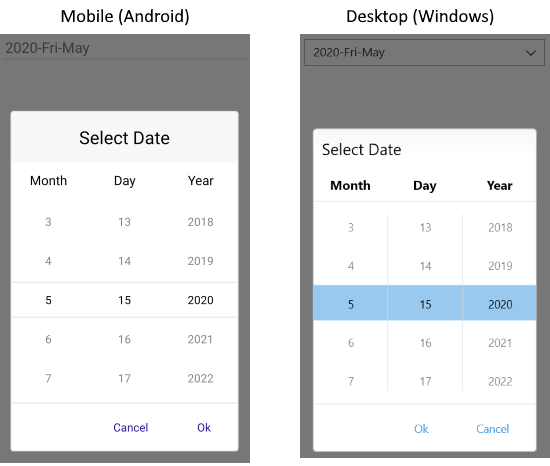
* `Popup`—Shows the UI for picking a date inside a popup. It's the default value for mobile (Android and iOS);
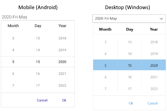
* `DropDown`—Opens the UI for picking a date inside a drop-down. It's the default value for Desktop (Windows, macOS);
Here is a sample of `PickerMode` set to `Popup`:
```XAML
```
The image below shows the result on mobile and desktop devices:
Quick example of `PickerMode` set to `DropDown`:
```XAML
```
The image below shows the result on mobile and desktop devices:
## Picker Toggle State
You can control whether the picker popup or drop-down is opened or closed by using the `IsOpen` (`bool`) property.
## Arrow Button Picker Mode
In addition, DatePicker exposes the `IsToggleButtonVisible` property which, when set to `True`, renders an `Arrow` button for opening the UI and allows users to pick a date.
By default, together with the `DropDown` picker mode, `IsToggleButtonVisible` is enabled for desktop devices, and is disabled for mobile platforms. You can explicitly apply it in both cases by using the following implementation:
```XAML
```
## See Also
* [Formatting the Telerik UI for .NET MAUI DatePicker](https://www.telerik.com/maui-ui/documentation/controls/datepicker/formatting)
* [Setting Date Ranges in the .NET MAUI DatePicker](https://www.telerik.com/maui-ui/documentation/controls/datepicker/date-range)
* [.NET MAUI DatePicker Templates](https://www.telerik.com/maui-ui/documentation/controls/datepicker/templates)
* [.NET MAUI DatePicker Selection](https://www.telerik.com/maui-ui/documentation/controls/datepicker/selection)
* [.NET MAUI DatePicker Styling](https://www.telerik.com/maui-ui/documentation/controls/datepicker/styling/styling)