# Styling the DataPager Buttons

The DataPager for .NET MAUI provides a styling mechanism for customizing the look of the navigation and page buttons.

## Styling the Navigation Buttons

The DataPager provides a styling mechanism for customizing the look of the navigation buttons by using the following properties:

* `NavigateToFirstPageButtonStyle` (`Style` with target type of `telerik:DataPagerButton`)—Specifies the style which applies to the first page navigation button.
* `NavigateToPreviousPageButtonStyle` (`Style` with target type of `telerik:DataPagerButton`)—Specifies the style which applies to the previous page navigation button.
* `NavigateToNextPageButtonStyle` (`Style` with target type of `telerik:DataPagerButton`)—Specifies the style which applies to the next page navigation button.
* `NavigateToLastPageButtonStyle` (`Style` with target type of `telerik:DataPagerButton`)—Specifies the style which applies to the last page navigation button.

The `DataPagerButton` inherits from `RadTemplatedButton`. Set the properties described in the [TemplatedButton Styling](https://www.telerik.com/maui-ui/documentation/controls/templatedbutton/styling) article to the DataPager navigation buttons styling properties.

The `DataPagerButton` exposes additional visual states—`Selected` and `SelectedDisabled`. Review the [TemplatedButton Visual States](https://www.telerik.com/maui-ui/documentation/controls/templatedbutton/visual-states) article to check what are the other states you can set to the navigation buttons.

## Styling the Numeric Buttons

The DataPager provides a styling mechanism for customizing the look of the numeric buttons by using the following properties:

* `NumericButtonStyle` (`Style` with target type of `telerik:DataPagerButton`)—Specifies the style which applies to the numeric buttons.
* `NumericButtonsViewStyle` (`Style` with target type of `telerik:DataPagerNumericButtonsView`)—Specifies the style which applies to the view presenting the numeric buttons.

The `DataPagerButton` inherits from `RadTemplatedButton`. Set the properties described in the [TemplatedButton Styling](https://www.telerik.com/maui-ui/documentation/controls/templatedbutton/styling) article to the DataPager navigation buttons styling properties.

The `DataPagerButton` exposes additional visual states—`Selected` and `SelectedDisabled`. Review the [TemplatedButton Visual States](https://www.telerik.com/maui-ui/documentation/controls/templatedbutton/visual-states) article to check what are the other states you can set to the navigation buttons.

## Example

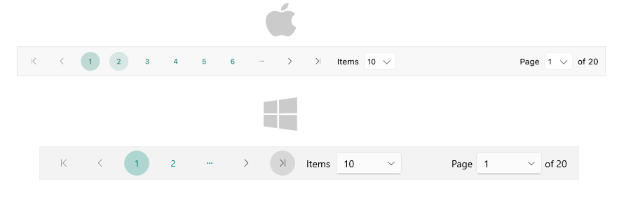
Here is an example how to style the buttons in the DataPager control.

**1.** Define the DataPager in XAML:

```XAML
		<telerik:RadDataPager Source="{Binding Data}"
                      ContentPadding="16, 4"
                      HeightRequest="48"
                      NavigateToFirstPageButtonStyle="{StaticResource DataPagerButtonStyle}"
                      NavigateToPreviousPageButtonStyle="{StaticResource DataPagerButtonStyle}"
                      NavigateToNextPageButtonStyle="{StaticResource DataPagerButtonStyle}"
                      NavigateToLastPageButtonStyle="{StaticResource DataPagerButtonStyle}"
                      NumericButtonStyle="{StaticResource DataPagerNumericButtonStyle}">
    <telerik:RadDataPager.BindingContext>
        <local:ViewModel />
    </telerik:RadDataPager.BindingContext>
</telerik:RadDataPager>
```

**2.** Add the `telerik` namespace:

```XAML
xmlns:telerik="http://schemas.telerik.com/2022/xaml/maui"
```

**3.** Define the button resources in the page's resource:

```XAML
<Color x:Key="DataPagerButtonAccentColor">#00897B</Color>
<Color x:Key="DataPagerButtonNonAccentColor">#424242</Color>
<telerik:ColorFilter x:Key="DataPagerButtonAccentColorAlpha16" Color="{StaticResource DataPagerButtonAccentColor}" Alpha="0.16" />
<telerik:ColorFilter x:Key="DataPagerButtonAccentColorAlpha28" Color="{StaticResource DataPagerButtonAccentColor}" Alpha="0.28" />
<telerik:ColorFilter x:Key="DataPagerButtonNonAccentColorAlpha16" Color="{StaticResource DataPagerButtonNonAccentColor}" Alpha="0.16" />
<telerik:ColorFilter x:Key="DataPagerButtonNonAccentColorAlpha28" Color="{StaticResource DataPagerButtonNonAccentColor}" Alpha="0.28" />
<Style x:Key="DataPagerButtonStyle" TargetType="telerik:DataPagerButton">
    <Setter Property="MinimumWidthRequest" Value="36" />
    <Setter Property="MinimumHeightRequest" Value="36" />
    <Setter Property="CornerRadius" Value="18" />
    <Setter Property="TextColor" Value="{StaticResource DataPagerButtonNonAccentColor}" />
    <Setter Property="Background" Value="Transparent" />
    <Setter Property="BorderThickness" Value="0" />
    <Setter Property="VerticalOptions" Value="Center" />
    <Setter Property="ControlTemplate">
        <ControlTemplate>
            <telerik:RadEffectsView x:Name="PART_EffectsView"
                                    BackgroundColor="{TemplateBinding BackgroundColor}"
                                    Background="{TemplateBinding Background}"
                                    BorderColor="{TemplateBinding BorderColor}"
                                    BorderBrush="{TemplateBinding BorderBrush}"
                                    BorderThickness="{TemplateBinding BorderThickness}"
                                    CornerRadius="{TemplateBinding CornerRadius, Converter={x:Static telerik:CornerRadiusToThicknessConverter.Instance}}"
                                    Padding="{TemplateBinding Padding}">
                <ContentPresenter telerik:ContentPresenterUtils.Content="{TemplateBinding ActualContent}" />
            </telerik:RadEffectsView>
        </ControlTemplate>
    </Setter>
    <Setter Property="VisualStateManager.VisualStateGroups">
        <Setter.Value>
            <VisualStateGroupList>
                <VisualStateGroup Name="CommonStates">
                    <VisualState Name="Normal" />
                    <VisualState Name="MouseOver">
                        <VisualState.Setters>
                            <Setter Property="telerik:DataPagerButton.Background" Value="{StaticResource DataPagerButtonNonAccentColorAlpha16}" />
                        </VisualState.Setters>
                    </VisualState>
                    <VisualState Name="Pressed">
                        <VisualState.Setters>
                            <Setter Property="telerik:DataPagerButton.Background" Value="{StaticResource DataPagerButtonNonAccentColorAlpha28}" />
                        </VisualState.Setters>
                    </VisualState>
                    <VisualState Name="Disabled">
                        <VisualState.Setters>
                            <Setter Property="Opacity" Value="0.6" />
                        </VisualState.Setters>
                    </VisualState>
                </VisualStateGroup>
            </VisualStateGroupList>
        </Setter.Value>
    </Setter>
</Style>
<Style x:Key="DataPagerNumericButtonStyle" TargetType="telerik:DataPagerButton" BasedOn="{StaticResource DataPagerButtonStyle}">
    <Setter Property="TextColor" Value="{StaticResource DataPagerButtonAccentColor}" />
    <Setter Property="VisualStateManager.VisualStateGroups">
        <VisualStateGroupList>
            <VisualStateGroup Name="CommonStates">
                <VisualState Name="Normal" />
                <VisualState Name="MouseOver">
                    <VisualState.Setters>
                        <Setter Property="telerik:DataPagerButton.Background" Value="{StaticResource DataPagerButtonAccentColorAlpha16}" />
                    </VisualState.Setters>
                </VisualState>
                <VisualState Name="Pressed">
                    <VisualState.Setters>
                        <Setter Property="telerik:DataPagerButton.Background" Value="{StaticResource DataPagerButtonAccentColorAlpha28}" />
                    </VisualState.Setters>
                </VisualState>
                <VisualState Name="Selected">
                    <VisualState.Setters>
                        <Setter Property="telerik:DataPagerButton.Background" Value="{StaticResource DataPagerButtonAccentColorAlpha28}" />
                    </VisualState.Setters>
                </VisualState>
                <VisualState Name="SelectedDisabled">
                    <VisualState.Setters>
                        <Setter Property="telerik:DataPagerButton.Background" Value="{StaticResource DataPagerButtonAccentColorAlpha28}" />
                    </VisualState.Setters>
                </VisualState>
                <VisualState Name="Disabled">
                    <VisualState.Setters>
                        <Setter Property="Opacity" Value="0.6" />
                    </VisualState.Setters>
                </VisualState>
            </VisualStateGroup>
        </VisualStateGroupList>
    </Setter>
</Style>
```

**4.** Define sample data:

```C#
public class ViewModel
{
    public ViewModel()
    {
        Data = CreateData(200);
    }

    public List<int> Data { get; set; }

    internal static List<int> CreateData(int count)
    {
        List<int> source = new List<int>();

        for (int i = 0; i < count; i++)
        {
            source.Add(i);
        }

        return source;
    }
}
```

This is the result on desktop:
![.NET MAUI DataPager Buttons styling](https://www.telerik.com/maui-ui/documentation/assets/d3076bbbdc3a35eb30a8dbe208dbf75a/datapager-buttons-styling.png)

> For the DataPager Buttons styling example, go to the [SDKBrowser Demo Application](https://www.telerik.com/maui-ui/documentation/demos-and-sample-apps/sdkbrowser-app) and navigate to the **DataPager > Styling** category.

## See Also

* [Paged Source](https://www.telerik.com/maui-ui/documentation/controls/datapager/data-binding)
* [Display Modes](https://www.telerik.com/maui-ui/documentation/controls/datapager/display-mode)
* [Page Configuration](https://www.telerik.com/maui-ui/documentation/controls/datapager/page-configuration)
* [Localization](https://www.telerik.com/maui-ui/documentation/controls/datapager/localization)
* [Commands in DataPager](https://www.telerik.com/maui-ui/documentation/controls/datapager/commands)
* [Styling the DataPager](https://www.telerik.com/maui-ui/documentation/controls/datapager/styling/datapager)
* [Integration with DataGrid](https://www.telerik.com/maui-ui/documentation/controls/datapager/integration/datagrid)
