# .NET MAUI DataGrid Style Selectors
The [.NET MAUI DataGrid](https://www.telerik.com/maui-ui/documentation/controls/datagrid/overview) component exposes a conditional styling feature. It allows users to apply different styles on a cell or per group header depending on a specific condition.
## Cell Style Selector
You can set a distinct style to a specific cell in a given column based on custom style-selection logic with the following properties:
* `CellContentStyleSelector`(`IStyleSelector`)—Styles the content of the cell by using the text alignment options (`TextMargin`, `HorizontalTextAlignment`, `VerticalTextAlignment`), the font options (`FontAttributes`, `FontFamily`, `FontSize`) and the `TextColor` property.
* `CellDecorationStyleSelector`(`IStyleSelector`)—Styles the decoration of a cell.
> For the DataGrid Style Selector example, go to the [SDKBrowser Demo Application](https://www.telerik.com/maui-ui/documentation/demos-and-sample-apps/sdkbrowser-app) and navigate to the **DataGrid > Styling** category.
## Row Background Style Selector
You can set a different style on a row, an alternate row, and on row details based on custom style-selection logic by using the `RowBackgroundStyleSelector` (`IStyleSelector`) property.
To apply a `RowBackgroundStyleSelector` you have to:
1. Create a custom class that inherits from `IStyleSelector`.
2. Implement the `SelectStyle` method.
The object item of the `SelectStyle` method is of type `DataGridRowInfo`. The `DataGridRowInfo` represents a class that provides information for each row in DataGrid and exposes the following properties:
* `Item` (`object`)—Gets the business object associated with the row.
* `IsRowDetails` (`bool`)—Gets a value that specifies whether the row is RowDetail.
* `IsAlternate` (`bool`)—Gets a value that specifies whether the row is an alternate one.
> For the DataGrid Row Background Style Selector example, go to the [SDKBrowser Demo Application](https://www.telerik.com/maui-ui/documentation/demos-and-sample-apps/sdkbrowser-app) and navigate to the **DataGrid > Styling** category.
## Group Style Selector
You can set a different style on a group header and footer based on custom style-selection logic with the following properties:
* `GroupHeaderStyleSelector`(`IStyleSelector`)—Specifies different style per-group header once the DataGrid control is grouped.
* `GroupFooterStyleSelector`(`IStyleSelector`)—Specifies different style per-group footer once the DataGrid control is grouped.
> To display the group footer, set the `ShowGroupFooters` property to `True`.
> For the DataGrid Style Selector example, go to the [SDKBrowser Demo Application](https://www.telerik.com/maui-ui/documentation/demos-and-sample-apps/sdkbrowser-app) and navigate to the **DataGrid > Styling** category.
The `CellContentStyleSelector`, `CellDecorationStyleSelector`, `RowBackgroundStyleSelector`, `GroupHeaderStyleSelector`, and `GroupFooterStyleSelector` use the `SelectStyle` method to change the style.
## Example with Cell and Group Style Selectors
The following example demonstrates how to apply the style selectors on the DataGrid cell and group header. You will add the DataGrid and set the `CellContentStyleSelector` property as a static resource of type `MyCellContentStyleSelector`, `CellDecorationStyleSelector` as a static resource of type `MyCellDecorationStyleSelector`, and `GroupHeaderStyleSelector` as a static resource of type `MyGroupSelector`:
**1.** Define the `RadDataGrid` in XAML:
```XAML
```
**2.** Create a sample data model:
```C#
public class Data
{
public Data(string country, string capital)
{
this.Country = country;
this.Capital = capital;
}
public string Country { get; set; }
public string Capital { get; set; }
}
```
**3.** Set the `ItemsSource` of the `RadDataGrid`:
```C#
var source = new ObservableCollection();
source.Add(new Data("India", "New Delhi"));
source.Add(new Data("South Africa", "Cape Town"));
source.Add(new Data("Nigeria", "Abuja"));
source.Add(new Data("Singapore", "Singapore"));
source.Add(new Data("Romania", "Bucharest"));
source.Add(new Data("Spain", "Madrid"));
source.Add(new Data("France", "Paris"));
source.Add(new Data("Japan", "Tokyo"));
this.datagrid.ItemsSource = source;
```
**4.** Create a custom class for each selector. Each class derives from `IStyleSelector` and overrides its `SelectStyle` method.
* The implementation of `MyCellContentSelector` class:
```C#
class MyCellContentSelector : IStyleSelector
{
public Style CellTemplate1 { get; set; }
public Style CellTemplate2 { get; set; }
public Style SelectStyle(object item, BindableObject container)
{
DataGridCellInfo cellInfo = item as DataGridCellInfo;
if (cellInfo != null)
{
if ((cellInfo.Item as Data).Capital == "Singapore")
{
return CellTemplate1;
}
else
{
return CellTemplate2;
}
}
return null;
}
}
```
* The implementation of `MyCellDecorationSelector` class:
```C#
class MyCellDecorationSelector : IStyleSelector
{
public Style CellTemplate1 { get; set; }
public Style CellTemplate2 { get; set; }
public Style SelectStyle(object item, BindableObject container)
{
DataGridCellInfo cellInfo = item as DataGridCellInfo;
if (cellInfo != null)
{
if ((cellInfo.Item as Data).Capital == "Singapore")
{
return CellTemplate1;
}
else
{
return CellTemplate2;
}
}
return null;
}
}
```
* The implementation of `MyGroupSelector` class:
```C#
class MyGroupSelector : IStyleSelector
{
public Style CountryTemplate1 { get; set; }
public Style CountryTemplate2 { get; set; }
public Style SelectStyle(object item, BindableObject container)
{
GroupHeaderContext header = item as GroupHeaderContext;
if (header != null)
{
if (header.Group.Key == "India")
{
return CountryTemplate1;
}
else
{
return CountryTemplate2;
}
}
return null;
}
}
```
**5.** Add `MyCellContentSelector`, `MyCellDecorationSelector`, and `MyGroupSelector` as resources in the **Resource** page of the application:
```XAML
```
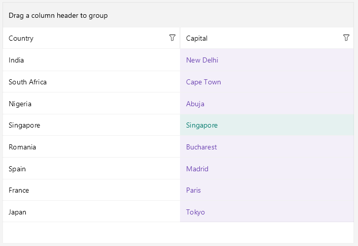
This is how the DataGrid control will look when `CellContentStyleSelector` is applied.
> For the DataGrid Style Selector example, go to the [SDKBrowser Demo Application](https://www.telerik.com/maui-ui/documentation/demos-and-sample-apps/sdkbrowser-app) and navigate to the **DataGrid > Styling** category.
## Example with Row Background Style Selectors
The following example demonstrates how to apply the style selectors on the DataGrid rows, row details, and alternate rows. You will add the DataGrid and set the `RowBackgroundStyleSelector` property as a static resource of type `MyRowBackgroundStyleSelector`:
**1.** Define the `RadDataGrid` in XAML:
```XAML
```
**2.** Create a sample data model:
```C#
public class MyData
{
public string Name { get; set; }
public int Age { get; set; }
public string City { get; set; }
}
```
**3.** Define the `ViewModel`:
```C#
public class ViewModel : NotifyPropertyChangedBase
{
public ViewModel()
{
this.Items = new ObservableCollection()
{
new MyData { Name = "John" , Age = 18, City = "London"},
new MyData { Name = "Mike" , Age = 56, City = "New York"},
new MyData { Name = "Joan" , Age = 64, City = "Madrid"},
new MyData { Name = "Seiji" , Age = 23, City = "Tokyo"},
new MyData { Name = "Dobi" , Age = 21, City = "Amsterdam"},
new MyData { Name = "Gun" , Age = 34, City = "Seoul"},
new MyData { Name = "Chao" , Age = 23, City = "Nanjing"},
new MyData { Name = "Jake" , Age = 34, City = "LA"},
new MyData { Name = "Andrea" , Age = 53, City = "London"},
new MyData { Name = "Miki" , Age = 12, City = "New York"},
new MyData { Name = "Tonny" , Age = 43, City = "Seattle"},
new MyData { Name = "John" , Age = 48, City = "Chicago"},
new MyData { Name = "Eva" , Age = 22, City = "Mexico"},
new MyData { Name = "Nicki" , Age = 19, City = "Chicago"},
new MyData { Name = "Emma" , Age = 48, City = "Brazil"},
};
}
public ObservableCollection Items { get; set; }
}
```
**4.** Create a custom class `MyRowBackgroundStyleSelector` that derives from `IStyleSelector` and override the `SelectStyle` method.
```C#
public class MyRowBackgroundStyleSelector : IStyleSelector
{
public Style RowBackgroundStyle { get; set; }
public Style AlternateRowBackgroundStyle { get; set; }
public Style RowDetailsBackgroundStyle { get; set; }
public Style AlternateRowDetailsBackgroundStyle { get; set; }
public Style SelectStyle(object item, BindableObject bindable)
{
if (item is DataGridRowInfo rowInfo)
{
// In case you want to style the row background based on the business object associated with the row.
var myitem = rowInfo.Item as MyData;
if (rowInfo.IsRowDetails)
{
if (rowInfo.IsAlternate)
{
return this.AlternateRowDetailsBackgroundStyle;
}
else
{
return this.RowDetailsBackgroundStyle;
}
}
else
{
if (rowInfo.IsAlternate)
{
return this.AlternateRowBackgroundStyle;
}
else
{
return this.RowBackgroundStyle;
}
}
}
return null;
}
}
```
**5.** Add `MyRowBackgroundStyleSelector` as resource in the **Resource** page of the application:
```XAML
```
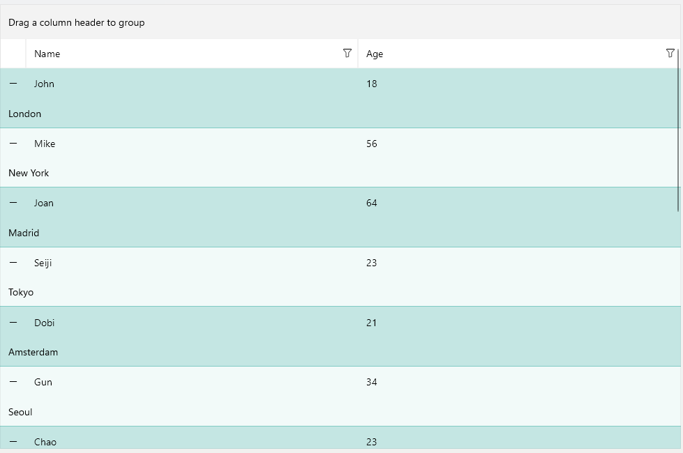
This is how the DataGrid control looks when applying the `RowBackgroundStyleSelector`.
> For the DataGrid Row Background Style Selector example, go to the [SDKBrowser Demo Application](https://www.telerik.com/maui-ui/documentation/demos-and-sample-apps/sdkbrowser-app) and navigate to the **DataGrid > Styling** category.
## See Also
* [DataGrid Styling](https://www.telerik.com/maui-ui/documentation/controls/datagrid/theming-and-styles/styling)
* [Columns Styling](https://www.telerik.com/maui-ui/documentation/controls/datagrid/theming-and-styles/columns-styling)