# .NET MAUI DataGrid Load On Demand Styling

The DataGrid exposes several mechanisms for styling the load-on-demand functionality, which you can use according to the `LoadOnDemandMode` you have chosen.

## Style the Loading Indicator in Automatic Mode

### Style the Default Loading Indicator

A loading indicator is visualized when data is loaded on demand automatically. The indicator is a [`RadBusyIndicator`](https://www.telerik.com/maui-ui/documentation/controls/busyindicator/overview), so to style its appearance, use an implicit style with `TargetType` set to `telerik:RadBusyIndicator`:

```XAML
<Style TargetType="telerik:RadBusyIndicator">
    <Setter Property="AnimationContentWidthRequest" Value="80" />
    <Setter Property="AnimationContentHeightRequest" Value="100" />
    <Setter Property="AnimationContentColor" Value="LightBlue" />
    <Setter Property="AnimationType" Value="Animation5" />
    <Setter Property="BackgroundColor" Value="LightCoral" />
</Style>
```

### Define Custom Loading Template

The `LoadOnDemandAutoTemplate` (`DataTemplate`) property allows you to define a custom template for the loading indicator when the `LoadOnDemandMode` is set to `Automatic`.

1. Define the custom template in XAML:

```XAML
<DataTemplate x:Key="CustomLoadOnDemandAutoTemplate">
    <Grid IsVisible="{Binding IsDataLoading}" BackgroundColor="#E0F2F1" Padding="8, 0" HeightRequest="32">
        <Label Text="Auto-loading items..." TextColor="#00796B" FontAttributes="Bold" VerticalTextAlignment="Center"/>
    </Grid>
</DataTemplate>
```

2. Set the template to the `LoadOnDemandAutoTemplate` property of the DataGrid:

```XAML
<telerik:RadDataGrid x:Name="dataGrid"
                     ItemsSource="{Binding Items}"
                     LoadOnDemand="dataGrid_LoadOnDemand"
                     LoadOnDemandMode="Automatic"
                     LoadOnDemandAutoTemplate="{StaticResource CustomLoadOnDemandAutoTemplate}"
                     LoadOnDemandBufferItemsCount="{Binding Source={x:Reference slider}, Path=Value}"/>
```

> important For DataGrid LoadOnDemand AutoTemplate example, refer to the [SDKBrowser Demo application](https://www.telerik.com/maui-ui/documentation/demos-and-sample-apps/sdkbrowser-app) and go to the **DataGrid > LoadOnDemand** category.

## Style the Loading Indicator in Manual Mode

### Style the LoadMore Row

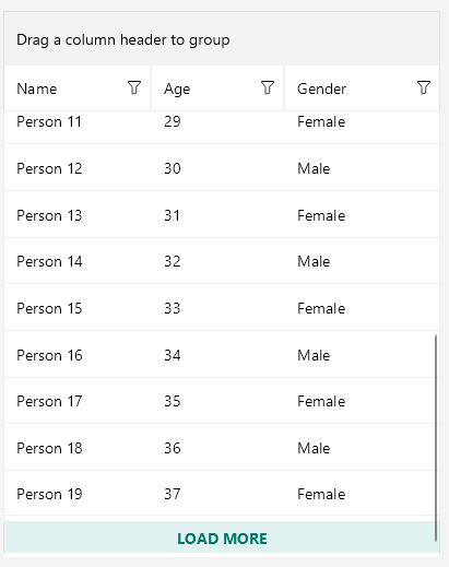
Use the `LoadOnDemandRowStyle` property to style the appearance of the row that contains the **Load More** button when the `LoadOnDemandMode` is `Manual`.

1. The custom style is of type `Style` with target type `DataGridLoadOnDemandRowAppearance`:

```XAML
<Style TargetType="telerik:DataGridLoadOnDemandRowAppearance" x:Key="CustomDataGridLoadOnDemandRowStyle">
    <Setter Property="BackgroundColor" Value="#E0F2F1"/>
    <Setter Property="IndicatorAnimationColor" Value="#00796B"/>
    <Setter Property="IndicatorAnimationType" Value="Animation5"/>
    <Setter Property="HorizontalTextAlignment" Value="Center"/>
    <Setter Property="VerticalTextAlignment" Value="Center"/>
    <Setter Property="OverlayOpacity" Value="0.5"/>
    <Setter Property="Text" Value="LOAD MORE"/>
    <Setter Property="TextFontAttributes" Value="Bold"/>
    <Setter Property="TextFontSize" Value="14"/>
    <Setter Property="TextColor" Value="#00796B"/>
</Style>
```

2. Set the style to the `LoadOnDemandRowStyle` property of the DataGrid:

```XAML
<telerik:RadDataGrid x:Name="dataGrid"
                     ItemsSource="{Binding Items}"
                     LoadOnDemand="dataGrid_LoadOnDemand"
                     LoadOnDemandMode="Manual"
                     LoadOnDemandRowStyle="{StaticResource CustomDataGridLoadOnDemandRowStyle}"/>
```

The following image shows the row appearance after setting the `LoadOnDemandRowStyle` property:
![Telerik UI for .NET MAUI DataGrid load on demand row with a customized Load More button style](https://www.telerik.com/maui-ui/documentation/assets/84274435986edfdd1c8dd47f620fb30e/datagrid-rowstyle.png)

> important For DataGrid LoadMore Row styling example, refer to the [SDKBrowser Demo application](https://www.telerik.com/maui-ui/documentation/demos-and-sample-apps/sdkbrowser-app) and go to the **DataGrid > LoadOnDemand** category.

### Customize the LoadMore RowTemplate

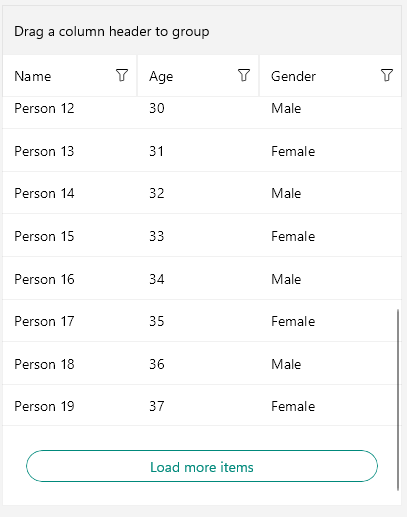
Use the `LoadOnDemandRowTemplate` property to set the template of the row that contains the **Load More** button when the `LoadOnDemandMode` is `Manual`.

1. The following example demonstrates a custom `DataTemplate`:

```XAML
<DataTemplate x:Key="CustomLoadOnDemandRowTemplate">
    <telerik:RadBorder IsEnabled="{Binding IsDataLoading, Converter={StaticResource InvertedBooleanConverter}}"
                       BorderBrush="#00897B" BorderThickness="1" CornerRadius="16" HeightRequest="32" Margin="12">
        <telerik:RadBorder.Triggers>
            <Trigger TargetType="telerik:RadBorder" Property="IsEnabled" Value="False">
                <Setter Property="Opacity" Value="0.38" />
            </Trigger>
        </telerik:RadBorder.Triggers>
        <Label Text="Load more items" TextColor="#00897B" HorizontalOptions="Center" VerticalOptions="Center" />
    </telerik:RadBorder>
</DataTemplate>
```

2. Set the template to the `LoadOnDemandRowTemplate` property of the DataGrid:

```XAML
<telerik:RadDataGrid x:Name="dataGrid"
                     ItemsSource="{Binding Items}"
                     LoadOnDemand="dataGrid_LoadOnDemand"
                     LoadOnDemandMode="Manual"
                     LoadOnDemandRowTemplate="{StaticResource CustomLoadOnDemandRowTemplate}"/>
```

The following image shows the row appearance after setting the `LoadOnDemandRowTemplate` property:
![Telerik UI for .NET MAUI DataGrid load on demand row with a customized Load More button template](https://www.telerik.com/maui-ui/documentation/assets/f501eab6663b90ce6c5a87d309ba2c5c/datagrid-rowtemplate.png)

> important For DataGrid LoadMore Template example, refer to the [SDKBrowser Demo application](https://www.telerik.com/maui-ui/documentation/demos-and-sample-apps/sdkbrowser-app) and go to the **DataGrid > LoadOnDemand** category.

## See Also

* [Load On Demand Overview](https://www.telerik.com/maui-ui/documentation/controls/datagrid/load-on-demand/overview)
* [Load On Demand Collection](https://www.telerik.com/maui-ui/documentation/controls/datagrid/load-on-demand/collection)
* [Load On Demand Event](https://www.telerik.com/maui-ui/documentation/controls/datagrid/load-on-demand/event)
* [Load On Demand Command](https://www.telerik.com/maui-ui/documentation/controls/datagrid/load-on-demand/command)
