# .NET MAUI DataGrid Column Headers

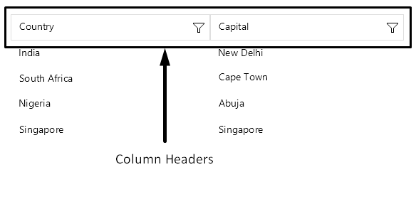
This article describes how to customize and use column headers when performing different data operations. Column headers are always visible by default. You can further customize them by using the `HeaderStyle` property.

> caption Column headers in the .NET MAUI DataGrid
![.NET MAUI DataGrid showing column headers](https://www.telerik.com/maui-ui/documentation/assets/1e88e45c22fb8d334b4c8e114c1a7222/column-header.png)

## Headers Visibility

The `ShowColumnHeaders` property of the DataGrid allows you to show or hide the column headers. By default, the property is set to `True`, which means that the column headers are visible.

```XAML
<telerik:RadDataGrid ShowColumnHeaders="False" />
```

## Changing the Text in the Header

To customize text inside the header you have to use the `HeaderText` property. The property is per column. If `HeaderText` is not set, the text inside the `PropertyName` is displayed.

```XAML
<telerik:RadDataGrid x:Name="dataGrid" 
					 AutoGenerateColumns="False">
	<telerik:RadDataGrid.Columns>
		<telerik:DataGridTextColumn PropertyName="Capital" 
									HeaderText="Capital Header"/>
		<telerik:DataGridTextColumn PropertyName="Country" 
									HeaderText="Country Header"/>
	</telerik:RadDataGrid.Columns>
</telerik:RadDataGrid>
```

## Sorting

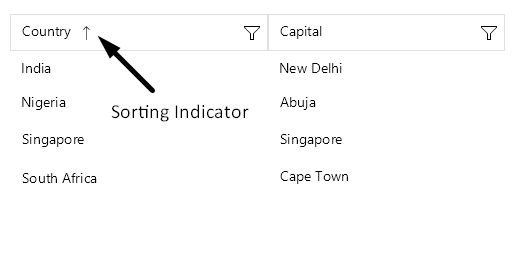
The user of the application can sort a particular column when tapping on its header. When the data is sorted by a column, the sort indicator shows in the header.
![.NET MAUI DataGrid column header showing a sorting indicator](https://www.telerik.com/maui-ui/documentation/assets/fb8b90fd67b2bc83cdb61ad5355974bc/column-header-sorting.png)

To learn more about the sorting functionality of the [.NET MAUI DataGrid](https://www.telerik.com/maui-ui/documentation/controls/datagrid/overview) take a look at the [Sorting](https://www.telerik.com/maui-ui/documentation/controls/datagrid/sorting) article.

## Filtering

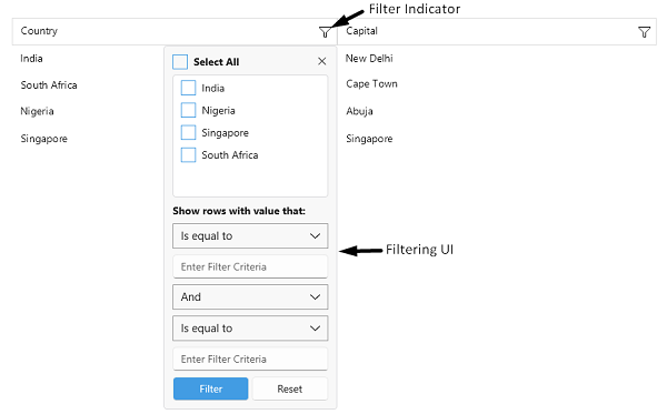
The header of the column hosts the built-in filtering mechanism (the filter indicator which opens the Filtering UI), which allows the user to filter the data by the columns' values.
![.NET MAUI DataGrid column header showing a filter indicator](https://www.telerik.com/maui-ui/documentation/assets/517b014858f05b64034c47e3916694de/column-header-filtering.png)

To learn more about the filtering functionality take a look at the [Filtering](https://www.telerik.com/maui-ui/documentation/controls/datagrid/filtering/overview) article.

## Styling

Use the `HeaderStyle` property to style the `DataGridColumn` header.

Check the [.NET MAUI DataGrid Column Header Styling](https://www.telerik.com/maui-ui/documentation/controls/datagrid/theming-and-styles/columns-styling#headerstyle) topic for more information about the styling options you can use.

> tip For more details how to hide the column headers from the DataGrid visualization, review the following article: [How to Hide Column Headers in a DataGrid for MAUI](https://www.telerik.com/maui-ui/documentation/knowledge-base/hide-column-headers-maui-datagrid).

## Header Content Customization

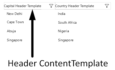
You can customize the content of the Header using the `HeaderContentTemplate`(`DataTemplate`) property.

Define the `DataTemplate` for the header:

```XAML
<DataTemplate x:Key="CapitalColumnHeaderTemplate">
    <HorizontalStackLayout Margin="4, 0" HeightRequest="30">
        <Image Source="rating.png" HeightRequest="16" />
        <Label Text="Capital"
               HorizontalOptions="Center"
               VerticalOptions="Center"
               Margin="4, 0, 0, 0" />
    </HorizontalStackLayout>
</DataTemplate>
<DataTemplate x:Key="CountryColumnHeaderTemplate">
    <HorizontalStackLayout Margin="4, 0" HeightRequest="30">
        <Image Source="map.png" HeightRequest="16" />
        <Label Text="Country"
               HorizontalOptions="Center"
               VerticalOptions="Center"
               Margin="4, 0, 0, 0" />
    </HorizontalStackLayout>
</DataTemplate>
```

Define the `HeaderContentTemplate` in the DataGrid column:

```XAML
<telerik:RadDataGrid x:Name="dataGrid"
                     ShowColumnFooters="True"
                     AutoGenerateColumns="False"
                     BorderBrush="{OnPlatform WinUI=#F1F1F1}"
                     BorderThickness="{OnPlatform Default=1, Android=0}">
    <telerik:RadDataGrid.Columns>
        <telerik:DataGridTextColumn PropertyName="Capital"
                                    HeaderStyle="{StaticResource CustomColumnHeaderStyle}"
                                    HeaderContentTemplate="{StaticResource CapitalColumnHeaderTemplate}"
                                    FooterContentTemplate="{StaticResource CapitalColumnFooterTemplate}" />
        <telerik:DataGridTextColumn PropertyName="Country"
                                    HeaderStyle="{StaticResource CustomColumnHeaderStyle}"
                                    HeaderContentTemplate="{StaticResource CountryColumnHeaderTemplate}"
                                    FooterContentTemplate="{StaticResource CountryColumnFooterTemplate}" />
    </telerik:RadDataGrid.Columns>
</telerik:RadDataGrid>
```

This is the result:

![.NET MAUI DataGrid showing a customized column header content template](https://www.telerik.com/maui-ui/documentation/assets/bec49fe89b7b3e10174148f89dc99b69/header-content-template.png)

## Color on Hover

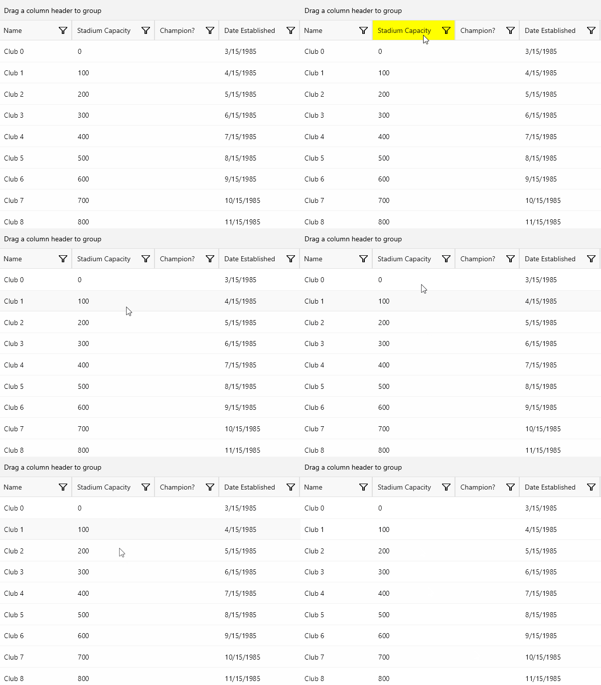
You can change the hover state background color of the column header by setting the `BackgroundColor` property.

The following example demonstrates how to apply the `BackgroundColor` property to the DataGrid `HeaderContentTemplate` for its hover visual state:

```XAML
  <DataTemplate x:Key="CustomHeaderTemplate">
            <telerik:RadBorder BackgroundColor="#F8F8F8"
                               BorderThickness="1">
                <VisualStateManager.VisualStateGroups>
                    <VisualStateGroup x:Name="CommonStates">
                        <VisualState x:Name="Normal" />
                        <VisualState x:Name="Focused" />
                        <VisualState x:Name="Disabled" />
                        <VisualState x:Name="PointerOver">
                            <VisualState.Setters>
                                <Setter Property="BackgroundColor" Value="#33000000" />
                            </VisualState.Setters>
                        </VisualState>
                    </VisualStateGroup>
                </VisualStateManager.VisualStateGroups>
            </telerik:RadBorder>
    </DataTemplate>
```

This is the result:

![.NET MAUI DataGrid column header hover state with custom background color](https://www.telerik.com/maui-ui/documentation/assets/225c3560fa43cee55918f72083dfb6a5/datagrid-hover-background-color.gif)

## See Also

* [Text Column](https://www.telerik.com/maui-ui/documentation/controls/datagrid/columns/column-types/text-column)
* [Picker Column](https://www.telerik.com/maui-ui/documentation/controls/datagrid/columns/column-types/combobox-column)
* [Template Column](https://www.telerik.com/maui-ui/documentation/controls/datagrid/columns/column-types/template-column)