# .NET MAUI DataGrid Column Footers

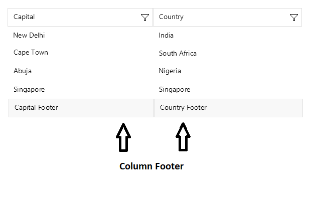
The [Telerik UI for .NET MAUI DataGrid](https://www.telerik.com/maui-ui/documentation/controls/datagrid/overview) allows you to display additional information which applies to the columns in a specific row placed at the bottom of the control. This row consists of individual footer cells for each column.

> caption Column footer in the .NET MAUI DataGrid
![.NET MAUI DataGrid showing column footer cells](https://www.telerik.com/maui-ui/documentation/assets/30836ba10bf24b1cf36b432d7fa7d8e4/column-footer.png)

By default, column footers are hidden, and, to make them visible, you have to set the `ShowColumnFooters` property to `True`.

The following example shows how to define a footer in the DataGrid:

```XAML
<telerik:RadDataGrid x:Name="dataGrid" 
                     ShowColumnFooters="True"/>
```

## Setting Text in the Footer

To define a text inside the footer you have to use the `FooterText` property. The property is per column:

```XAML
<telerik:RadDataGrid x:Name="dataGrid" 
					 ShowColumnFooters="True" 
					 AutoGenerateColumns="False">
	<telerik:RadDataGrid.Columns>
		<telerik:DataGridTextColumn PropertyName="Capital" 
									FooterText="Capital Footer"/>
		<telerik:DataGridTextColumn PropertyName="Country" 
									FooterText="Country Footer"/>
	</telerik:RadDataGrid.Columns>
</telerik:RadDataGrid>
```

> Note that the footer has to be defined per column otherwise the cell will appear empty.

## Styling

Use the `FooterStyle` property to style the `DataGridColumn` footer.

Check the [.NET MAUI DataGrid Column Footer Styling](https://www.telerik.com/maui-ui/documentation/controls/datagrid/theming-and-styles/columns-styling#footerstyle) topic for more information about the styling options you can use.

## Footer Content Customization

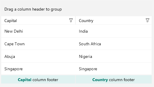
You can customize the content of the footer by using the `FooterContentTemplate`(`DataTemplate`) property.

Define the `DataTemplate` for the footer:

```XAML
<DataTemplate x:Key="CapitalColumnFooterTemplate">
    <telerik:RadBorder BackgroundColor="#E0F2F1"
                       BorderBrush="{Binding BorderBrush, Source={x:Reference dataGrid}}"
                       BorderThickness="1"
                       HeightRequest="30">
        <Label HorizontalOptions="Center" VerticalOptions="Center">
            <Label.FormattedText>
                <FormattedString>
                    <Span Text="Capital" TextColor="#00796B" FontAttributes="Bold" />
                    <Span Text=" column footer" />
                </FormattedString>
            </Label.FormattedText>
        </Label>
    </telerik:RadBorder>
</DataTemplate>
<DataTemplate x:Key="CountryColumnFooterTemplate">
    <telerik:RadBorder BackgroundColor="#E0F2F1"
                       BorderBrush="{Binding BorderBrush, Source={x:Reference dataGrid}}"
                       BorderThickness="1"
                       HeightRequest="30">
        <Label HorizontalOptions="Center" VerticalOptions="Center">
            <Label.FormattedText>
                <FormattedString>
                    <Span Text="Country" TextColor="#00796B" FontAttributes="Bold" />
                    <Span Text=" column footer" />
                </FormattedString>
            </Label.FormattedText>
        </Label>
    </telerik:RadBorder>
</DataTemplate>
```

Define the `FooterContentTemplate` in the `DataGridColumn`:

```XAML
<telerik:RadDataGrid x:Name="dataGrid"
                     ShowColumnFooters="True"
                     AutoGenerateColumns="False"
                     BorderBrush="{OnPlatform WinUI=#F1F1F1}"
                     BorderThickness="{OnPlatform Default=1, Android=0}">
    <telerik:RadDataGrid.Columns>
        <telerik:DataGridTextColumn PropertyName="Capital"
                                    HeaderStyle="{StaticResource CustomColumnHeaderStyle}"
                                    HeaderContentTemplate="{StaticResource CapitalColumnHeaderTemplate}"
                                    FooterContentTemplate="{StaticResource CapitalColumnFooterTemplate}" />
        <telerik:DataGridTextColumn PropertyName="Country"
                                    HeaderStyle="{StaticResource CustomColumnHeaderStyle}"
                                    HeaderContentTemplate="{StaticResource CountryColumnHeaderTemplate}"
                                    FooterContentTemplate="{StaticResource CountryColumnFooterTemplate}" />
    </telerik:RadDataGrid.Columns>
</telerik:RadDataGrid>
```

The following image shows the end result:
![.NET MAUI DataGrid showing a customized column footer content template](https://www.telerik.com/maui-ui/documentation/assets/0f3a8b7b2a1bf61f339b55cd20105889/footer-content-template.png)

## See Also

* [Text Column](https://www.telerik.com/maui-ui/documentation/controls/datagrid/columns/column-types/text-column)
* [Picker Column](https://www.telerik.com/maui-ui/documentation/controls/datagrid/columns/column-types/combobox-column)
* [Template Column](https://www.telerik.com/maui-ui/documentation/controls/datagrid/columns/column-types/template-column)
