# .NET MAUI CircularSlider Labels
The CircularSlider for .NET MAUI can show labels along the backtrack. This helps users to better understand the underlying range of values.
## Labels Step and Placement
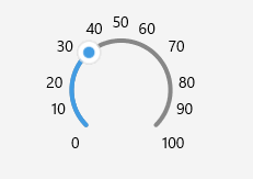
To display labels, define the `LabelStep` and `LabelsPlacement` properties of the CircularSlider.
* `LabelStep` (`double`)—Defines the values on the backtrack that are indicated by labels. Each label is placed at the specified value interval. For example, if `LabelStep="5"`, your labels show the 0, 5, 10, 15, and 20 values on a 0-20 backtrack.
* `LabelsPlacement` (`Telerik.Maui.Controls.RangeSlider.SliderLabelsPlacement`)—Defines where the labels are displayed relative to the position of the backtrack. The available options are:
* `None`—No labels are displayed.
* `Start`—The labels appear on the inner side of the arc.
* `End`—The labels appear on the outer side of the arc.
Check an example on how you can configure labels:
```XAML
```
This is the result:
> For a runnable example demonstrating the CircularSlider labels settings, see the [SDKBrowser Demo Application](https://www.telerik.com/maui-ui/documentation/demos-and-sample-apps/sdkbrowser-app) and go to the **CircularSlider > Labels** category.
## Full Circle Label Display Mode
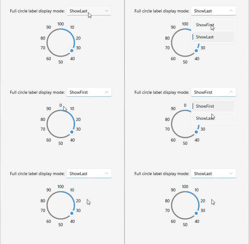
When the CircularSlider forms a full circle, the first (minimum) and last (maximum) value labels overlap at the same position. Use the `FullCircleLabelDisplayMode` property to control which label is shown at that overlap point.
* `FullCircleLabelDisplayMode` (`Telerik.Maui.Controls.CircularSlider.CircularSliderFullCircleLabelDisplayMode`)—Defines which label is shown at the overlap point when the slider is a full circle. The available options are:
* `ShowFirst`—The first (minimum) value label is shown at the overlap point. This is the default value.
* `ShowLast`—The last (maximum) value label is shown at the overlap point.
```XAML
```
This is the result:
> For a runnable example demonstrating the CircularSlider full circle label display mode, see the [SDKBrowser Demo Application](https://www.telerik.com/maui-ui/documentation/demos-and-sample-apps/sdkbrowser-app) and go to the **CircularSlider > Labels** category.
## Labels Formatting
You can use the formatting properties to modify the text of the labels.
* `StringFormat` (`string`)—Defines a custom string format for the labels of the CircularSlider.
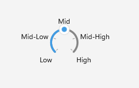
* `StringConverter` (`Telerik.Maui.IStringConverter`)—Defines a custom string converter. You can use the string converter to replace the range values with more user-friendly names in your CircularSlider labels.
Here is a quick example with a custom string converter:
1. Add the following sample Dictionary String Converter to your resources. It replaces the values of the range with meaningful names to make the range more readable:
```XAML
```
2. Apply the converter to the CircularSlider:
```XAML
```
3. Add the `telerik` namespace:
```XAML
xmlns:telerik="http://schemas.telerik.com/2022/xaml/maui"
```
This is the result:
> For a runnable example demonstrating the CircularSlider labels string converter, see the [SDKBrowser Demo Application](https://www.telerik.com/maui-ui/documentation/demos-and-sample-apps/sdkbrowser-app) and go to the **CircularSlider > Labels** category.
## Label Template
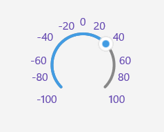
You can use the `LabelTemplate` property to customize how the CircularSlider labels render.
* `LabelTemplate` (`DataTemplate`)—Defines the template of the CircularSlider labels.
Check below a sample `LabelTemplate` example:
1. Add the custom `DataTemplate` to your page resources:
```XAML
```
2. Apply it to the CircularSlider's `LabelTemplate`:
```XAML
```
This is the result:
> For a runnable example demonstrating the CircularSlider labels template, see the [SDKBrowser Demo Application](https://www.telerik.com/maui-ui/documentation/demos-and-sample-apps/sdkbrowser-app) and go to the **CircularSlider > Labels** category.
## See Also
* [Ticks](https://www.telerik.com/maui-ui/documentation/controls/circularslider/ticks)
* [Tooltips](https://www.telerik.com/maui-ui/documentation/controls/circularslider/tooltips)
* [Labels Styling](https://www.telerik.com/maui-ui/documentation/controls/circularslider/styling/labels-styling)