# .NET MAUI Carousel Styling

The Carousel wraps each item in a `RadCarouselItemView` container. `RadCarouselItemView` derives from `RadBorder`, so you can style properties such as `BackgroundColor`, `BorderColor`, `BorderThickness`, `CornerRadius`, and `Padding`.

## Carousel Styling Properties

To style the item containers, use the following properties of the `RadCarousel`:

* `ItemViewStyle` (`Style` with target type `RadCarouselItemView`)—Specifies the style applied to each item container.
* `ItemViewStyleSelector` (`IStyleSelector`)—Specifies a selector that chooses a style for each item container. When the selector returns `null`, the Carousel uses the `ItemViewStyle`.

## Visual States of the Item Container

The `RadCarouselItemView` supports visual states in the `CommonStates` visual state group, such as `Normal`, `Highlighted`, `Previous`, `Next`, and their `MouseOver` and `Pressed` variants. For the full list, see the [Carousel Visual States](https://www.telerik.com/maui-ui/documentation/controls/carousel/visual-states) article.

In addition, the `RadCarouselItemView` exposes the following read-only properties that indicate the current state of the item container:

* `IsHighlighted` (`bool`)—Indicates whether the item is the highlighted item of the Carousel.
* `IsPressed` (`bool`)—Indicates whether the user is currently pressing the item.
* `IsMouseOver` (`bool`)—Indicates whether the mouse pointer is over the item.

## Apply a Custom Item View Style

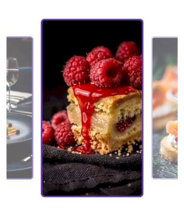
The following example sets rounded borders and a custom background to all item containers and changes the colors of the highlighted item.

1. Add the style to the page resources:

   ```XAML
   <Style x:Key="CarouselItemViewStyle" TargetType="telerik:RadCarouselItemView">
       <Setter Property="CornerRadius" Value="8" />
       <Setter Property="BorderThickness" Value="3" />
       <Setter Property="BorderColor" Value="#B39DDB" />
       <Setter Property="BackgroundColor" Value="#EDE7F6" />
       <Setter Property="VisualStateManager.VisualStateGroups">
           <VisualStateGroupList>
               <VisualStateGroup x:Name="CommonStates">
                   <VisualState x:Name="Normal" />
                   <VisualState x:Name="Highlighted">
                       <VisualState.Setters>
                           <Setter Property="BorderColor" Value="#673AB7" />
                           <Setter Property="BackgroundColor" Value="#D1C4E9" />
                           <Setter Property="BorderThickness" Value="3" />
                       </VisualState.Setters>
                   </VisualState>
               </VisualStateGroup>
           </VisualStateGroupList>
       </Setter>
   </Style>
   ```

2. Apply the style to the Carousel:

   ```XAML
   <Grid MaximumHeightRequest="{OnPlatform Android=400, iOS=400, MacCatalyst=550, WinUI=550}">
       <telerik:RadCarousel ItemsSource="{Binding Items}"
                            ItemViewStyle="{StaticResource CarouselItemViewStyle}"
                            VerticalOptions="Start"
                            Margin="0, 24, 0, 0">
           <telerik:RadCarousel.ItemTemplate>
               <DataTemplate x:DataType="local:CarouselItem">
                   <Image Source="{Binding Image}" Aspect="AspectFill"/>
               </DataTemplate>
           </telerik:RadCarousel.ItemTemplate>
       </telerik:RadCarousel>
   ```

3. Add the `telerik` namespace:

   ```XAML
   xmlns:telerik="http://schemas.telerik.com/2022/xaml/maui"
   ```

4. Add the business object:

   ```C#
   public class CarouselItem
   {
       public string Title { get; set; }

       public string Description { get; set; }

       public string Image { get; set; }

       public bool IsNewDish { get; set; }
   }
   ```

5. Define the `ViewModel`:

   ```C#
   public class CarouselViewModel
   {
       public ObservableCollection<CarouselItem> Items { get; } = new()
       {
           new CarouselItem
           {
               Title = "Blueberry Pancakes",
               Description = "Dutch baby pancake with fresh blueberries, orange zest, and a drizzle of maple syrup.",
               Image = "carousel_firstlook_1.jpg",
               IsNewDish = true
           },
           new CarouselItem
           {
               Title = "Bolognese",
               Description = "Slow-simmered ragù with hand-pulled spaghetti, topped with micro herbs.",
               Image = "carousel_firstlook_2.jpg",
               IsNewDish = false
           },
           new CarouselItem
           {
               Title = "Spaghetti",
               Description = "Fresh spaghetti with San Marzano tomato sauce and garden basil.",
               Image = "carousel_firstlook_3.jpg",
               IsNewDish = false
           },
           new CarouselItem
           {
               Title = "Lemon Herb Chicken",
               Description = "Herb-crusted chicken with lemon butter sauce and roasted vegetables.",
               Image = "carousel_firstlook_4.jpg",
               IsNewDish = true
           },
           new CarouselItem
           {
               Title = "Fine Dining",
               Description = "Delicate tartare with edible flowers, micro greens, and golden carrot purée.",
               Image = "carousel_firstlook_5.jpg",
               IsNewDish = false
           },
           new CarouselItem
           {
               Title = "Raspberry Cake",
               Description = "Raspberry coulis over a rich cheesecake with fresh berries.",
               Image = "carousel_firstlook_6.jpg",
               IsNewDish = true
           },
           new CarouselItem
           {
               Title = "Salmon Canapues",
               Description = "Smoked salmon on crispy toasts with cream cheese and dill.",
               Image = "carousel_firstlook_7.jpg",
               IsNewDish = false
           },
           new CarouselItem
           {
               Title = "Shrimp Fettuccine",
               Description = "Tiger prawns tossed with fettuccine in a light garlic cream sauce.",
               Image = "carousel_firstlook_8.jpg",
               IsNewDish = true
           }
       };
   }
   ```

This is the result:
![.NET MAUI Carousel with a custom style applied to the item containers](https://www.telerik.com/maui-ui/documentation/assets/68f6e9657851a7df07de866335ce713c/carousel-styling.png)

> tip For a runnable example demonstrating the Carousel styling scenario, see the [SDKBrowser Demo Application](https://www.telerik.com/maui-ui/documentation/demos-and-sample-apps/sdkbrowser-app) and go to the **Carousel > Styling** category.

## Apply Styles with a Style Selector

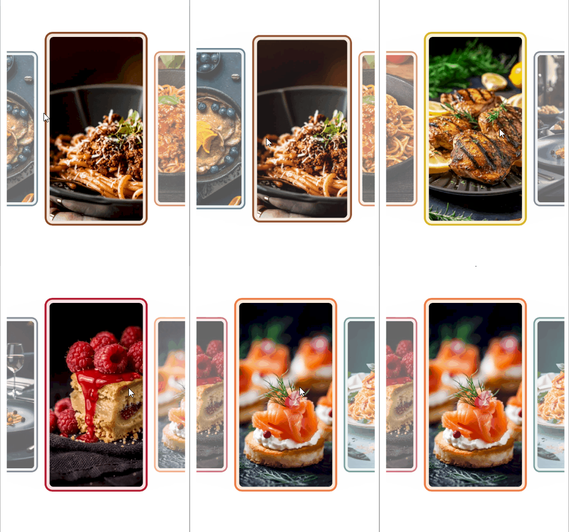
Use a style selector when different items need different styles, for example, to emphasize featured items.

1. Create a class that implements `IStyleSelector`:

   ```C#
   public class DishItemStyleSelector : IStyleSelector
   {
       public Style BlueberryPancakesStyle { get; set; }

       public Style BologneseStyle { get; set; }

       public Style SpaghettiStyle { get; set; }

       public Style LemonHerbChickenStyle { get; set; }

       public Style FineDiningStyle { get; set; }

       public Style RaspberryCakeStyle { get; set; }

       public Style SalmonCanapesStyle { get; set; }

       public Style ShrimpFettuccineStyle { get; set; }

       public Style SelectStyle(object item, BindableObject bindable)
       {
           return item switch
           {
               CarouselItem { Image: "carousel_firstlook_1.jpg" } => this.BlueberryPancakesStyle,
               CarouselItem { Image: "carousel_firstlook_2.jpg" } => this.BologneseStyle,
               CarouselItem { Image: "carousel_firstlook_3.jpg" } => this.SpaghettiStyle,
               CarouselItem { Image: "carousel_firstlook_4.jpg" } => this.LemonHerbChickenStyle,
               CarouselItem { Image: "carousel_firstlook_5.jpg" } => this.FineDiningStyle,
               CarouselItem { Image: "carousel_firstlook_6.jpg" } => this.RaspberryCakeStyle,
               CarouselItem { Image: "carousel_firstlook_7.jpg" } => this.SalmonCanapesStyle,
               CarouselItem { Image: "carousel_firstlook_8.jpg" } => this.ShrimpFettuccineStyle,
               _ => throw new ArgumentException("The item must have a supported carousel image.", nameof(item))
           };
       }
   }
   ```

2. Define the selector and its styles in the page resources:

   ```XAML
   <Style x:Key="DishItemStyle" TargetType="telerik:RadCarouselItemView">
       <Setter Property="CornerRadius" Value="16" />
       <Setter Property="Margin" Value="4" />
       <Setter Property="BorderThickness" Value="4" />
   </Style>
   <example:DishItemStyleSelector x:Key="DishItemStyleSelector">
       <example:DishItemStyleSelector.BlueberryPancakesStyle>
           <Style TargetType="telerik:RadCarouselItemView" BasedOn="{StaticResource DishItemStyle}">
               <Setter Property="BorderColor" Value="#24485C" />
               <Setter Property="BackgroundColor" Value="#E3ECF1" />
           </Style>
       </example:DishItemStyleSelector.BlueberryPancakesStyle>
       <example:DishItemStyleSelector.BologneseStyle>
           <Style TargetType="telerik:RadCarouselItemView" BasedOn="{StaticResource DishItemStyle}">
               <Setter Property="BorderColor" Value="#8B4A28" />
               <Setter Property="BackgroundColor" Value="#F3E6DC" />
           </Style>
       </example:DishItemStyleSelector.BologneseStyle>
       <example:DishItemStyleSelector.SpaghettiStyle>
           <Style TargetType="telerik:RadCarouselItemView" BasedOn="{StaticResource DishItemStyle}">
               <Setter Property="BorderColor" Value="#C45120" />
               <Setter Property="BackgroundColor" Value="#FBE8DC" />
           </Style>
       </example:DishItemStyleSelector.SpaghettiStyle>
       <example:DishItemStyleSelector.LemonHerbChickenStyle>
           <Style TargetType="telerik:RadCarouselItemView" BasedOn="{StaticResource DishItemStyle}">
               <Setter Property="BorderColor" Value="#D7B72C" />
               <Setter Property="BackgroundColor" Value="#FCF5D7" />
           </Style>
       </example:DishItemStyleSelector.LemonHerbChickenStyle>
       <example:DishItemStyleSelector.FineDiningStyle>
           <Style TargetType="telerik:RadCarouselItemView" BasedOn="{StaticResource DishItemStyle}">
               <Setter Property="BorderColor" Value="#354253" />
               <Setter Property="BackgroundColor" Value="#E6E9EE" />
           </Style>
       </example:DishItemStyleSelector.FineDiningStyle>
       <example:DishItemStyleSelector.RaspberryCakeStyle>
           <Style TargetType="telerik:RadCarouselItemView" BasedOn="{StaticResource DishItemStyle}">
               <Setter Property="BorderColor" Value="#B51F35" />
               <Setter Property="BackgroundColor" Value="#F9E1E5" />
           </Style>
       </example:DishItemStyleSelector.RaspberryCakeStyle>
       <example:DishItemStyleSelector.SalmonCanapesStyle>
           <Style TargetType="telerik:RadCarouselItemView" BasedOn="{StaticResource DishItemStyle}">
               <Setter Property="BorderColor" Value="#ED8048" />
               <Setter Property="BackgroundColor" Value="#FDEBDD" />
           </Style>
       </example:DishItemStyleSelector.SalmonCanapesStyle>
       <example:DishItemStyleSelector.ShrimpFettuccineStyle>
           <Style TargetType="telerik:RadCarouselItemView" BasedOn="{StaticResource DishItemStyle}">
               <Setter Property="BorderColor" Value="#23665D" />
               <Setter Property="BackgroundColor" Value="#E0EFEB" />
           </Style>
       </example:DishItemStyleSelector.ShrimpFettuccineStyle>
   </example:DishItemStyleSelector>
   ```

3. Assign the selector to the Carousel:

   ```XAML
   <Grid MaximumHeightRequest="{OnPlatform Android=400, iOS=400, MacCatalyst=550, WinUI=550}">
       <telerik:RadCarousel ItemsSource="{Binding Items}"
                            ItemViewStyleSelector="{StaticResource DishItemStyleSelector}"
                            ItemSpacing="6"
                            VerticalOptions="Start"
                            Margin="{OnPlatform MacCatalyst=24, WinUI=24}">
           <telerik:RadCarousel.ItemTemplate>
               <DataTemplate x:DataType="local:CarouselItem">
                   <Border StrokeThickness="0"
                           StrokeShape="RoundRectangle 8"
                           Margin="10">
                       <Image Source="{Binding Image}"
                              Aspect="AspectFill"/>
                   </Border>
               </DataTemplate>
           </telerik:RadCarousel.ItemTemplate>
       </telerik:RadCarousel>
   </Grid>
   ```

4. Add the business object:

   ```C#
   public class CarouselItem
   {
       public string Title { get; set; }

       public string Description { get; set; }

       public string Image { get; set; }

       public bool IsNewDish { get; set; }
   }
   ```

5. Define the `ViewModel`:

   ```C#
   public class CarouselViewModel
   {
       public ObservableCollection<CarouselItem> Items { get; } = new()
       {
           new CarouselItem
           {
               Title = "Blueberry Pancakes",
               Description = "Dutch baby pancake with fresh blueberries, orange zest, and a drizzle of maple syrup.",
               Image = "carousel_firstlook_1.jpg",
               IsNewDish = true
           },
           new CarouselItem
           {
               Title = "Bolognese",
               Description = "Slow-simmered ragù with hand-pulled spaghetti, topped with micro herbs.",
               Image = "carousel_firstlook_2.jpg",
               IsNewDish = false
           },
           new CarouselItem
           {
               Title = "Spaghetti",
               Description = "Fresh spaghetti with San Marzano tomato sauce and garden basil.",
               Image = "carousel_firstlook_3.jpg",
               IsNewDish = false
           },
           new CarouselItem
           {
               Title = "Lemon Herb Chicken",
               Description = "Herb-crusted chicken with lemon butter sauce and roasted vegetables.",
               Image = "carousel_firstlook_4.jpg",
               IsNewDish = true
           },
           new CarouselItem
           {
               Title = "Fine Dining",
               Description = "Delicate tartare with edible flowers, micro greens, and golden carrot purée.",
               Image = "carousel_firstlook_5.jpg",
               IsNewDish = false
           },
           new CarouselItem
           {
               Title = "Raspberry Cake",
               Description = "Raspberry coulis over a rich cheesecake with fresh berries.",
               Image = "carousel_firstlook_6.jpg",
               IsNewDish = true
           },
           new CarouselItem
           {
               Title = "Salmon Canapues",
               Description = "Smoked salmon on crispy toasts with cream cheese and dill.",
               Image = "carousel_firstlook_7.jpg",
               IsNewDish = false
           },
           new CarouselItem
           {
               Title = "Shrimp Fettuccine",
               Description = "Tiger prawns tossed with fettuccine in a light garlic cream sauce.",
               Image = "carousel_firstlook_8.jpg",
               IsNewDish = true
           }
       };
   }
   ```

This is the result:
![.NET MAUI Carousel with a style selector applied to each item containers](https://www.telerik.com/maui-ui/documentation/assets/3054fcdf9399011097f64acfc5c158d3/carousel-styling-selector.gif)

> tip For a runnable example demonstrating the Carousel style selector scenario, see the [SDKBrowser Demo Application](https://www.telerik.com/maui-ui/documentation/demos-and-sample-apps/sdkbrowser-app) and go to the **Carousel > Styling** category.

## See Also

* [Visual States](https://www.telerik.com/maui-ui/documentation/controls/carousel/visual-states)
* [Item Effects](https://www.telerik.com/maui-ui/documentation/controls/carousel/item-effects)
* [Highlighted Item](https://www.telerik.com/maui-ui/documentation/controls/carousel/highlighted-item)
