# .NET MAUI Calendar Year Styling
Calendar control for .NET MAUI provides the `YearStyleSelector`(of type `CalendarStyleSelector`) property which specifies the style selector for the years in the decade view of the calendar.
The following example demonstrates how to style the years with the `YearStyleSelector` property:
**1.** Define the Calendar:
```XAML
```
**2.** The style selectors defined in the page's resources:
```XAML
```
**3.** Add the `CustomStyleSelector` class that inherits from `CalendarStyleSelector`:
```C#
public class CustomCalendarStyleSelector : CalendarStyleSelector
{
private Style customNormalLabelStyle;
private Style customOutOfScopeLabelStyle;
private Style customSelectedLabelStyle;
private Style customSelectedMouseOverLabelStyle;
private Style sundayMouseOverLabelStyle;
private Style sundaySelectedLabelStyle;
private Style sundaySelectedMouseOverLabelStyle;
public override Style SelectStyle(object item, BindableObject container)
{
var node = (CalendarNode)item;
var calendar = (RadCalendar)node.Calendar;
bool isToday = node.IsToday;
bool isSunday = calendar.DisplayMode == CalendarDisplayMode.Month && node.Date.Value.DayOfWeek == DayOfWeek.Sunday;
bool isMouseOver = node.IsMouseOver;
if (node.IsSelected)
{
return isMouseOver
? isSunday ? this.SundaySelectedMouseOverLabelStyle : this.CustomSelectedMouseOverLabelStyle
: isSunday ? this.SundaySelectedLabelStyle : this.CustomSelectedLabelStyle;
}
if (isMouseOver)
{
return isSunday ? this.SundayMouseOverLabelStyle : base.SelectStyle(item, container);
}
if (isToday || !node.IsEnabled)
{
return base.SelectStyle(item, container);
}
if (node.IsOutOfScope)
{
return this.CustomOutOfScopeLabelStyle;
}
return isSunday ? this.SundayLabelStyle : this.CustomNormalLabelStyle;
}
public Style CustomNormalLabelStyle
{
get => customNormalLabelStyle;
set
{
customNormalLabelStyle = value;
customNormalLabelStyle.BasedOn = this.NormalLabelStyle;
}
}
public Style CustomOutOfScopeLabelStyle
{
get => customOutOfScopeLabelStyle;
set
{
customOutOfScopeLabelStyle = value;
customOutOfScopeLabelStyle.BasedOn = this.OutOfScopeLabelStyle;
}
}
public Style CustomSelectedLabelStyle
{
get => customSelectedLabelStyle;
set
{
customSelectedLabelStyle = value;
customSelectedLabelStyle.BasedOn = this.SelectedBorderStyle;
}
}
public Style CustomSelectedMouseOverLabelStyle
{
get => customSelectedMouseOverLabelStyle;
set
{
customSelectedMouseOverLabelStyle = value;
customSelectedMouseOverLabelStyle.BasedOn = this.CustomSelectedLabelStyle;
}
}
public Style SundayLabelStyle { get; set; }
public Style SundayMouseOverLabelStyle
{
get => sundayMouseOverLabelStyle;
set
{
sundayMouseOverLabelStyle = value;
sundayMouseOverLabelStyle.BasedOn = this.SundayLabelStyle;
}
}
public Style SundaySelectedLabelStyle
{
get => sundaySelectedLabelStyle;
set
{
sundaySelectedLabelStyle = value;
sundaySelectedLabelStyle.BasedOn = this.SundayLabelStyle;
}
}
public Style SundaySelectedMouseOverLabelStyle
{
get => sundaySelectedMouseOverLabelStyle;
set
{
sundaySelectedMouseOverLabelStyle = value;
sundaySelectedMouseOverLabelStyle.BasedOn = this.SundayMouseOverLabelStyle;
}
}
}
```
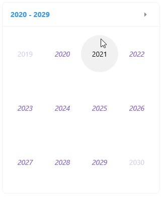
> For a runnable example demonstrating how to style the years in the Calendar, see the [SDKBrowser Demo Application](https://www.telerik.com/maui-ui/documentation/demos-and-sample-apps/sdkbrowser-app) and go to **Calendar > Style Selector**.
## See Also
* [Day Styling](https://www.telerik.com/maui-ui/documentation/controls/calendar/styling/day-styling)
* [Decade Styling](https://www.telerik.com/maui-ui/documentation/controls/calendar/styling/decade-styling)
* [Header Styling](https://www.telerik.com/maui-ui/documentation/controls/calendar/styling/header-styling)
* [Month Styling](https://www.telerik.com/maui-ui/documentation/controls/calendar/styling/month-styling)