# .NET MAUI Calendar Header Styling
The .NET MAUI Calendar component comes with built-in styling options that allow you to customize the appearance of its header.
## Styling the Header Border and Label
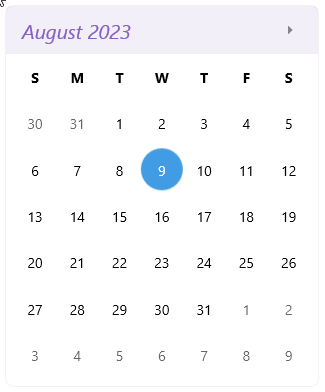
* To style the border around the Calendar header, use the `HeaderBorderStyle`(of type `Style` with target type `telerik:RadBorder`).
* To style the label in the header, use the `HeaderLabelStyle`(of type `Style` with target type `Label`).
The following example demonstrates how to apply custom styles to the header label and the border around the header:
**1.** Define the Calendar:
```XAML
```
**2.** Add the `HeaderBorderStyle` style:
```XAML
```
**3.** Add the `HeaderLabelStyle` style:
```XAML
```
> For a runnable example that demonstrates how to style the Calendar header buttons, see the [SDKBrowser Demo Application](https://www.telerik.com/maui-ui/documentation/demos-and-sample-apps/sdkbrowser-app) and go to **Calendar > Styling**.
## Styling the Navigation Buttons
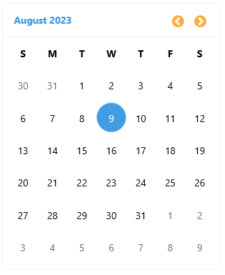
To style the navigation buttons in the header of the Calendar, use the following properties:
* `NavigateToPreviousViewButtonStyle`(of type `Style` with target type `Button`)—Specifies the style for the button in the header that navigates to the previous view.
* `NavigateToNextViewButtonStyle`(of type `Style` with target type `Button`)—Specifies the style for the button in the header that navigates to the next view.
The following example demonstrates how to apply custom styles to the navigation buttons:
**1.** Define the Calendar:
```XAML
```
**2.** Add the `NavigateToPreviousViewButtonStyle` style:
```XAML
```
**3.** Add the `NavigateToNextViewButtonStyle` style:
> For a runnable example that demonstrates how to style the Calendar header buttons, see the [SDKBrowser Demo Application](https://www.telerik.com/maui-ui/documentation/demos-and-sample-apps/sdkbrowser-app) and go to **Calendar > Styling**.
## See Also
* [Day Styling](https://www.telerik.com/maui-ui/documentation/controls/calendar/styling/day-styling)
* [Decade Styling](https://www.telerik.com/maui-ui/documentation/controls/calendar/styling/decade-styling)
* [Month Styling](https://www.telerik.com/maui-ui/documentation/controls/calendar/styling/month-styling)
* [Year Styling](https://www.telerik.com/maui-ui/documentation/controls/calendar/styling/year-styling)