# .NET MAUI Button Content Configuration
The Button control provides configuration options that let you align its content, add images, and adjust the fonts.
## Setting an Image
Use the following properties to add images to the button:
* `BackgroundImage` (`Microsoft.Maui.Controls.ImageSource`)—Defines an image as a background of the button.
* `ImageSource` (`Microsoft.Maui.Controls.ImageSource`)—Defines an image as a part of the button's content.
Use the `ContentLayout` (`Microsoft.Maui.Controls.ButtonContentLayout`) property to control the position of the image and the spacing between the button's image and text.
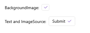
The following XAML shows how to apply an image as a background of the button by using the `BackgroundImage` property.
```XAML
```
The following XAML shows how to apply an image as part of the button content by using the `ImageSource` property.
```XAML
```
This is the end result:
> For a runnable example with the Button Images scenario, see the [SDKBrowser Demo Application](https://www.telerik.com/maui-ui/documentation/demos-and-sample-apps/sdkbrowser-app) and go to **Button > Features**.
## Content Alignment
Use the following properties to align the content in the button when text and [image](https://www.telerik.com/maui-ui/documentation/controls/button/configuration#setting-an-image) are set.
* `HorizontalContentAlignment` (`Microsoft.Maui.TextAlignment`)—Specifies the horizontal alignment of the text and image.
* `VerticalContentAlignment` (`Microsoft.Maui.TextAlignment`)—Specifies the vertical alignment of the text and image.
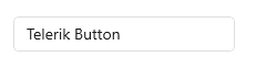
The following example demonstrates how to apply the `HorizontalContentAlignment` and the `VerticalContentAlignment`.
**1.** Define the Button in XAML:
```XAML
```
**2.** Add the `telerik` namespace:
```XAML
xmlns:telerik="http://schemas.telerik.com/2022/xaml/maui"
```
The following image shows the end result.
> For a runnable example with the Button Content Alignment scenario, see the [SDKBrowser Demo Application](https://www.telerik.com/maui-ui/documentation/demos-and-sample-apps/sdkbrowser-app) and go to **Button > Features**.
## Font Options
The following properties specify the font options for the `Button.Text`:
* `FontFamily` (`string`)—Specifies the font family of the `Button.Text`.
* `FontSize` (`double`)—Specifies the font size of the `Button.Text` in pixels.
* `FontAttributes` (`Microsoft.Maui.Controls.FontAttributes`)—Specifies the font attributes of the `Button.Text`.
## See Also
* [Styling the Button](https://www.telerik.com/maui-ui/documentation/controls/button/styling)
* [Creating a Circular Button](https://www.telerik.com/maui-ui/documentation/knowledge-base/button-howto-create-circle-button)