# .NET MAUI BusyIndicator Content

This article explains the content options of the BusyIndicator when the control is and isn't in a busy state.

When the control is not busy you can display a content using the `Content`(`View`) property.

```XAML
<telerik:RadBusyIndicator x:Name="BusyIndicator"
                                    AnimationContentHeightRequest="100"
                                    AnimationContentWidthRequest="100"
                                    AnimationContentColor="#674bb2"
                                    AutomationId="busyIndicator"
                                    IsBusy="True">
    <telerik:RadBusyIndicator.Content>
        <Label Text="This is the content of the RadBusyIndicator control displayed when the indicator is not busy." TextColor="Black" />
    </telerik:RadBusyIndicator.Content>
</telerik:RadBusyIndicator>
```

The `ContentUnderOpacity`(`double`)—Defines the opacity when the indicator is busy. the content behind the indicator is visible. The default value is `0`.

```XAML
<telerik:RadBusyIndicator x:Name="BusyIndicator" ContentUnderOpacity="0.4">
   <telerik:RadBusyIndicator.Content>
      <Label Text="This is the content of the RadBusyIndicator control displayed when the indicator is not busy." TextColor="Black" />
   </telerik:RadBusyIndicator.Content>
</telerik:RadBusyIndicator>
```

## Busy Content

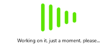
Setting the `BusyContent` property of BusyIndicator allows you to display any content together with the built-in animations while the control is in its Busy state.

### Custom Busy Content

You can customize the `BusyContentTemplate` to arrange the custom content and the animated content per your choice.

The following example demonstrates how to customize the busy content.

**1.** Apply the `BusyContent` and `BusyContentTemplate` properties.

```XAML
<telerik:RadBusyIndicator x:Name="BusyIndicator"
						  AnimationContentHeightRequest="100"
						  AnimationContentWidthRequest="100"  
						  AnimationType="Animation6"                                            
						  IsBusy="True">           
    <telerik:RadBusyIndicator.BusyContent>
        <Label Text="Working on it, just a moment, please..." />
    </telerik:RadBusyIndicator.BusyContent>
    <telerik:RadBusyIndicator.BusyContentTemplate>
        <ControlTemplate>
            <Grid>
                <Grid.RowDefinitions>
                    <RowDefinition Height="Auto" />
                    <RowDefinition Height="Auto" />
                    <RowDefinition Height="*" />
                </Grid.RowDefinitions>
                <ContentPresenter Content="{TemplateBinding Path=AnimationContent}" />
                <ContentPresenter Grid.Row="1"
                                  Content="{TemplateBinding Path=BusyContent}"
                                  HorizontalOptions="Center" />
            </Grid>
        </ControlTemplate>
    </telerik:RadBusyIndicator.BusyContentTemplate>
</telerik:RadBusyIndicator>
```

**2.** Add the `telerik` namespace:

```XAML
xmlns:telerik="http://schemas.telerik.com/2022/xaml/maui"
```

The following image shows the result.
![Telerik UI for .NET MAUI BusyIndicator showing a custom bounce pulse animation and Working on it message](https://www.telerik.com/maui-ui/documentation/assets/16b150c3e4d2c43d6deeb5116c2f4c06/busyindicator-custombusycontent.png)

## See Also

* [BusyIndicator Animations](https://www.telerik.com/maui-ui/documentation/controls/busyindicator/animations)
* [Adding an Image Inside the BusyIndicator for .NET MAUI](https://www.telerik.com/maui-ui/documentation/knowledge-base/add-image-inside-busyindicator-dotnet-maui)
