# Animations in .NET MAUI BusyIndicator
The BusyIndicator provides options for controlling the size and color of its built-in animations and enables you to define custom animations.
## Built-in Animations
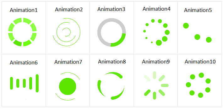
To change the selected animation of the BusyIndicator, use its `AnimationType` property. `AnimationType` is an enum that accepts values from `Animation1` to `Animation10`. By default, `AnimationType` is `Animation1`.
> important The animation will be displayed only when the `IsBusy` property is `True`.
### Controlling Size and Color
To change the size and color of the animated element (animation content), use the following properties:
* `AnimationContentWidthRequest` and `AnimationContentHeightRequest`—Define the animation size.
* `AnimationContentColor`—Customizes the color of the built-in animation.
> important `AnimationContentWidthRequest`, `AnimationContentHeightRequest`, and `AnimationContentColor` won't be applied if you use custom animations.
By default, the size of the animation content is `25x25` pixels.
The snippet below shows how to configure the predefined BusyIndicator animations.
```XAML
```
The image below shows the modified BusyIndicator in its busy state.

## Custom Animation
To create a custom animation, use a combination of the `AnimationType`, `BusyContent`, and `Animations` properties:
1. To indicate to the control that you use a custom animation, set the `AnimationType` to `Custom`.
2. Add the content that you want to animate to `BusyContent`.
3. The custom animation is added to the `Animations` collection of the BusyIndicator.
The `Animations`(Collection of type `RadAnimation`)—Used when the `AnimationType` of the BusyIndicator control is `Custom`.
The following example demonstrates how to create a custom animation that changes the opacity of a text (blinking effect) in XAML and in C#.
```XAML
```
```C#
RadDoubleAnimation annimation = new RadDoubleAnimation() { Duration = 800, From = 0.1, To = 1, PropertyPath = "Opacity", Target = radBusyIndicator.BusyContent, RepeatForever = true, AutoReverse = true };
this.radBusyIndicator.Animations.Add(annimation);
Application.Current.Windows[0].Page.Dispatcher.StartTimer(TimeSpan.FromMilliseconds(5000),
() =>
{
this.radBusyIndicator.IsBusy = false;
return false;
});
```
## See Also
* [Custom Busy Content](https://www.telerik.com/maui-ui/documentation/controls/busyindicator/content)
* [Adding an Image Inside the BusyIndicator for .NET MAUI](https://www.telerik.com/maui-ui/documentation/knowledge-base/add-image-inside-busyindicator-dotnet-maui)