# Customizations in .NET MAUI BadgeView

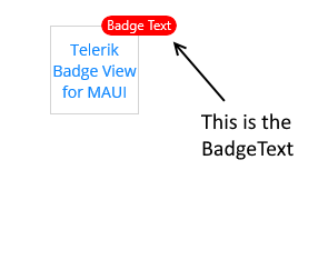
If you don't want to use a [predefined Badge type](https://www.telerik.com/maui-ui/documentation/controls/badgeview/predefined-badges) and need to customize the text inside the Badge indicator, use the `BadgeText`(`string`) property.

```XAML
<telerik:RadBadgeView BadgeText="Badge Text">
    <telerik:RadBadgeView.Content>
        <telerik:RadBorder WidthRequest="80"
                                     HeightRequest="80"
                                     BorderThickness="1"
                                     BorderColor="LightGray">
            <Label Text="Telerik Badge View for MAUI"
                   FontSize="14"
                   VerticalTextAlignment="Center"
                   HorizontalTextAlignment="Center"/>
        </telerik:RadBorder>
    </telerik:RadBadgeView.Content>
</telerik:RadBadgeView>
```

The following image shows the final result.
![Telerik UI for .NET MAUI BadgeView showing custom BadgeText above a labeled content panel](https://www.telerik.com/maui-ui/documentation/assets/1a0736d53cfb131cf657be2da2783144/badgeview-badgetext.png)

## ControlTemplate

The BadgeView supports a default `ControlTemplate` which you can customize.

> important To override the default control template, you need to set an implicit style with `TargetType="telerik:Badge"`.

### Use the Default ControlTemplate

To use the default `ControlTemplate`:

**1.** Set the default `ControlTemplate` in the page resources:

```XAML
<Style TargetType="telerik:Badge">
    <Setter Property="ControlTemplate">
        <Setter.Value>
            <ControlTemplate>
                
                <telerik:RadBorder BorderThickness="{TemplateBinding BorderThickness}"
                                   BorderColor="{TemplateBinding BorderColor}"
                                   CornerRadius="{TemplateBinding CornerRadius}"
                                   BackgroundColor="{TemplateBinding BackgroundColor}"
                                   MinimumHeightRequest="{TemplateBinding MinimumHeightRequest}"
                                   MinimumWidthRequest="{TemplateBinding MinimumWidthRequest}">
                    <Label x:Name="PART_BadgeContent"
                           Text="{TemplateBinding Text}" 
                           TextColor="{TemplateBinding TextColor}"
                           Margin="{TemplateBinding TextMargin}"
                           FontSize="{TemplateBinding FontSize}"
                           FontFamily="{TemplateBinding FontFamily}"
                           FontAttributes="{TemplateBinding FontAttributes}"
                           HorizontalTextAlignment="Center"
                           VerticalTextAlignment="Center" />
                </telerik:RadBorder>
            </ControlTemplate>
        </Setter.Value>
    </Setter>
</Style>
```

**2.** The following snippet shows the BadgeView definition in XAML:

```XAML
<telerik:RadBadgeView VerticalOptions="Start"
                                HorizontalOptions="Start">
    <telerik:RadBadgeView.Content>
        <BoxView BackgroundColor="LightGray"
                 VerticalOptions="Center"
                 WidthRequest="80"
                 HeightRequest="80"
                 HorizontalOptions="Center"/>
    </telerik:RadBadgeView.Content>
</telerik:RadBadgeView>
```

**3.** Add the `telerik` namespace:

```XAML
xmlns:telerik="http://schemas.telerik.com/2022/xaml/maui"
```

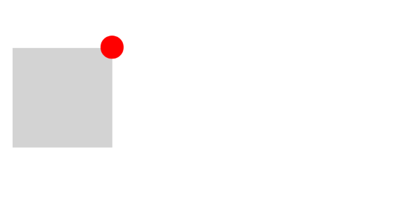
The following image shows the final result.
![Telerik UI for .NET MAUI BadgeView using the default control template with a red badge on a gray content area](https://www.telerik.com/maui-ui/documentation/assets/1a6eb05844de9970fe522f9b2e35bac5/badgeview-default-controltemplate.png)

### Use a Custom ControlTemplate

To customize the `ControlTemplate`:

**1.** Define the custom `ControlTemplate` in the page resources:

```XAML
<Style TargetType="telerik:Badge">
    <Setter Property="ControlTemplate">
        <Setter.Value>
            <ControlTemplate>
                
                <telerik:RadBorder HeightRequest="30"
                                   WidthRequest="60"
                                   BackgroundColor="#0DA6FF"
                                   CornerRadius="15">
                    <Grid ColumnDefinitions="Auto, Auto" 
                          ColumnSpacing="0"
                          HorizontalOptions="Center">
                        <Label Text="&#xE809;"
                               TextColor="White"
                               VerticalOptions="Center"
                               FontFamily="TelerikFont"/>
                        <Label Text="234"
                               VerticalOptions="Center"
                               Grid.Column="1"
                               TextColor="White"/>
                    </Grid>
                </telerik:RadBorder>
            </ControlTemplate>
        </Setter.Value>
    </Setter>
</Style>
```

**2.** The following snippet shows the BadgeView definition in XAML:

```XAML
<telerik:RadBadgeView VerticalOptions="Start"
                                HorizontalOptions="Start">
    <telerik:RadBadgeView.Content>
        <BoxView BackgroundColor="LightGray"
                 VerticalOptions="Center"
                 HorizontalOptions="Center"
                 WidthRequest="80"
                 HeightRequest="80"/>
    </telerik:RadBadgeView.Content>
</telerik:RadBadgeView>
```

**3.** Add the following namespace:

```XAML
xmlns:telerik="http://schemas.telerik.com/2022/xaml/maui"
```

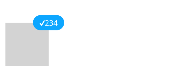
The following image shows the final result.
![Telerik UI for .NET MAUI BadgeView using a custom control template for the badge](https://www.telerik.com/maui-ui/documentation/assets/acd9c6952f5896754c458db11eed5018/badgeview-custom-controltemplate.png)

> For a runnable example with the BadgeView ControlTemplate scenario, see the [SDKBrowser Demo Application](https://www.telerik.com/maui-ui/documentation/demos-and-sample-apps/sdkbrowser-app) and go to **BadgeView > Features**.

## See Also

* [Badge Position and Alignment](https://www.telerik.com/maui-ui/documentation/controls/badgeview/position-alignment)
* [Badge Animation](https://www.telerik.com/maui-ui/documentation/controls/badgeview/animation)
* [Badge Types](https://www.telerik.com/maui-ui/documentation/controls/badgeview/predefined-badges)
