# Configure the .NET MAUI BadgeView
This article demonstrates the main configuration options of the Telerik UI for .NET MAUI BadgeView control.
## Content
The BadgeView exposes the `Content`(of type `Microsoft.Maui.Controls.View`) property, which defines its content. The Badge marker/indicator is positioned based on the content inside the BadgeView.
> important You are required to define content for the BadgeView by setting its `Content` property. Otherwise, the control will not be visualized.
```XAML
```
### Example
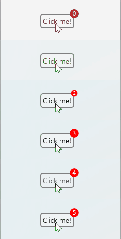
The example demonstrates how to set the content of the BadgeView and features a Button inside the `Content`. The `BadgeText` will be updated on a `ButtonClick`.
```XAML
```
The following snippet demonstrates the code behind with the button click implementation:
```C#
public partial class BadgeViewContent : RadContentView
{
private int badgeCounter = 0;
public BadgeViewContent()
{
InitializeComponent();
}
private void Button_Clicked(object sender, EventArgs e)
{
badgeCounter++;
badgeView.BadgeText = badgeCounter.ToString();
}
}
```
The following image shows the final result.
## Badge Text
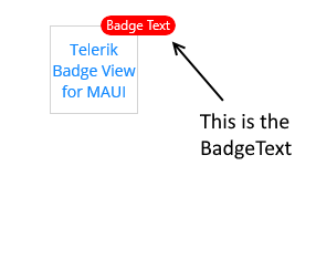
To define some text in the BadgeView, set the `BadgeText` property(`string`). The text will be displayed in the Badge indicator.
```XAML
```
The following image shows the final result.
> tip You can customize the look and feel of the BadgeView. For detailed information, refer to the articles on [BadgeView styling](https://www.telerik.com/maui-ui/documentation/controls/badgeview/styling) and [customization](https://www.telerik.com/maui-ui/documentation/controls/badgeview/customization).
## Badge Visibility
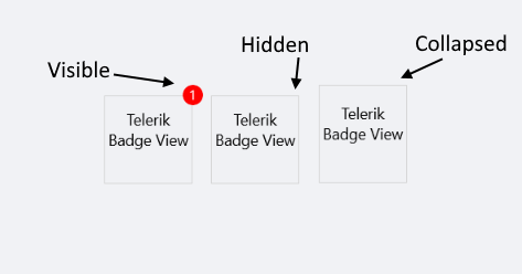
To change the visibility state of the Badge indicator, use the `BadgeVisibility` property (enum of type `Microsoft.Maui.Visibility`).
The following options are supported:
* (Default) `Visible`—The Badge marker/indicator is visualized.
* `Hidden`—The Badge marker/indicator is hidden.
* `Collapsed`—The Badge marker/indicator is collapsed.
### Example
The following example demonstrates how to hide the `BadgeVisibility` state.
```XAML
```
The following image shows the final result.
## Padding
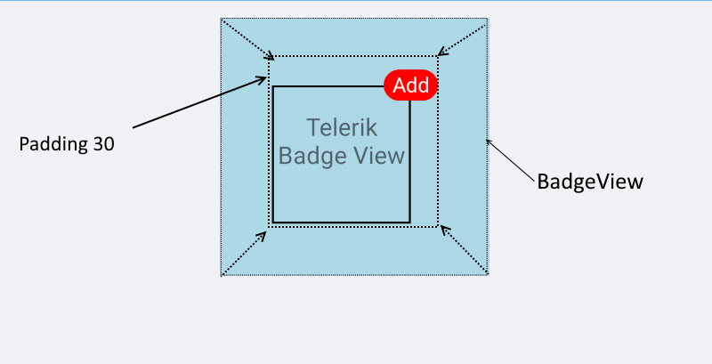
The BadgeView provides the `Padding`(`Microsoft.Maui.Controls.Compatibility`) property, which defines its inner padding.
```XAML
```
The following image shows the result.
## See Also
* [Badge Position and Alignment](https://www.telerik.com/maui-ui/documentation/controls/badgeview/position-alignment)
* [Badge Animation](https://www.telerik.com/maui-ui/documentation/controls/badgeview/animation)
* [Badge Types](https://www.telerik.com/maui-ui/documentation/controls/badgeview/predefined-badges)
* [Badge Styling](https://www.telerik.com/maui-ui/documentation/controls/badgeview/styling)
* [Badge Customization](https://www.telerik.com/maui-ui/documentation/controls/badgeview/customization)