
KendoReact
React Toolbar
- Enable users to easily access and manage content within your React app.
- Part of the KendoReact library along with 100+ professionally-designed components.
- Includes support, documentation, demos, virtual classrooms, learning resources and more!
-
Easily Add a Toolbar to Your React Apps
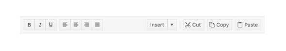
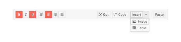
The React Toolbar component provides an intuitive component akin to the minimal toolbars found within traditional desktop applications like Word and Excel. Beyond containing simple buttons for interactions, the KendoReact Toolbar component has a range of buttons and organizational options to help arrange the tools appropriately.
-
Tools
Within the KendoReact Toolbar, the Tools can be rendered as a Button, ButtonGroup, DropDownButton and SplitButtons. Of course, custom buttons can also be added. This flexibility allows the Toolbar to fit any integration scenarios that needs to display and organize actionable buttons in a specific way.
-
Globalization
The KendoReact Button supports being rendered in a right-to-left mode, allowing for the Button to be used in any globalization or localization scenarios.

-
Keyboard Navigation
With built-in support for keyboard navigation, the React Toolbar can be navigated through using just the keyboard as the method of interaction.
-
Accessibility
The KendoReact Toolbar is fully accessible, rated AAA with WCAG 2.0 and sporting compliance with both Section 508 and WAI-ARIA standards.

