
KendoReact
React RadioButtonGroup
- Add two or more radio buttons in a list of options that automatically apply the design of your application's theme.
- Part of the KendoReact library along with 100+ professionally-designed components.
- Includes support, documentation, demos, virtual classrooms, learning resources and more!
-
Customizable React Radio Button
The KendoReact RadioButtonGroup is a component that is used when two or more options need to be available from a RadioButton. This helps with managing the current values available for users, validation and integration with forms, and how to display the group of RadioButtons on the page.

-
Controlled and Uncontrolled Modes
By default, the KendoReact RadioButtonGroup maintains its own state (controlled mode). But by setting the state of the component, the KendoReact RadioButtonGroup becomes an uncontrolled React component.
See the React RadioButtonGroup Controlled and Uncontrolled Modes demo
-
Default State
The React RadioButtonGroup enables developers to either render the component without an initial value or set an initial value through a default value property.

-
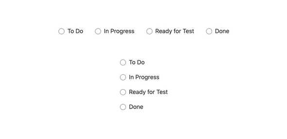
Layout
Toggling between horizontal and vertical layouts for the KendoReact RadioButtonGroup component can be done by interacting with a single property.
-
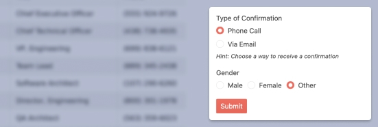
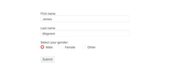
Forms Support
The KendoReact RadioButtonGroup component can easily be added to a HTML form element, third-party React form libraries or the KendoReact Form component.
-
Keyboard Navigation
Navigating through and selecting values in the React RadioButtonGroup can be done 100% via keyboard interactions.
-
Accessibility
Thanks to compliance with Section 508 and WAI-ARIA standards, the KendoReact RadioButtonGroup is compliant with modern accessibility standards. It also has a AAA rating with WCAG 2.0.

