
KendoReact
React MultiSelect
- The React MultiSelect component greatly simplifies the selection of multiple items from a list.
- Part of the KendoReact library along with 100+ professionally-designed components.
- Includes support, documentation, demos, virtual classrooms, learning resources and more!
-
Enable Users to Select Multiple Items From a List
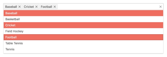
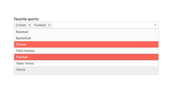
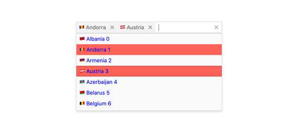
The KendoReact MultiSelect is a form component that displays a list of options in a popup and allows for multiple items to be selected from this list. Each selected item is rendered as a tag in the input element. The React MultiSelect component contains header and footer elements within the data list, supports virtualization and has the ability to work with custom renderers to customize the look and feel of the component.
-
Data Binding
The KendoReact MultiSelect can be bound to various forms of data, including datasets of objects, an array of primitive values or binding directly to a single value property. Additionally, the React MultiSelect can bind separate fields to the displayed text and the underlying value.
-
Filtering
The built-in filtering mechanism of the KendoReact MultiSelect automatically reduces the number of available choices in the MultiSelect dropdown. Filtering can be configured in various ways, including "starts with" or "contains" to ensure the most intuitive filtering behavior for any scenario.
-
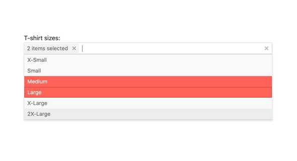
Custom Tags
Every selected value in the KendoReact MultiSelect is rendered as a tag. With the custom tags feature, the MultiSelect can customize what to display when an item is selected, including having a single tag representing all selected items.
-
Disabled Items
You have the flexibility to disable certain items within the React MultiSelect. Once an item is disabled, it cannot be selected as a value for the component, but it might still remain focusable or non-focusable when navigating through the items using the keyboard. See the React MultiSelect Disabled Items demo
-
Custom Rendering
The KendoReact MultiSelect component provides options for customizing the way the component renders its elements. This includes allowing for custom renderers for each item in the option list, the tags displayed in the input, the header and footer elements, as well as the message when no data is bound to the component.
-
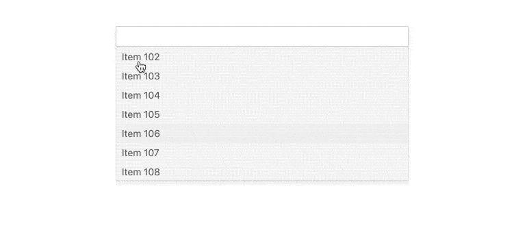
Virtualization
With Virtualization enabled, the KendoReact MultiSelect component can scroll through thousands or hundreds of thousands of data items while keeping scrolling buttery smooth.
-
Floating Labels
Popularized by Material Design, the floating label starts off as a placeholder in an input element only to animate out and float above the input and act as a label. The KendoReact AutoComplete component comes with support for floating labels built-in, no matter what design language you chose to incorporate it with.

-
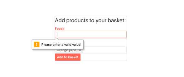
Forms Support
The KendoReact MultiSelect component can be added to any HTML form, be a part of a KendoReact Form or integrated with any other third-party React form library. The MultiSelect features styling and settings for displaying an invalid state and can work with custom validation messages.
-
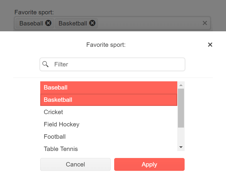
Adaptive Rendering
The KendoReact MultiSelect supports an adaptive mode, enabling a mobile-friendly rendering of the component popup. The component automatically adapts to the current screen size and alters its rendering accordingly.
-
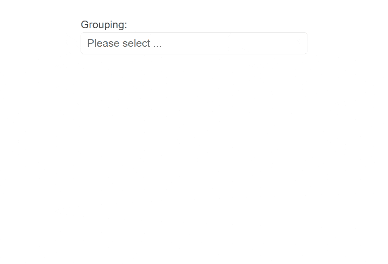
Grouping
Group similar data items in logical categories to help users quickly and easily navigate through the drop-down list. Define the field responsible for each category while you binding your dataset to the KendoReact MultiSelect component.
-
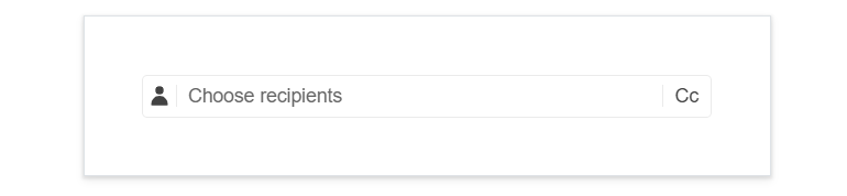
Prefix and Suffix Adornments
Elevate user interactivity leveraging the option for adding prefix and suffix adornments. These are custom items, usually an icon or button, inside the field before or after the input area. Typical prefix adornments are currency symbols or unit indicators, while suffix adornments are often used for password visibility toggles, formatting or clearing the input.
-
Keyboard Navigation
The KendoReact MultiSelect component has keyboard navigation built-in, allowing users to easily traverse and select items within the React MultiSelect using only the keyboard.
-
Accessibility
Accessibility is a core pillar of the KendoReact library, and the KendoReact MultiSelect is no exception. This means the MultiSelect is AAA rated with WCAG 2.0, and supports WAI-ARIA and Section 508 standards.

