
KendoReact
React DropDownTree
- Display complex data in a DropDown efficiently by using a hierarchical structure.
- Part of the KendoReact library along with 100+ professionally-designed components.
- Includes support, documentation, demos, virtual classrooms, learning resources and more!
-
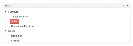
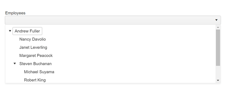
Show Hierarchical Data in a Drop-down Tree of Selectable Options
A combination of a TreeView and a DropDown component, the KendoReact DropDownTree is perfect for forms that need to display complex data concisely. When users interact with this simple input element, the dropdown opens up to reveal a built-in TreeView with a hierarchical structure. Users can then pick a node and the selected value will appear in the input of the component.
-
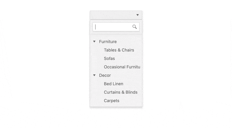
Filtering
When filtering is enabled, the React DropDownTree will display an additional search box at the top of the item collection. This filtering mechanism allows end-users to reduce the amount of information displayed within the component and helps them find the specific items they're searching for quickly and efficiently.
-
Custom Rendering
The KendoReact DropDownTree provides several ways for React developers to customize the look-and-feel of the React component. How each node within the built-in TreeView gets rendered can be controlled by its own custom renderer, and the way the selected items are displayed within the input element can also be customized. Combined, these approaches give you enough flexibility to fit the React DropDownTree into any application design.
-
Adaptive Rendering
The KendoReact DropDownTree supports an adaptive mode, enabling a mobile-friendly rendering of the component popup. The component automatically adapts to the current screen size and alters its rendering accordingly.
-
Forms Support
As the React DropDownTree is an advanced version of the select HTML element, the component will often be used as part of a larger collection of form components. Thankfully, the KendoReact DropDownTree provides a native KendoReact implementation of HTML form validation to ensure a natural fit within any form.
-
Keyboard Navigation
The KendoReact DropDownTree has built-in keyboard support to help interact with the React component using just a keyboard. This enables users to open and close the dropdown, switch between items, select items and more - all via keyboard interactions.
-
Accessibility
One of the core aspects of KendoReact is accessibility. The KendoReact team understands how important accessibility is for the web and this drives the team to make every component accessible to all audiences. The KendoReact DropDownTree supports Section 508 guidelines, keyboard navigation and WCAG 2.0 compliance with an AAA rating.
