
KendoReact
React DropDownButton
- This UX staple provides options for enabling or disabling its content, displaying icons, and binding it to data.
- Part of the KendoReact library along with 100+ professionally-designed components.
- Includes support, documentation, demos, virtual classrooms, learning resources and more!
-
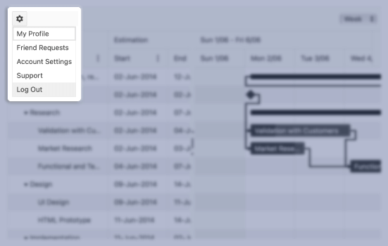
Configurable Button with a Drop Down List
The React DropDownButton displays a popup list with action items and provides options for enabling or disabling its content, displaying icons, and binding it to data.

-
Disabled DropDownButton
By default, the KendoReact DropDownButton is enabled. But when requirements call for the component to be disabled until certain requirements are met, the React DropDownButton can be disabled with a single configuration option.

-
Icon DropDownButton
The KendoReact DropDownButton can be displayed as just an icon, or with a mix of text and icons as a part of its main content. These icons can be imported from third-party font icon libraries like FontAwesome, as custom images, or be pulled from the internal KendoReact Icons.

-
Data Binding
Beyond being declaratively built, the KendoReact DropDownButton component can be data bound to an array of strings or an array of objects.
-
Custom Rendering
The KendoReact DropDownButton can be customized by providing custom renderers for the React DropDownButton popup or by overriding the item rendering for each of the items displayed in the drop down.

-
Keyboard Navigation
With its built-in keyboard navigation support, the KendoReact DropDownButton has several keyboard shortcuts to help interact with and select items within the component.
-
Accessibility
The KendoReact DropDownButton is WCAG 2.0 AAA rated, and is compliant with WAI-ARIA and Section 508 accessibility standards.

