
KendoReact
React ComboBox
- The React ComboBox offers built-in filtering, suggestions and virtualization, plus accessibility and forms support.
- Part of the KendoReact library along with 100+ professionally-designed components.
- Includes support, documentation, demos, virtual classrooms, learning resources and more!
-
Enable Users to Select Items From a List of Predefined Options
The React ComboBox component, part of KendoReact, is a form component designed to let end users choose a predefined value from a list, and often is used as a much richer version of the select HTML element. The component naturally highlights the dropdown that the values appear in a dropdown arrow next to the text input, and the component sports a whole slew of features to make picking the proper value as easy as possible.

-
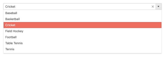
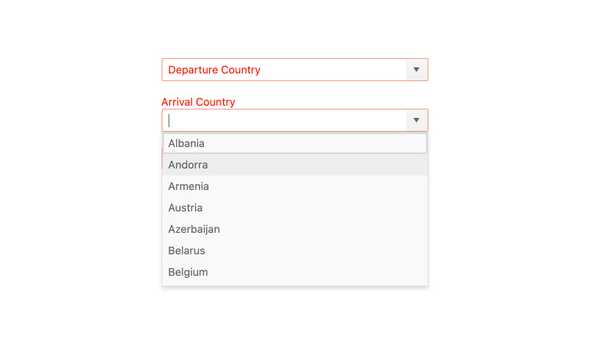
Filtering
The built-in filtering mechanism of the KendoReact ComboBox automatically reduces the number of available choices in the ComboBox dropdown. Filtering can be configured in various ways, including "starts with" or "contains" to ensure the most intuitive filtering behavior for any scenario.

-
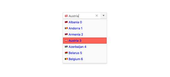
Suggestions
With the suggestion feature enabled, the KendoReact ComboBox will attempt to autofill the input element based on the closest available value. This suggestion will continue to update as the user types.

-
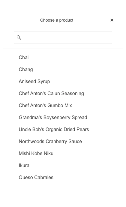
Custom Rendering
By default, the KendoReact ComboBox renders items with plain text. Certain scenarios call for more advanced rendering and this is where the custom rendering feature of the React ComboBox shines! This allows a custom renderer to be injected for any list item, header or footer element, as well as the suggestion lists when no data is availableâenabling developers to take full control over the look and feel of the ComboBox component.
-
Adaptive Rendering
The KendoReact ComboBox supports an adaptive mode that provides a mobile-friendly rendering of its suggestion list popup. When enabled, the picker component will automatically adapt to the current screen size and change its rendering accordingly.

-
Disabled Items
You have the flexibility to disable certain items within the React ComboBox. Once an item is disabled, it cannot be selected as a value for the component, but it might still remain focusable or non-focusable when navigating through the items using the keyboard.
-
Virtualization
Depending on your requirements the React ComboBox may be bound to thousands or hundreds of thousands of data items, which can be quite taxing on any modern browser to render. Thanks to the built-in virtualization feature of the KendoReact ComboBox, scrolling through large amounts of data is done with buttery-smooth performance.

-
Floating Labels
Popularized by Material Design, the floating label starts off as a placeholder in an input element only to animate out and float above the input and act as a label. The KendoReact ComboBox component comes with support for floating labels built-in, no matter what design language you chose to incorporate it with.

-
Adaptive Rendering
The KendoReact ComboBox supports an adaptive mode, enabling a mobile-friendly rendering of the component popup. The component automatically adapts to the current screen size and alters its rendering accordingly.
-
Grouping
The React ComboBox component allows you to group similar data items in logical categories to help users quickly and easily navigate through the drop-down list. Define the field responsible for each category while binding your dataset to the KendoReact ComboBox component.
-
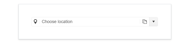
Prefix and Suffix Adornments
Elevate user interactivity leveraging the option for adding prefix and suffix adornments. These are custom items, usually an icon or button, inside the field before or after the input area. Typical prefix adornments are currency symbols or unit indicators, while suffix adornments are often used for password visibility toggles, formatting or clearing the input.
-
Forms Support
The KendoReact ComboBox is most often used as a part of a form to help the user select from a longer list of data. In this vein, the React ComboBox supports being added to any plain form element or integrated into an existing React Form library (including the Form component from KendoReact). Thanks to built-in styling and behavior around validation, this UI component can fit with any form.
-
Keyboard Navigation
Keyboard navigation has become a crucial part of website navigation for several reasons ranging from speed of data input to accessibility concerns. Thankfully, this React ComboBox comes with built-in keyboard navigation to help navigate through every part of the component and assist with selecting a value with ease.
-
Accessibility
Creating accessible React UI components is a core concept of KendoReact, and the ComboBox is no exception! The KendoReact ComboBox is compliant with Section 508 standards, is AA rated with WCAG 2.0, and follows WAI-ARIA standards.

