
Kendo UI for Angular
Angular Grid
- Best-in-class Angular data grid built for performance with must-have features such as paging, sorting, filtering, grouping and many more.
- Part of the Kendo UI for Angular library along with 110+ professionally-designed components.
- Includes support, documentation, demos, virtual classrooms, Visual Studio Code Extensions and more!
-
Overview
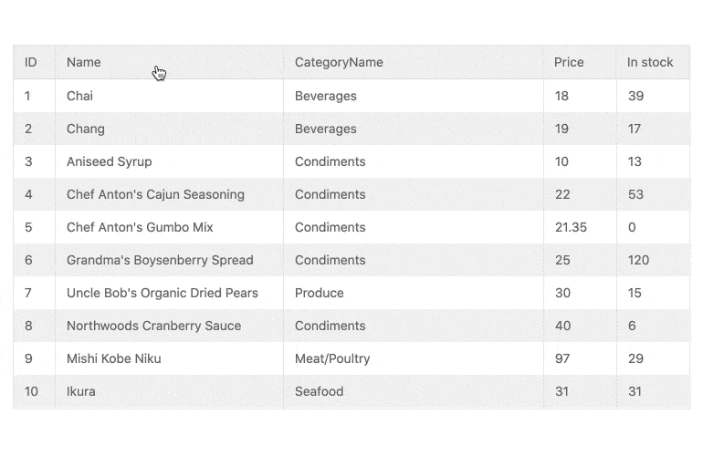
The Kendo UI for Angular Grid is one of the most powerful data grid components available for Angular developers. Built from the ground up for Angular and with focus on performance, the Angular Data Grid contains must-have features, including paging, sorting, filtering, grouping and editing. For scenarios that require handling hundreds of thousands of data items, the Angular Data Table supports rendering large datasets thanks to row and column virtualization. The Angular Grid provides more essential features, such as resizing and reordering of columns, displaying hierarchical data, context menus that appear when right-clicking on a row, column menus to provide additional functionality on a column-by-column basis, as well as custom templates.
-
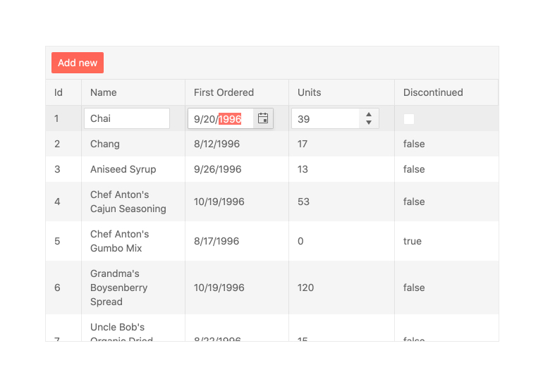
Editing
There are various ways user can edit data items in the Kendo UI for Angular Data Grid. They can edit row by row through a dedicated edit button, edit individual cells by clicking on them or use an external form to edit the currently selected item. The Angular Grid can then work with any Angular service layer to persist changes back to a database.
-
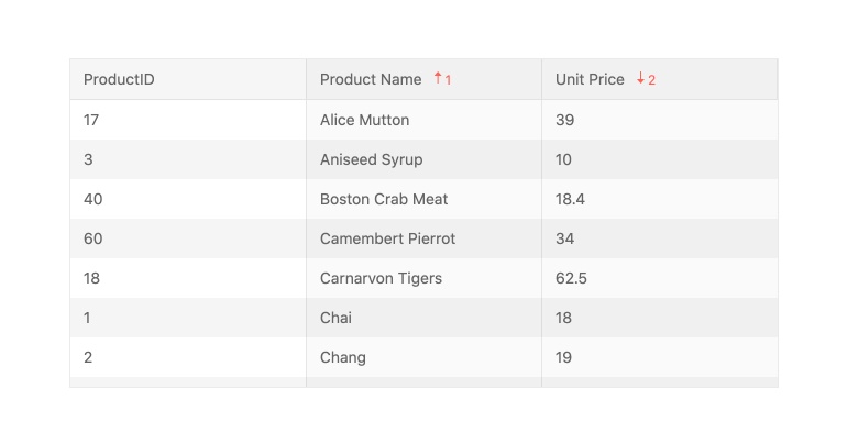
Sorting
Enable users to sort data items in the Angular Data Table in an ascending or descending order with the Kendo UI for Agular sorting function. Users can click on the column header to cycle through sorting in an ascending, descending or no sort order. You can also allow users to sort a single or multiple columns or disable sorting on a column-by-column basis. Developers can also render the Angular Data Grid with pre-sorted data, defining which columns to sort and in which order ahead of time.
-
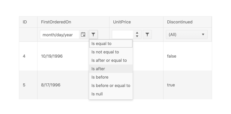
Filtering
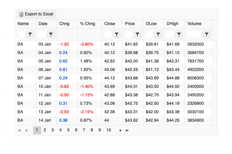
With the out-of-the-box filtering feature of the Kendo UI for Angular Grid, users can quickly slice and dice the data bound to the Angular Data Table with ease. Filtering can be done through a dedicated filter row, which displays a dedicated row just for filters, or through a filter menu that pops up when clicking on a filter icon in the header of a column. The Angular Data Grid can also be extended to provide a custom component to handle filtering, allowing you to have full control over the user experience.
-
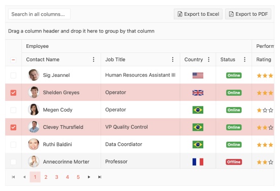
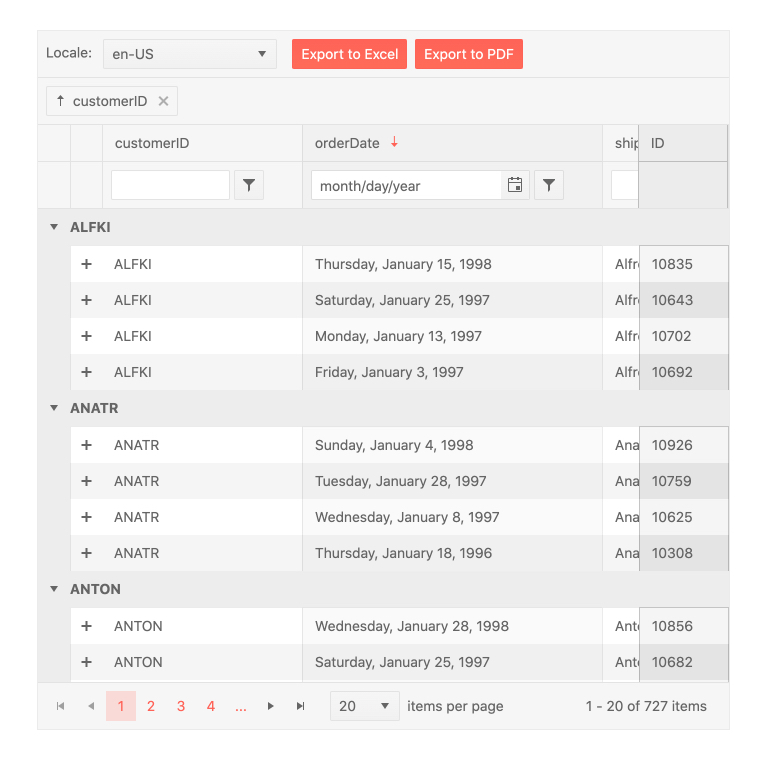
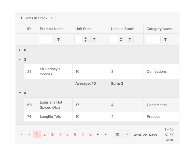
Grouping and Aggregates
Users can drag and drop columns in the Kendo UI for Angular Data Grid to group them by field. This is not limited to a single column and there is no limit to the number of groups and subgroups that can be defined. When grouped, each group can be expanded or collapsed by users clicking on the appropriate expand/collapse icons. Each group can also provide aggregate information in both a header and a footer area and each group can be sorted in an ascending or descending order.
-
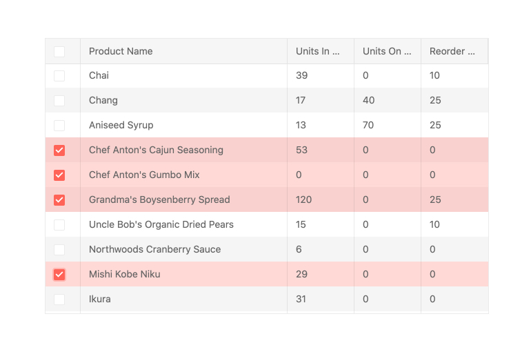
Selection
The Kendo UI for Angular Data Grid features selection in multiple forms, including single row and multi-row selection. You can enable users to select an individual row through clicking on it, select multiple rows by CTRL-clicking on them or through a column of dedicated checkboxes.
-
Native Angular Performance
Our Data Grid is not a jQuery or JavaScript wrapper. It is engineered specifically for Angular enabling you to take full advantage of the framework’s native performance capabilities like Ahead of Time Compilation (AOT), Angular Universal Rendering and Tree Shaking.

-
Flexible Data Binding
Choose the right data-binding approach based on your specific project requirements. You have the flexibility to bind the Angular Data Grid to:
- Local Data
- OData
- Remote Data
- Streaming Data
-
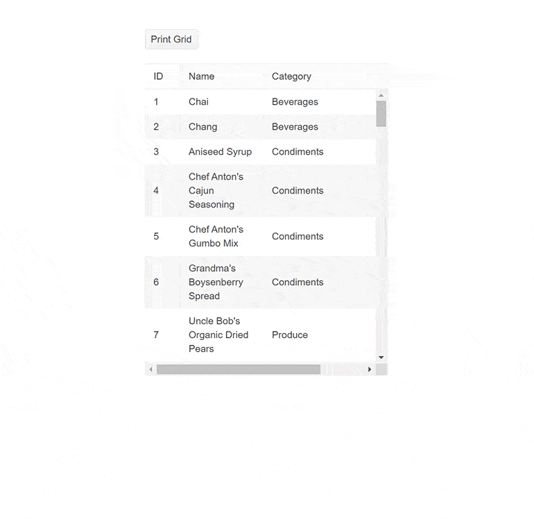
Printing
The Angular Grid supports configurable print layout, enabling users to print all grid columns and rows with the corresponding content. Both scrollable and pageable grids can be printed.
-
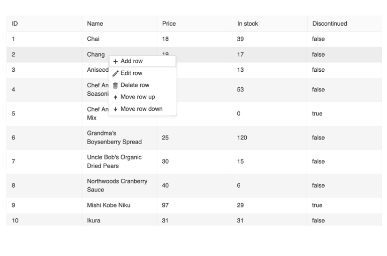
Context Menu
The Angular Data Grid enables you to display a context menu within the component, providing a convenient way to apply data processing operations to specific rows. The context menu empowers users to quickly and easily add, edit, and delete records, select and reorder rows, and export the data grid to a PDF or Excel file. Additionally, you have the flexibility to customize the order of the menu items and create custom controls based on your specific needs.
-
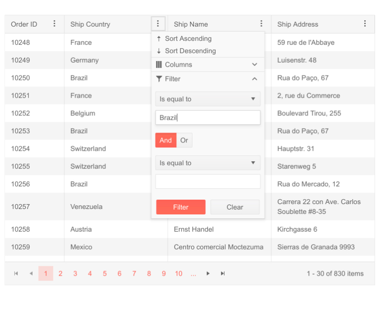
Column Menu
The column menu provides a convenient way to apply data processing features to the specified columns. The user can sort and filter the grid data, toggle the locked and sticky state of the columns, or change their visibility. You can customize the order of the menu items and create custom controls as necessary.
The Kendo UI for Angular Data Grid also offers the possibility to display the menu items into tabs for even better user experience when managing the grid column settings:
- Filter tab, including the filter item only
- General tab, including the sort, lock, stick, and resize items
- Columns tab, including the Column choose item only
-
Row Reordering
The Angular Grid component supports row reordering via drag and drop. With this feature enabled, your users can easily rearrange rows and configure their view themselves.

-
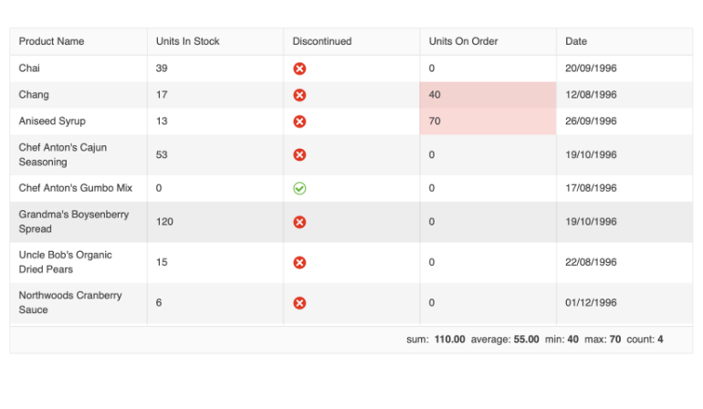
Selection Aggregates
The Angular Data Grid enables you to select a single or multiple cells or rows and calculate different metrics based on the selected data. This feature allows you to get a quick snapshot of key aggregates for the selected data. You can utilize the built-in approach and display the metrics at the bottom of the Data Grid or create your own elements to present the data based on your specific needs.
-
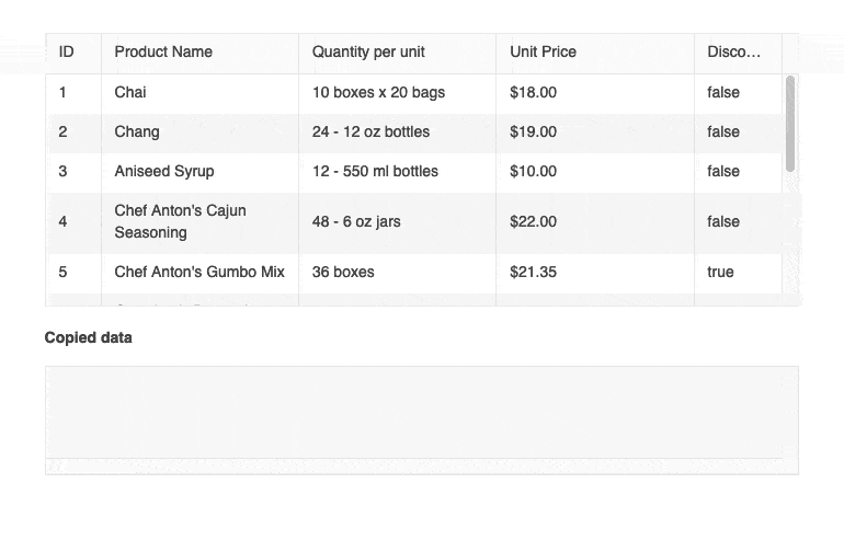
Clipboard
The Kendo UI for Angular Data Grid enables you to perform all standard clipboard operations from and to the Grid by using the system clipboard.
The grid clipboard supports the following keyboard options:- Copy selected or focused content
- Cut selected or focused content
- Paste the clipboard content
-
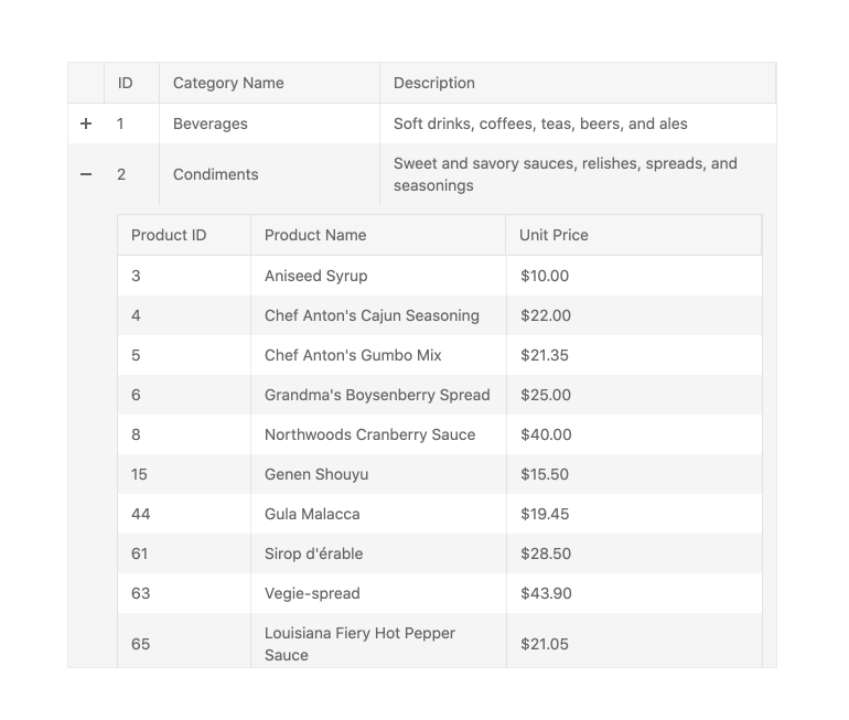
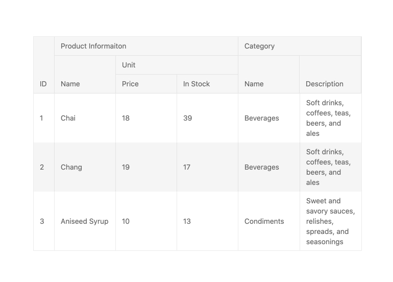
Hierarchy
With the built-in Hierarchy feature, the Kendo UI for Angular Grid can showcase multiple Angular Data Tables in a parent-child relationship. The hierarchy allows for each Angular Data Table to have its own unique set of features enabled (like sorting, paging, filtering, etc.) based on the data it should display. With no limit for now deep the hierarchy can go, the Angular Data Grid is perfect for displaying any type of related data tables.
-
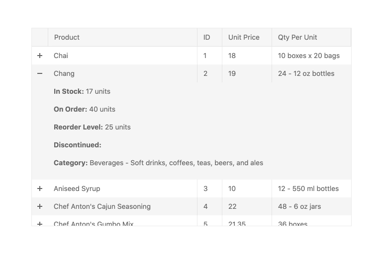
Detail Rows
In addition to its capability to display data in a parent-child relationship, the Kendo UI for Angular Grid can display a unique detail row with a completely customized layout. By passing in an Angular template, you have full control over what additional information should be displayed and how. Just like with a hierarchy, the detail rows of the angular Data Table can be expanded or collapsed on a row-by-row basis.
-
Compact Rendering
Small screens are a primary channel for app delivery and developers are challenged with presenting data grid views in ways that device users can understand. To help solve this need, the Angular Data Grid has a compact rendering mode. In this mode, cell padding will automatically be decreased regardless of which built-in theme is being used (Kendo Default, Material, Fluent, Bootstrap).
-
Column Interactions
The Kendo UI for Angular Grid provides built-in functionality for various column interactions. Users can toggle between showing or hiding columns, resize and reorder columns, drag columns to be grouped and more. These options can be applied across all columns or defined on a column-by-column basis.
-
Multi-Header Columns
Multi-header columns allow for columns to be rendered in a hierarchical fashion, providing parent column headers that span over single or several columns. With the Kendo UI for Angular Grid, there is no limit to how many parent headers are configured, and just like individual columns, headers can be reordered or resized, which will apply to the underlying headers as well.
-
Frozen Columns
The Kendo UI for Angular Grid allows for frozen columns (also known as locked columns) to be configured upon initial rendering or on –the fly. Columns can be added to the left-hand side or right-hand side of the Angular Data Table.
-
Sticky Rows
In just a few steps, you can designate one or more rows to always be visible (or stick) to the right or left side or the top or bottom of your grid while the user scrolls. This is a great way to ensure that the most important information is visible when you have limited space.
See the Angular Grid Sticky Rows demo
-
Virtual Columns
Virtualization is critical to successfully bind and display large datasets with hundreds of thousands of data items. The Angular Data Grid's column virtualization enables users to maintain a buttery smooth scrolling experience.
-
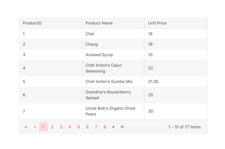
Paging
Easily break down large data sets into pages to deliver an optimal user experience with higher performance. With its built-in Paging mechanism, the Kendo UI for Angular Grid offers users to page through data with a specific page size, which can be updated both by the user and programmatically by the developer. Though intuitive controls, users can navigate to the next and previous pages or jump to a specific page by selecting its number. Paging in the Angular Data Grid can be enabled by setting a single configuration to true and can also be deeply customized through additional options.
-
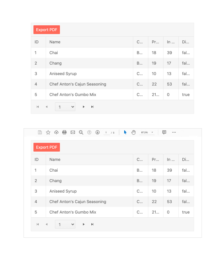
Export to Excel and PDF
The Kendo UI for Angular Grid integrates with both the Angular Excel Export package and the Angular PDF Export package found in the Kendo UI for Angular library. Through this integration, the content of the Angular Data Table can be exported to either an Excel file or a PDF file with a single button click. For scenarios that require some customization of the exported files, the Angular Data Grid provides a large set of configuration options to ensure any exported file fulfills all requirements.
-
Keyboard Navigation
Even though the Kendo UI for Angular Grid is an extremely powerful component with a huge range of features, users can quickly and easily navigate through every element of the Angular Data Table using keyboard navigation. This also extends to the CRUD operations of the Angular Data Grid, allowing users to quickly manipulate data using just their keyboard.
-
Accessibility
The Kendo UI for Angular Data Grid adheres to the WCAG 2.2 AA and Section 508 accessibility standards. It also follows the WAI-ARIA best practices to ensure proper keyboard navigation for its component role and is tested with the widely-used screen readers.
See the Angular Grid Accessibility demo

Get Started with Kendo UI for Angular
