We need a fairly common data chart. Both axis are values, so they are like scatter charts. But we need lines connecting the data points.
I would say that it should support line and spline, just like excel.
Is this possible?
3 Answers, 1 is accepted
0
Nick Iliev
Telerik team
answered on 13 Nov 2017, 08:01 AM
Hi Douglas,
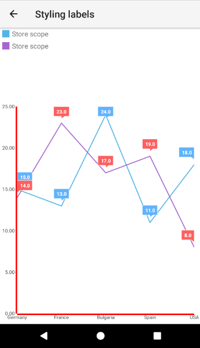
As far as I understood, what we need to accomplish is to have Line or Spline series with data points similar to the ones in Scatter series.
A very similar scenario can be achieved with Line and Spline series by using labels and applying some styling. More about label styling can be found in this documentation article.
Real example demonstrating this technique can be found here and the result looks as follows (on Android):
Regards,
Nikolay Iliev
Progress Telerik
Did you know that you can open private support tickets which are reviewed and answered within 24h by the same team who built the components? This is available in our UI for NativeScript Pro + Support offering.
That option really only works if we have a value for every possible X value. Otherwise, the line chart is not scaled properly in the X direction.
We can infill missing X values with zeros for some charts. But for others, we want the spline to curve to the next x,y.
0
Nick Iliev
Telerik team
answered on 15 Nov 2017, 08:54 AM
Hi Douglas,
Indeed at this very moment emitting a value will emit the line from the data points before and fafter the emitted value
This is considered expected design behavour as if the dots are connected with a line it might cause confusion for the X category entry with emitted value.
As you have noted one possible solution is to apply zero values to the X data points.
Did you know that you can open private support tickets which are reviewed and answered within 24h by the same team who built the components? This is available in our UI for NativeScript Pro + Support offering.