
Telerik and Kendo UI Kits for Figma
Be in Perfect Sync with Your Designer
Smooth designer-developer collaboration is within your reach with the Telerik & Kendo UI Kits for Figma. Each Figma UI kit is a perfect design equivalent of our web UI components that help you avoid unnecessary iterations.
Perfectly Matching Building Blocks for
Design and Development
With the Telerik & Kendo UI component libraries and matching web Figma UI kits, you speed up UI development cycles and avoid unnecessary back and forth.


Customizable web UI components for both designers and developers
Easy start of your Design System or integration with existing one
Fully accessible (compliant with WCAG 2.0, Section 508, WAI-ARIA)
Developers, Start Speaking the Same Language as Your Designers
No matter if you work with in-house designers or an agency—your collaboration is off to a running start with a Telerik and Kendo UI Figma UI kit.
Speed Up UI Development Cycles with Matching Components
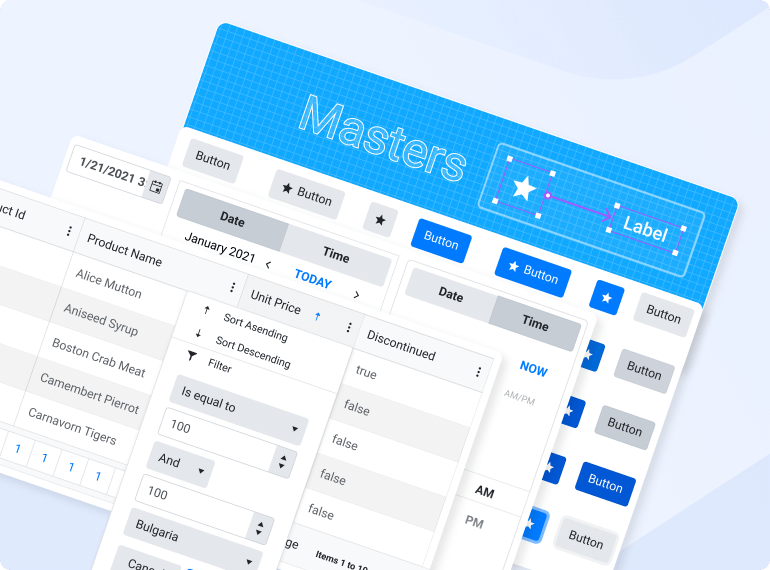
Enjoy the ready-to-use web Figma UI kits that match the Material, Bootstrap, Fluent and Default themes you get out of the box with the Telerik and Kendo UI web component libraries.
Ensure Smooth Implementation and Friendly Collaboration
Optimize iterations with a single source of truth. Thanks to the Figma UI kits, the designer knows exactly what components you will be using for your UI.
Start Crafting Your Own Design System
Nothing can stand in your way when you have a powerful UI component library and customizable Figma design kits.

Top Features

Built Following Design Best Practices
Each Figma UI kit is built with the Atomic design principle in mind, so the complex components reuse the basic ones. All styles and usage descriptions are exposed and the components are fully customizable to meet your creative needs.
Auto-Layout
Create designs that dynamically adjust to their contents. Easily add layers, accommodate longer text strings or maintain alignment as your designs evolve.
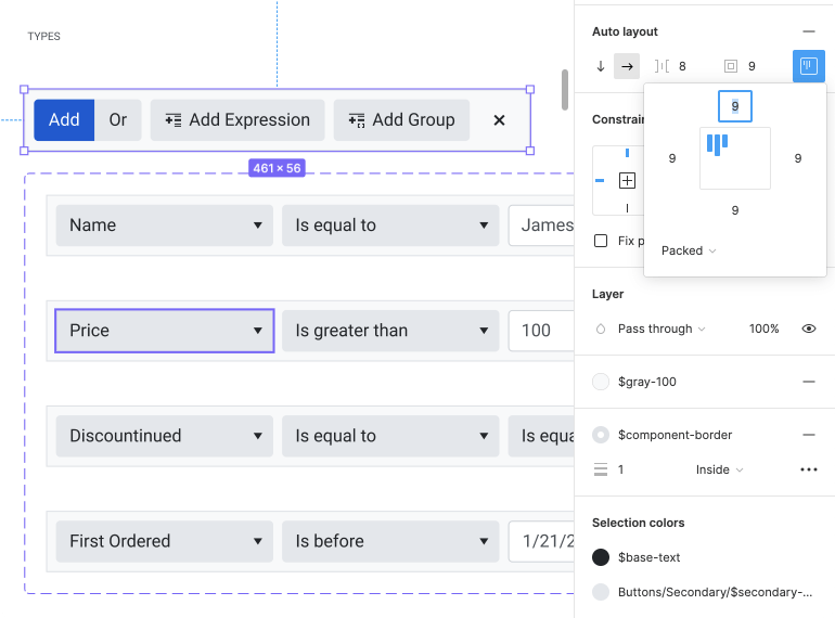
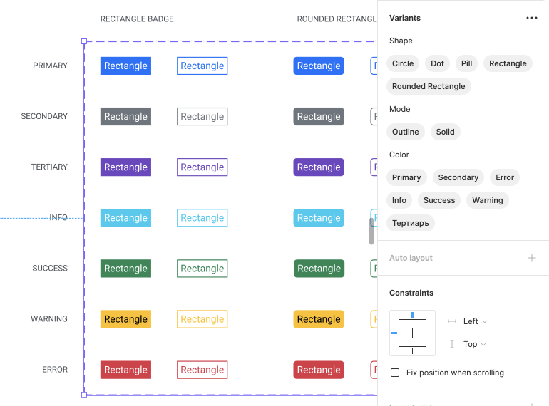
Component Variants
Variations of the same component are grouped and organized into one. This makes components easier to maintain and more intuitive to use. You can extend with even more variants yourself!
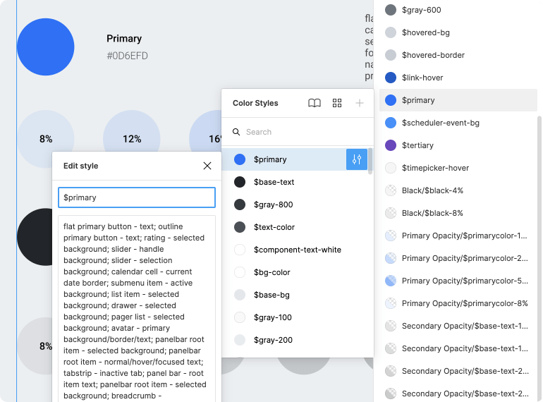
Design Tokens
Design tokens are the parameters needed to easily construct and maintain a design system—colors, typography, effects, etc. Using them instead of hard-coded values will make your design system flexible, consistent and maintainable.
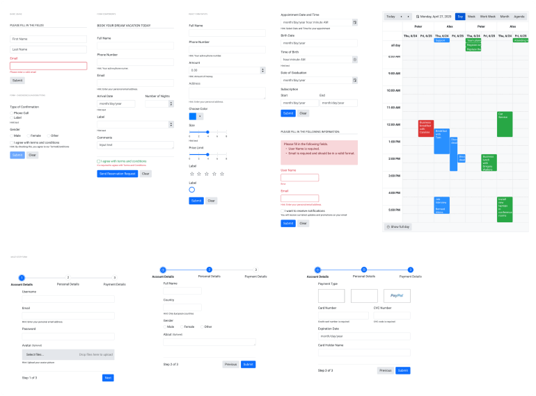
Component Scenarios
You can build your own complex components with the available construction elements or just use and adapt one of the suggested scenarios to your needs to move faster.
Part of the Telerik and Kendo UI Component Libraries
If you own a license for one of our web UI libraries, the corresponding Figma design kits come to you as a bonus, now available for free as part of each library. More value for the same price!

Seamless Upgrades
with
the InstaRelinker Tool
Seamlessly upgrade to newer versions of the kits while keeping your styles. No more tedious hours spent manually swapping instances and replacing remote styles with local styles. With the InstaRelinker, this happens in seconds! Available as a Figma community plugin.
Download the InstaRelinker
Learning as You Go? We Can Help.
Get started with expert content on the intersection of design and development or dive straight into the Figma kits documentation.
Blogs

The Ultimate Guide to Building a UI Component Library
In this comprehensive series, TJ VanToll shares tips and strategies he’s learned from over a decade working with UI components on web projects that can help you plan, build and distribute your own corporate component library.

How and Why You Should Create a Design System for Your Apps
What if you had a system in place that ensured your app was built the right way from the get-go, regardless of which team member (new or old) was working on it? That’s what design systems do, and you can learn all about them in this blog.

Figma for Developers
If you thought Figma was only for designers, think again! Figma is a powerful tool, with tons of great features for developers to take advantage of as well—plus, teams work better together when everyone has a high-level understanding of each other’s tools and priorities.
Web Figma UI Kits Documentation
.NET web
JavaScript
Tools to Help You Apply UI Customizations
We combine our UI components with front-end documentation and tools into a Design System Kit to help you satisfy your styling requirements and produce consistent UI without hassle. You and/or designers can leverage these resources:


Get in Perfect Sync with Your Designer
Smooth designer-developer collaboration is within your reach with the Figma UI Kits. Start using them today!
