Design Systems for Developers

Having a design system makes it easy for developers to onboard new team members, quickly find answers to basic questions without having to DM someone and wait for an answer, download common assets like logos and icons, and so much more.
If you work with designers, chances are high that you’ve heard the words “design system” bandied about at least a few times. UI design systems are a hot topic in the design world right now, and for a good reason—they offer tons of advantages for everyone working on a product, developers included!
Plenty of developers will hear the word “design” and immediately tune out, assuming that this isn’t something intended for them. On the contrary, understanding your way around a design system will vastly improve your understanding of how designs and prototypes are meant to be translated into code and make your life much easier by providing quick access to several resources. This speeds up the development process exponentially, as well as reducing misunderstandings during the handoff process.
Whether your team already has a design system and you’re not really sure what you’re supposed to do with it, or you’ve just heard the term and are curious what it really means, you’re in the right place! We’re going to look at the purpose of a design system, what’s often included, and how you can best leverage this useful resource to improve the development process and user experience of your application.
What Is a Design System, Anyway?
A design system is a collection of connected design elements, organized and documented for easy reference. Think of it like a library of all the design resources and assets you could ever need, customized specifically for your application.
It’s similar in concept to a component library but turned up to a thousand! In the same way that components can be broken down into building blocks and then combined in a variety of different ways to quickly craft UIs, designs can be broken down into their smallest elements as well—fonts, colors, icons, images, copy, etc. Design systems are documented collections of those design elements and how they work together.

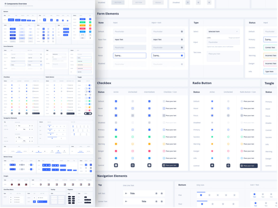
Image from https://www.sketchappsources.com/free-source/4059-eva-design-system-sketch-freebie-resource.html
What’s the Purpose of a Design System?
Design Systems ultimately exist to provide consistency. They can do this in a variety of ways and have other benefits that happen as a side effect, but consistency is the primary goal.
Visual Consistency and User Trust
Design systems create visual consistency by documenting for future reference the design decisions that have been made for your application, products and brand. Making different UI choices or using different patterns in different places—whether that’s different places within your application or beyond—creates a frustrating and unintuitive user experience, which should always be avoided. (Not to mention being a frustrating experience for designers and developers alike, who have to start fresh or redo work for each project.) It also makes your brand and product look unprofessional, which leads to a low level of trust from your users. You don’t want your social media graphics to look completely different from your website, which looks completely different from your app.
First impressions matter and coming across as disorganized—or worse, like you don’t know what you’re doing—isn’t helpful when you’re trying to get someone to buy or use your product. This is especially true if you’re working in a field like banking, education, security, healthcare or similar, where your users trust you with important parts of their lives.
From a developer’s perspective, a design system is most useful when you’re thinking about the UI of an application. Unless the same person is the one coding the user interfaces in every situation, people will make different personal judgment calls or design decisions if there’s not a single source of truth to refer to. While many of those kinds of UX and UI decisions might feel small or even unnoticeable when you’re making them, they’ll all add up for the users engaging with your app regularly. This problem compounds itself if you’re part of a large team or work somewhere with multiple different dev teams focused on various parts of the application (perhaps even different applications that all need to share the same look and feel), where many different people are all making different design decisions.
Streamlining the Design and Development Process
Trying to work without a reference point also slows down both the design and the development process, because making those decisions takes time. Re-hashing UI choices or trying to remember how a situation was handled elsewhere in the application breaks your flow and distracts you from the problem you were previously focused on. By using a design system, you can avoid this by always having a single source of truth so that developers can quickly refer to it in moments of confusion and get back on track.
Finally, not every developer enjoys or is comfortable making design decisions. As mentioned above, even the small choices stack up to impact the overall usability of your application—that’s a lot of pressure to place on someone who has a skillset focused on something else! And yet, developers are asked to make these kinds of small design decisions on the fly, as part of feature development, relatively regularly. I think it’s good for developers to know some design basics, but at the end of the day, many developers will feel relieved and happy to be able to defer to the design knowledge of someone else who actually enjoys that kind work—and if all your design knowledge is captured in a design system, they won’t even have to DM a designer to do so.
Naming Consistency
Design systems are also hugely useful because they make sure that everyone is using the same language to talk about the same elements. Have you ever been in a situation where you and a coworker thought you were disagreeing on something, only to discover you were describing the same thing—only you were calling it a “toast notification” and they were calling it a “snackbar notification”? Or maybe your idea of “sky blue” is different than what your designer had envisioned? When you’re using multiple different libraries, frameworks or languages, it can be easy to get wires crossed.
Those misunderstandings are inevitable if you’re trying to describe visual elements without a point of reference. It doesn’t really matter what something is called, as long as everyone knows what you’re talking about—and design systems solve that problem intrinsically. You can’t catalog something without giving it a name!
You know what they say—there are only two hard things in programming: naming things, cache invalidation and off-by-one errors. But seriously, I’ve found this naming consistency to be especially useful in two main ways: component names and color names.
Naming and documenting your components as part of a design system ensures that everyone—not just the developers—knows what all the components are, what they’re called and what each one does. This gives designers the tools to talk about and make use of the components you already have. Without this, I’ve found it all too common to be asked to build something almost-but-not-quite the same as something we already have. Sound like a component library? Well, yes, it is! You’re just including it as part of a larger design system so that access and awareness of your component library isn’t limited to just the dev teams.
Colors are the other huge benefit, because you can make sure that your CSS variables line up with their Figma (or other design software) tokens. Best case scenario, this allows you to take advantage of software like Unite UX that enables export from Figma files into SASS files you can add to your codebase. Even if that’s not possible, naming everything the same way will undoubtedly ease communication and the handoff process. It’s really a win/win situation.
Check out Figma for Developers to learn more about this popular design software and which of its features developers can take advantage of.
What Can I Find in a Design System?
Some of the most common elements include (but aren’t limited to) design tokens, grid systems, icon libraries, component designs, style guides and brand language/tone-of-voice guides. We’ll walk through each of these (because they can just kind of sound like gibberish words if you’re not familiar with them) and discuss how developers can make use of them.
Design Tokens
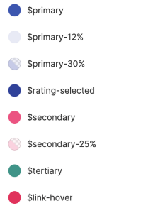
 Design tokens are the very smallest parts of a design system—the little values you find when you drill all the way down on an element. For example, you’ll often find design tokens for spacing, colors, fonts and font sizes, opacities, border radii, etc. The U.S. Web Design System website puts it most elegantly: “Design tokens are a limited set of discrete options, just like a scale of musical notes is drawn from the spectrum of all possible frequencies.”
As you read that description, you might have already realized the dev side equivalent to these tokens: CSS properties. Storing all these design tokens as variables in your stylesheets and applying them to base elements in your global styles will make your life a lot easier and your development process a lot faster. It brings all the ease of using Bootstrap-style “small,” “medium” and “large” pre-set styles, with the advantage of having all those styles created thoughtfully and intentionally by designers for your specific application and userbase.
Icon Libraries
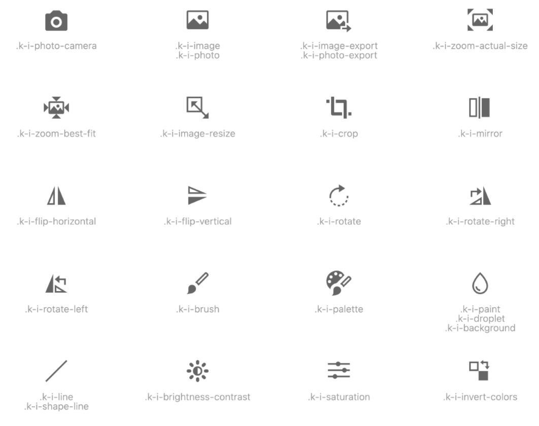

Icon libraries are, well, libraries of icons—the important part here is that all the icons are cohesive. Whether that’s a third-party library that your design team has chosen to use exclusively, or a set of completely custom designed icons for your application, it’s important to specify one set of icons so that you don’t end up using icons from various different sets that all have different illustration styles, line weights and sizes. Whether your icon library is a collection of SVGs or an icon font, the important part is knowing what icons you have to choose from, what they’re called and where those icons live.
Component Libraries
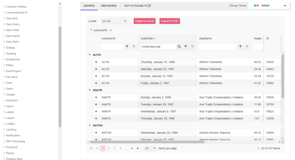

Image from: https://www.telerik.com/kendo-react-ui/components/grid/
You’re likely already familiar with component libraries, like KendoReact for example (and if you’re not, may I suggest The Ultimate Guide to Building a Component Library as an introduction?), but did you know they could be included as part of a larger design system? As mentioned above, one of the main benefits here is sharing what was previously a dev-specific resource with people outside the development team. This is a great example of how design systems are really a two-way street—it’s not just a collection of exclusively design stuff, it’s a place for designer/developer collaboration.
Documenting your components is also an incredibly helpful thing for speeding up your onboarding of new team members, both designers and developers. Nothing will help you get a feel for a codebase and application faster than being able to look at all the building blocks that make it up—seeing all the variations, the designs, how they’re built.
It’s also wildly helpful if you have non-standard, application-specific components that new folks might not recognize by name alone. I once worked at a company where the “Walkaround” was a common, often-used component ... but it’s not like you’d find that in a third-party component library! It was something totally custom, created for their specific data visualization needs. Being able to look it up in their design system and see examples of how to use it made incorporating that component in features a lot easier.
Grid Systems

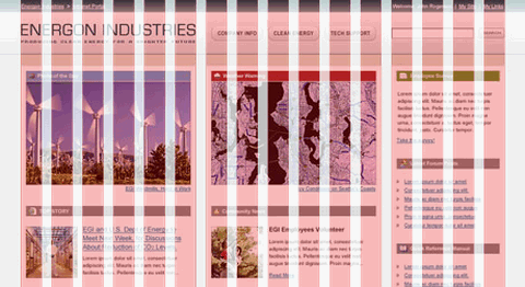
Image from https://www.designer-daily.com/the-use-of-grids-in-website-design-6639
With the advent of CSS Grid, grid systems have been getting a lot more attention on the dev side. But on the design side, they’re not exactly a new concept—the idea of using a grid to organize and lay out elements is as old as design itself. Print designers used grids to fit information on physical pages and create a visual hierarchy to guide the viewer’s eye through the content. The same concepts work equally well for UI design—in fact, all web and UI design is naturally grid-based, just due to the way HTML and CSS works! It’s a match made in heaven.
By creating grid systems that can be reused for different pages of your app or site, you can really speed up the time it takes to create designs and build out interfaces. It also helps create that consistency that we talked about earlier; when the layout is predictable, users quickly learn where they can expect various elements to live and what will happen when they interact with certain things. Without this kind of visual consistency, it takes longer for your users to figure out what’s happening on each page and where they need to go to accomplish their tasks. Not to mention, it’s like starting both your design and development processes with a cheat code! It gives you a template to start with, instead of a completely blank page.
Style Guides


Image from https://www.canva.com/learn/50-meticulous-style-guides-every-startup-see-launching/
Style guides are kind of the original design system; they document the high-level rules for a brand’s visual presentation. This generally includes a handful of most-used design tokens (like brand colors and fonts), but also things like examples of the type of imagery that should be chosen (e.g., fun and playful illustrations or black-and-white photography only), the logos and logo variations, or any brand-specific characters or icons. Basically, it’s a place to document brand-related assets and how they should be used.
Style guides are also incredibly useful as a quick summary of your brand that you can hand to contract workers, advertising agencies, freelancers, or other people outside your company who need to use your brand assets. It ensures that a consistent look still happens, even when work is being done by folks less familiar with your brand. It’s a handy document to have on hand for those folks who need some info, but don’t need the same level of detail as a full-time employee.
Brand Language and Tone-of-Voice Guides

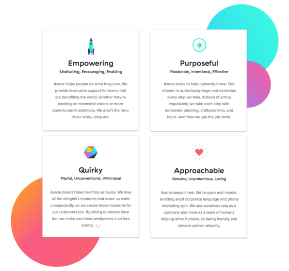
Image from https://www.contentharmony.com/blog/great-brand-guidelines/
Finally, a wonderful thing to include in your design system is a brand language and tone-of-voice guide. Capturing a feeling or a tone can be difficult, but the way you talk to your users really does have an enormous impact! How casual or formal you are, whether you include little jokes and quips or keep it completely strait-laced, whether you use contractions or do not—all of that adds up to the way your brand “sounds” when users are navigating your app.
You might be quick to assume that this doesn’t matter for developers, since they’re not the ones responsible for copywriting. However, based on experience, I’d be willing to bet that you’ve written more microcopy than you think! Developers often end up filling in little bits of copy during the development process: button text, form labels, captions, alt text, etc. Those little things all add up across your interface! Having a brand language guide can help you choose between “Let’s go!” or “Next”—and they do feel different to your users.
Wrapping Up
If you’ve read any of my writing before, this won’t be a surprise to you: I believe that both you AND your users benefit when designers and developers are equipped to work well together. Design systems are a fantastic way to accomplish this goal, by creating a single source of truth that both parties can refer to. Having all of this compiled makes it easy for developers to onboard new team members, quickly find answers to basic questions without having to DM someone and wait for an answer, download common assets like logos and icons, and so much more. Not to mention the overall consistency and ease of communication that a design system can provide! If you have one at your company and you’re not making use of it, hopefully this has inspired you to start taking advantage of such a great resource. And if you don’t have one yet ... maybe it’s something worth suggesting!

Kathryn Grayson Nanz
Kathryn Grayson Nanz is a developer advocate at Progress with a passion for React, UI and design and sharing with the community. She started her career as a graphic designer and was told by her Creative Director to never let anyone find out she could code because she’d be stuck doing it forever. She ignored his warning and has never been happier. You can find her writing, blogging, streaming and tweeting about React, design, UI and more. You can find her at @kathryngrayson on Twitter.
