
UI for Blazor
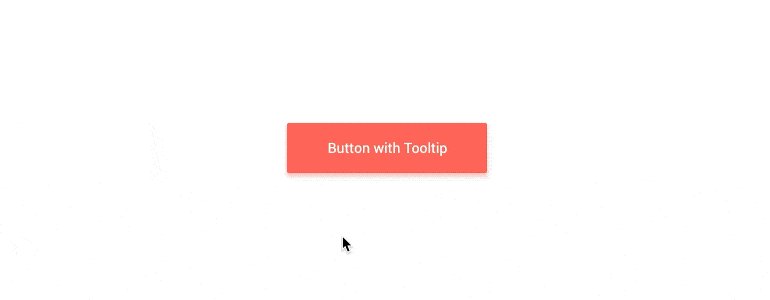
Blazor Tooltip
- The Blazor Tooltip component is a popup with information related to an UI element.
- Part of the Telerik UI for Blazor library along with 110+ professionally-designed UI components.
- Includes support, documentation, demos, virtual classrooms, Visual Studio Code Extensions and more!
-
Enrich Displayed Information with Blazor Tooltip
The Blazor Tooltip UI component replaces the default browser tooltip and enables you to enrich displayed information with text, images, HTML and even other components. The Tooltip control offers full range of customization through its templates, configuration of position and exposed events and works for both Blazor WebAssembly (WASM) and Server-side Blazor apps.
Explore Telerik Blazor Tooltip UI Component Demo.
-
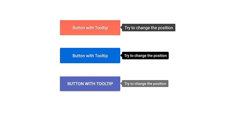
Tooltip Position
The Tooltip component location can be configured according to its target element using the Position parameter. Depending on your Blazor app scenario, the Tooltip component can be set to the following positions:
- Top (default value)
- Bottom
- Right
- Left
Explore Telerik Blazor Tooltip Component Position Demo.
-
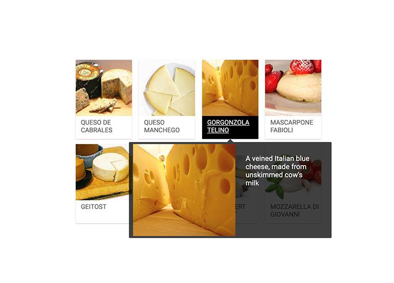
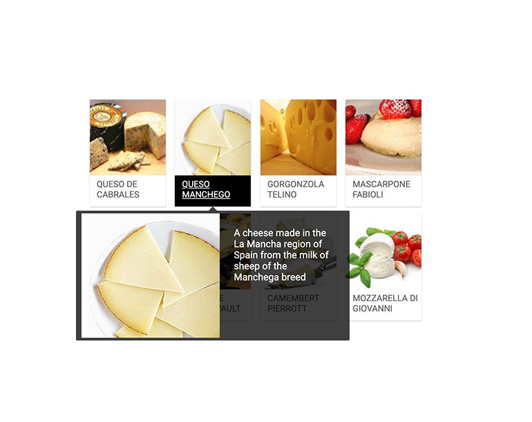
Customizing Tooltip with Templates
The content of the Tooltip component can easily be customized using the tooltip template, which enables styling with text, images, HTML or components. This is possible via the template context object which provides access to the tooltip target metadata (data attributes and title) and can easily be related to the tooltip content.
Explore Telerik Blazor Tooltip Customization with Template Demo.
-
Tooltip Load Content OnDemand
You can generate Tooltip content through a separate Blazor component and load data on demand (such as tooltips with Load-on-demand in a Grid Row).
Example of loading data on demand with the Blazor Tooltip.
-
Tooltip Show Event
Using the ShowOn parameter in the Tooltip component, you can control in your Blazor apps which interaction would invoke the display of the tooltip. By default, the Tooltip shows on hover (mouseover) of its target, just like the browser tooltips that the Tooltip component replaces. Additionally, you can trigger the Tooltip display with the click event.

-
Tooltip Theming
The Telerik Blazor Tooltip has several built-in themes such as Default (our own styling), Material (based on the Material Design guidelines), Bootstrap (which looks like the Bootstrap styling to integrate better) and Fluent (based on Microsoft Fluent UI). You can easily customize any of out-of-the-box themes with a few lines of CSS, or create new theme to match your colors and branding by using the Telerik SASS ThemeBuilder application.
-
Right-to-Left (RTL) Support
The Telerik UI for Blazor Tooltip component supports right-to-left configuration. The RTL functionality is supported by most of our components to accommodate users who communicate in a right-to-left language script, such as Arabic and Hebrew.
Learn more in our Blazor Right-to-Left Support documentation

