
UI for Blazor
Blazor TabStrip
- Show a collection of tabs that highlight only parts of the content at a time with the Blazor TabStrip component.
- Part of the Telerik UI for Blazor library along with 110+ professionally-designed UI components.
- Includes support, documentation, demos, virtual classrooms, Visual Studio Code Extensions and more!
-
Organize Content in Beautiful Tabs with Blazor Tab Strip
The Blazor Tab Strip component lets you organize content into beautiful tabs that are easy to navigate in both Blazor WebAssembly (WASM) and Server-side Blazor apps. You can disable certain tabs on condition, select a given tab programmatically and respond to a new tab selection. Additional control parameters are also available – like being to able to determine which tab is currently visible or making any of the changes the user made persistent.
-
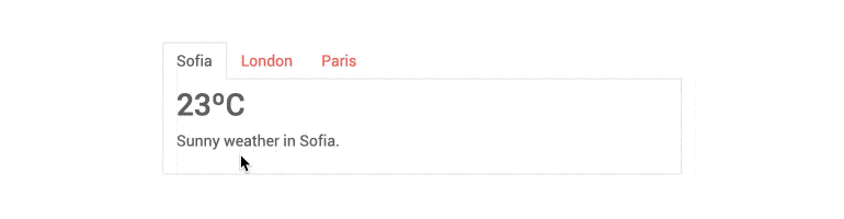
TabStrip Tabs
The Blazor Tab Strip component exposes different configuration parameters:
- Title – Define the text you would like to see in the Tab heading
- Visible – Control the tab visibility
- Disabled – Determine the selection of tabs by marking them as disabled or enabled
-
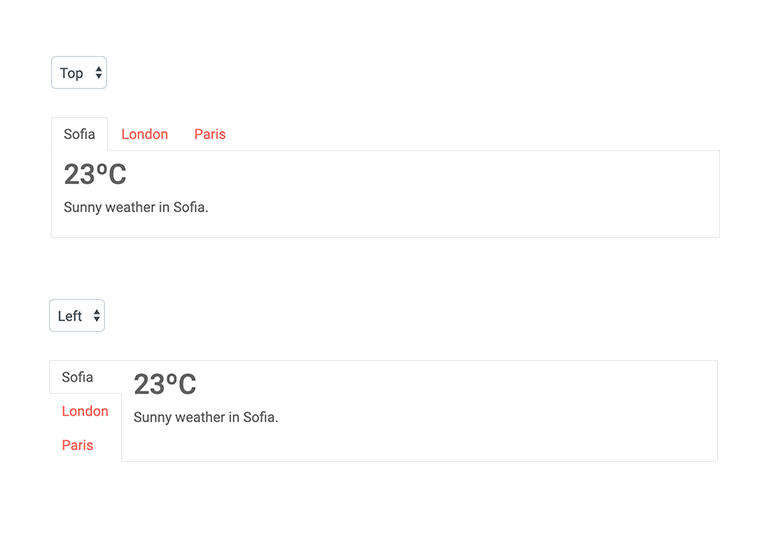
Tab Position
To fit your scenario and layout, you can place the tab headers on top, at the bottom, or on either side of the content. You can check it out in the Tab Positions example.
-
TabStrip Persist State
The Blazor Tab Strip component can be configured whether to persist the content when changing tabs.
-
Header Template
Control the content of each Blazor tab's header by providing a template for it. This allows you to add icons or even other Blazor components to offer rich content for your users.
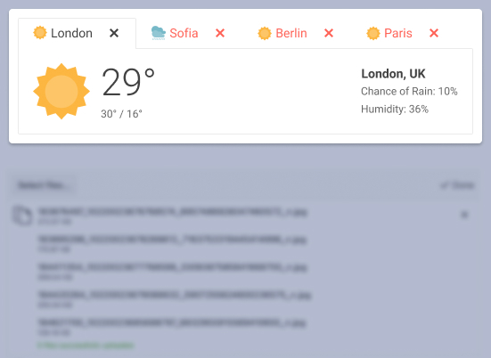
Blazor TabStrip Header Templates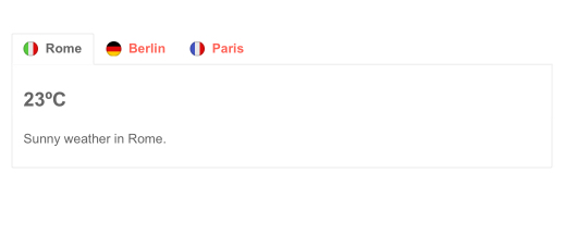
-
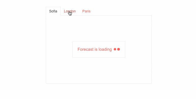
TabStrip Events
If you need to know that the user has selected a certain tab, the Blazor Tab Strip gives you the ActiveTabIndexChanged event so you can even choose to prevent the user from selecting the tab.
-
TabStrip Accessibility and Keyboard Navigation
Semantic HTML and adherence to web accessibility standards (WCAG, Section 508 and WAI-ARIA attributes for screen readers) help screen readers read the Telerik tab strip. Out-of-the-box keyboard support lets your users navigate the tabs without a mouse.
-
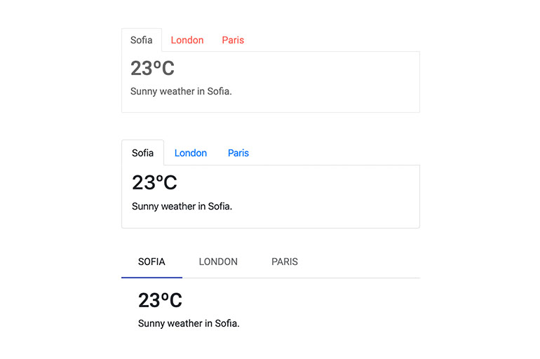
TabStrip Theming
The Telerik Blazor Tab Strip component has several built-in themes such as Default (our own styling), Material (based on the Material Design guidelines), Bootstrap (which looks like the Bootstrap styling to integrate better) and Fluent (based on Microsoft Fluent UI). You can easily customize any of out-of-the-box themes with a few lines of CSS, or create a new theme to match your colors and branding by using the Telerik SASS ThemeBuilder application.
-
Right-to-Left (RTL) Support
The Telerik UI for Blazor Tab Strip component supports right-to-left configuration. The RTL functionality is supported by most of our components to accommodate users who communicate in a right-to-left language script, such as Arabic and Hebrew.
Learn more in our Blazor Right-to-Left Support documentation

