
UI for Blazor
Blazor PanelBar
- Use the Blazor PanelBar component when you need to display data in collapsible panels.
- Part of the Telerik UI for Blazor library along with 110+ professionally-designed UI components.
- Includes support, documentation, demos, virtual classrooms, Visual Studio Code Extensions and more!

-
Display Data in an Accordion Type with Blazor PanelBar
The Telerik UI for Blazor PanelBar component combines a vertical bar, containing multiple panels with support for hierarchical data. Each panel can be expanded separately or together with others. The displayed data can be arbitrary—display anything from plain text to images and other Telerik UI for Blazor controls.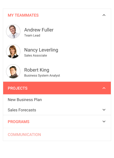
-
PanelBar Configuration
The component enables you to toggle between two modes: single (only one panel can be expanded at a time) and multiple (many panels can be expanded). Each of the panels can be additionally marked as disabled to prevent users from expanding it.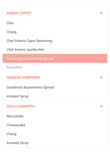
-
Templates
Use templates to specify how the content of each panel item is displayed. Leverage any combination of Telerik UI for Blazor controls to achieve the desired functionality.
Check out the Blazor PanelBar Templates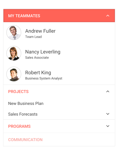
-
Hierarchical and Flat Data
The component works with both hierarchical and flat data. You can display simple linear structures such as a list of all employees in a company or complex hierarchical structures such as a complete organizational chart (e.g. all company employees, listed under their direct managers).
Example of Blazor PanelBar Hierarchical data
Example of Blazor PanelBar Flat data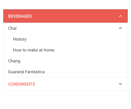
-
Events
Subscribe to the OnItemClick event to get notified when any component element (a panel or a panel item) is clicked. Subscribe to ExpandedItemsChanged to react when a certain panel is expanded. Subscribe to OnItemRender to know when an item is rendered so you can set a class to it.
The UI for Blazor PanelBar Component also exposes OnExpand and OnCollapse events. The two events are invoked when an expandable panel bar item is toggled. Both OnExpand and OnCollapse can receive an event argument called IsCancelled, which allows you to control further the triggering logic and whether to prevent the events from executing, respectively keeping the item's state unchanged.
-
Accessibility and Keyboard Navigation
The component can be navigated through a set of keyboard shortcuts: the Up and Down arrows control the currently selected item, the Right and Left arrows expand and collapse it, Home and End jump to the first and last items respectively and Enter expands the current panel or executes the current action (e.g., opens a link).
-
Blazor PanelBar Theming
The color scheme of the Telerik UI for Blazor PanelBar is entirely controlled by your active theme. You can easily modify the colors of the PanelBar with only a few lines of code.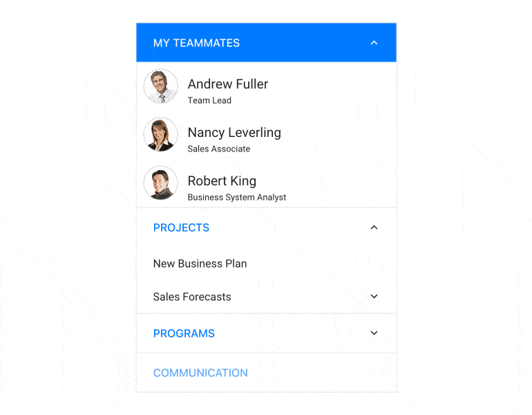
-
Right-to-Left (RTL) Support
The Telerik UI for Blazor Panel Bar component supports right-to-left configuration. The RTL functionality is supported by most of our components to accommodate users who communicate in a right-to-left language script, such as Arabic and Hebrew.
Learn more in our Blazor Right-to-Left Support documentation

