
UI for Blazor
Blazor Menu
- Show a list of options in a dropdown and popup menu structure, while letting users navigate in and out of your app.
- Part of the Telerik UI for Blazor library along with 110+ professionally-designed UI components.
- Includes support, documentation, demos, virtual classrooms, Visual Studio Code Extensions and more!

-
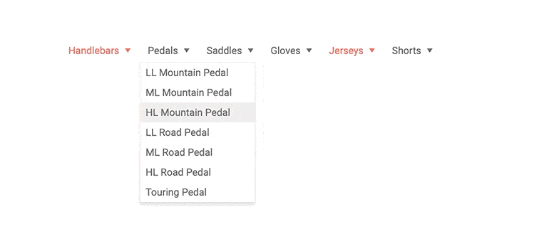
Show a List of Dropdown and Popup Options with Blazor Menu
The Blazor Menu component builds a navigation for you based on your texts, URLs, images and data. The Menu works in both Blazor WebAssembly (WASM) and server-side Blazor apps and provides flexible data binding and automatic fly-out menus for child items let you show your app’s navigation hierarchy to your user.
-
Menu Data Binding
A menu item model provides a few fields so the menu can render the desired text and link for you. Hierarchy is expressed either through flat binding and parent-child IDs, or by creating nested menu items collections in a recursive hierarchical data source. You can use your own field names and custom models, and point the menu to the right fields and it will do the rest.

-
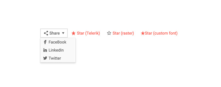
Menu Images
You can decorate menu items with icons and images to help your users navigate and find the page they are looking for. We provide a set of font icons for your use, and you can also use your own font icons, raster images or even sprites.
-
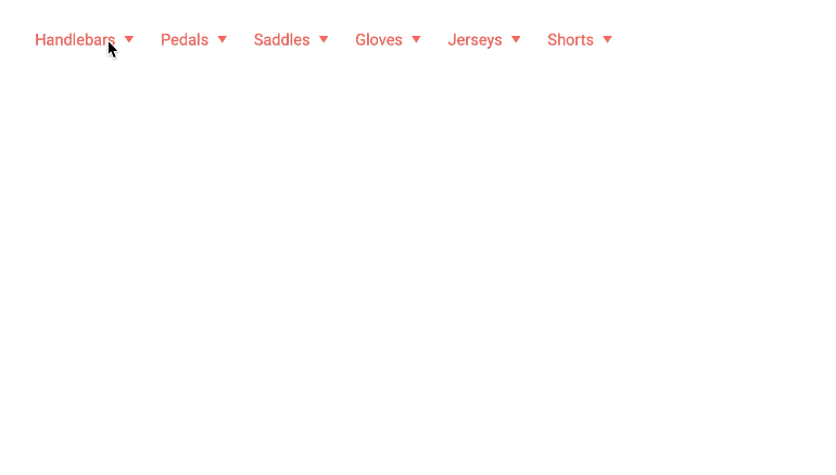
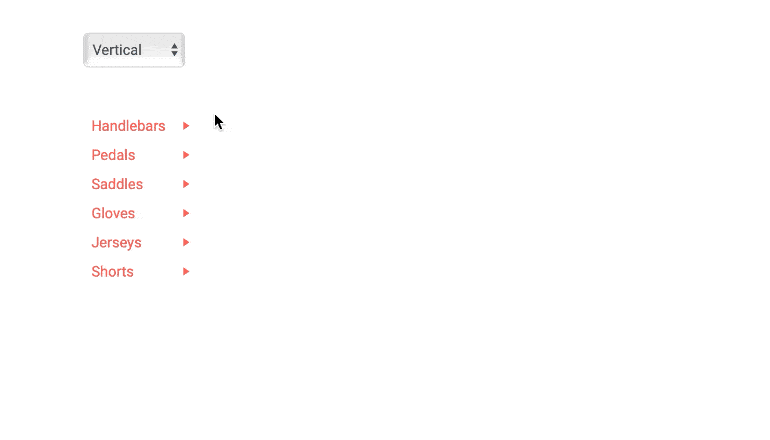
Menu Orientation
The Telerik Blazor menu can be both horizontal, or vertical, so it can match the layout you need – a horizontal one in your app header, or a vertical menu in the left-hand side navigation – just set a simple parameter.
-
Customizing Menu with Templates
If you want to implement more complex logic for your menus (like highlighting the current page, or rendering something more complex than links and text, or open certain links in a new tab), the Telerik Menu component has you covered – the item template lets you put HTML and components in the menu item as your business logic dictates.
See the samples for menu templates
-
Appearance
Customize the appearance of the Telerik UI for Blazor Menu, using the OnItemRender event. It enables you to apply conditional styling on its items based on specific criteria. The OnItemRender event fires for each node when it is about to render and allows you to set a Class for each li element based on an arbitrary condition.
-
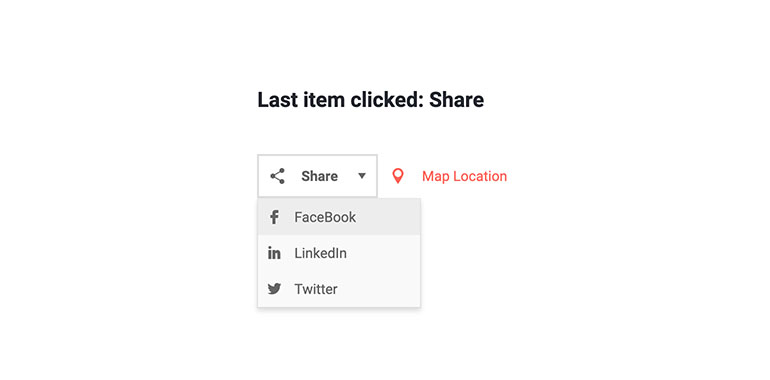
Menu Events
Some of your items may not have URLs at all and may not be links, but you still want your app to react when the user clicks them. Or, you may want to navigate the user only based on certain condition or logic that you have at runtime. The Telerik Blazor Menu helps you by exposing a click event for the items that you can respond to.
See the Menu Click event handling demo.

-
Menu Theming
The Telerik Blazor Menu has several built-in themes such as Default (our own styling), Material (based on the Material Design guidelines), Bootstrap (which looks like the Bootstrap styling to integrate better) and Fluent (based on Microsoft Fluent UI). You can easily customize any of out-of-the-box themes with a few lines of CSS, or create new theme to match your colors and branding by using the Telerik SASS ThemeBuilder application.
-
Right-to-Left (RTL) Support
The Telerik UI for Blazor Menu component supports right-to-left configuration. The RTL functionality is supported by most of our components to accommodate users who communicate in a right-to-left language script, such as Arabic and Hebrew.
Learn more in our Blazor Right-to-Left Support documentation

