UI for Blazor
Blazor Loader Container
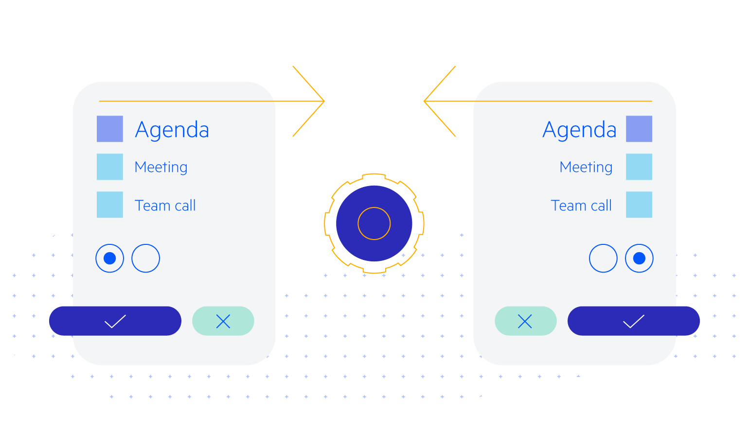
- Overlay the page or parts of it to indicate to users that an operation is ongoing with the Blazor Loader Container.
- Part of the Telerik UI for Blazor library along with 110+ professionally-designed UI components.
- Includes support, documentation, demos, virtual classrooms, Visual Studio Code Extensions and more!

-
Identify the Load Progress with Blazor Loader Container
The Telerik UI for Blazor Loader Container is a handy tool for displaying a progress indicator when a part of your app is loading. It notifies users that a process is running in the background, for example a Grid performing heavy data updates and waiting for a data refresh by the server.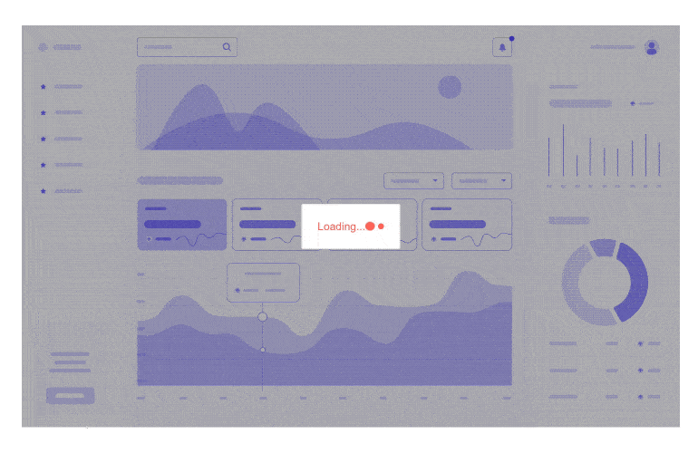
-
Blazor Loader Container Appearance
You have several options to customize the look and feel of the Loader Container. The component uses the Telerik UI for Blazor Loader and shares most of its properties. Choose from three different types of loading animations: Pulsing, Infinite Spinner and Converging Spinner. Set the size of the loader to small, medium or large. Select the color of the animated loading icon from our pre-defined themes or define your own.
Check out the Loader Container demo page.

-
Templates
With the Telerik UI for Blazor Loader Container, you can provide your own content by replacing the loading indicator HTML with custom loader graphics and animations.
Check out the Blazor Loader Container Templates in this demo
-
Blazor Loader Container Theming
The Telerik Blazor Loader Container component has several built-in themes such as Default (our own styling), Material (based on the Material Design guidelines), Bootstrap (which looks like the Bootstrap styling to integrate better) and Fluent (based on Microsoft Fluent UI). You can easily customize any of out-of-the-box themes, style a specific component instance or create new theme to match your colors and branding by using the Telerik SASS ThemeBuilder application.

-
Integration with Custom Components
If you are building components on your own, our engineers made sure to carefully implemented the Blazor Loading Container, so it is compatible with any custom component. We even use it in our Grid, ListView, Scheduler, Upload and more. Information on what you need to do to run them together can be found on our demo and docs page.
-
Right-to-Left (RTL) Support
The Telerik UI for Blazor Loader Container component supports right-to-left configuration. The RTL functionality is supported my most of our components to accommodate users who communicate in a right-to-left language script, such as Arabic and Hebrew.
Learn more in our Blazor Right-to-Left Support documentation