UI for Blazor
Blazor GridLayout
- The Blazor GridLayout provides the possibility to organize content in a sophisticated grid-layout with rows and columns.
- Part of the Telerik UI for Blazor library along with 110+ professionally-designed UI components.
- Includes support, documentation, demos, virtual classrooms, Visual Studio Code Extensions and more!

-
Organize Content in Sophisticated Manner with Blazor GridLayout
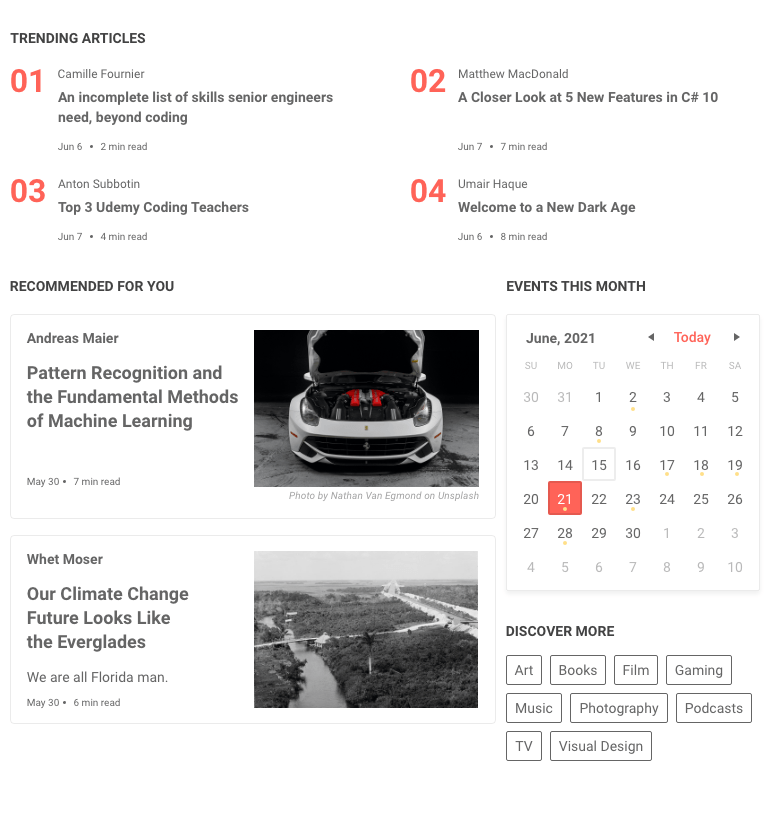
We developed the GridLayout for Blazor to provide you with an easy way to organize UI elements in a grid-layout system with rows and columns. The component is based on a CSS grid layout, thus items can be configured per specific row and column. Implementing it would give your project a sophisticated look, while practically organizing and displaying data in the most convenient way for your clients’ needs. This component is similar to the Gird in WPF and you can easily arrange elements in a familiar way.
See the Telerik UI for Blazor GridLayout demo
-
Customization
You can use various features to customize the component to answer your user’s requirements. Some of them include row and column spacing, horizontal and vertical align options, row height, column width and more.
-
RowSpan and ColumnSpan
With the GridLayout component you can easily specify which items you want to span across multiple rows or columns using the RowSpan and ColumnSpan commands.
Check out the documentation for more information -
Theming
With the GridLayout component you can apply several built-in themes such as Default (our own styling), Material (based on the Material Design guidelines), Bootstrap (which looks like the Bootstrap styling to integrate better) and Fluent (based on Microsoft Fluent UI) on the components stacked within the layout. Each theme predefines several series colors, so your data is visualized according to your design guidelines. You can further customize any of the out-of-the box themes, style a specific chart component or create new theme to match your colors and branding by using the Telerik SASS ThemeBuilder application.
-
Right-to-Left (RTL) Support
The Telerik UI for Blazor Grid Layout component supports right-to-left configuration. The RTL functionality is supported by most of our components to accommodate users who communicate in a right-to-left language script, such as Arabic and Hebrew.
Learn more in our Blazor Right-to-Left Support documentation

All Blazor Components
Data Management
Scheduling
File Upload & Management
Editors
- AutoComplete Updated
- CheckBox
- ColorGradient
- ColorPalette
- ColorPicker
- ComboBox Updated
- DateInput
- DatePicker
- DateRange Picker
- DateTimePicker
- DropDownList
- FlatColorPicker
- ListBox
- MaskedTextBox Updated
- MultiColumn ComboBox Updated
- MultiSelect Updated
- Numeric TextBox Updated
- RadioGroup
- Rich Text Editor
- Signature
- TextArea Updated
- TextBox Updated
- TimePicker
Data Visualization
- Area Chart
- Bar Chart
- Barcode
- Bubble Chart
- Candlestick Chart
- Chart Updated
- Column Chart
- Donut Chart
- Heatmap
- Line Chart
- OHLC Chart
- Pie Chart
- QR Code
- Radar Area Chart
- Radar Column Chart
- Radar Line Chart
- Range Area Chart
- Range Bar Chart
- Range Column Chart
- Scatter Chart
- Scatter Line Chart
- Stock Chart
- Trendline Chart Updated
- Waterfall Chart
Interactivity & UX
- AI Prompt New
- ChunkProgressBar
- Dialog
- Loader
- Loader Container
- Notification
- Popover New
- Popup New
- ProgressBar
- RangeSlider
- Skeleton
- Slider
- ValidationMessage
- ValidationSummary
- ValidationTooltip
Navigation
Layout
- Animation Container
- Avatar
- Card
- Carousel
- Form
- GridLayout
- MediaQuery
- PanelBar
- Splitter
- StackLayout
- TileLayout
- Tooltip
- Window
- Wizard
Geo Visualization
Document Processing
Productivity Tools
Gauges
Labels
Icons
