
UI for Blazor
Blazor Data Grid
- Visualize data and empower users to edit it with features like paging, sorting, filtering and more with Telerik UI for Blazor Data Grid.
- Part of the Telerik UI for Blazor library along with 110+ professionally-designed UI components.
- Includes support, documentation, demos, virtual classrooms, Visual Studio Code Extensions and more!
-
Everything You Need in a Blazor Data Grid
Flexible data visualization and manipulation thanks to 100+ Blazor Data Grid features from sorting and filtering to hierarchy and export. Each feature is meticulously documented and easy to implement. Read on to find out more about some of the most popular ones.
See Telerik UI for Blazor Grid Demo
Learn how to get started with Telerik UI for Blazor Data Grid

-
Editing Data in Grid
The Telerik Blazor Grid component lets your end users edit the data. They can alter or delete existing records or insert new ones—all the CRUD operations are conveniently exposed through events that give you the user action and the model, so all you have to do is add your business logic and call your data service. Excel-like editing is also supported in which the number of keystrokes is greatly reduced – hitting Enter will store the current cell value, move on to the next cell in the column, and automatically select its content so that the next keystroke will override it.
The grid also offers three built-in editing modes:
Popup
Inline where the entire row is being edited and saved at the same time,
InCell which lets you quickly edit only a certain field and send up the changes.
All 3 editing modes offer integration with validation through the Blazor built-in validation and the Telerik UI for Blazor Validation Tooltip component
Edited cells are always visible and selected so that users can always see what they are modifying.
Telerik UI for Blazor Grid Editing examples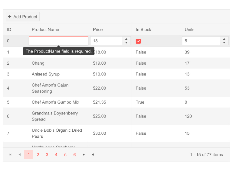
-
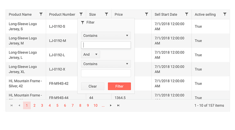
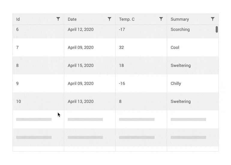
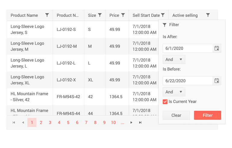
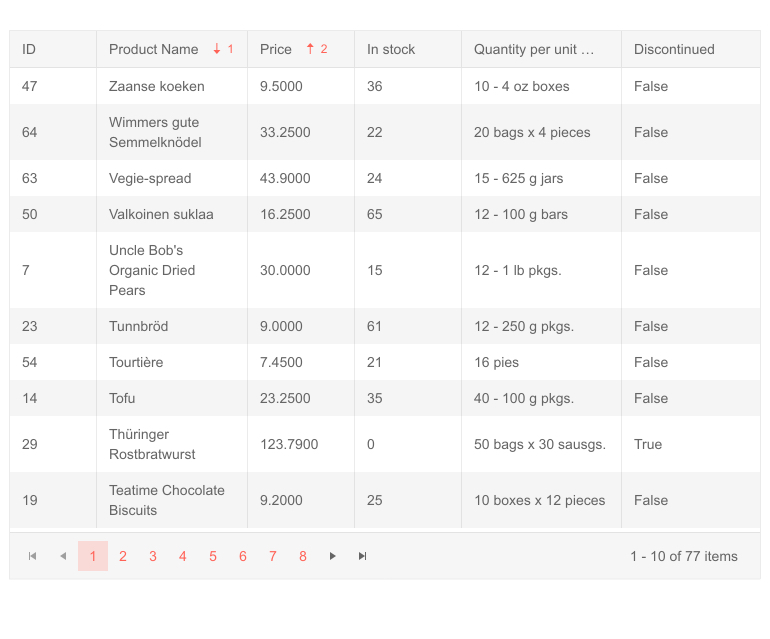
Grid Filtering
When you are looking for a certain record, or for rows that match a given criteria, you need to filter the data set. The Telerik Blazor grid lets your users do that effortlessly. The two different filtering modes offer different experiences—the always available Filter Row lets them type and filter immediately, while the Filter Menu takes up less real estate and lets them build more complex queries.
-
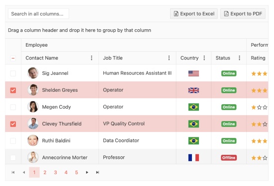
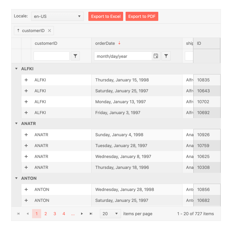
Grid Grouping
You can group the grid according to the values in different fields to see relationships between them, aggregates over the given groups and nest groups within groups to explore the data. Just set the Groupable parameter to true and you can simply drag the column headers to group by them.
See Telerik UI for Blazor Grid Grouping Demo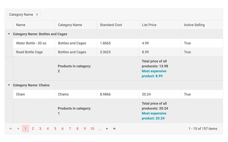
-
Grid Virtual Scrolling
Some users prefer to scroll through the data instead of using a pager. With large data sets, this can easily slow down your application. Telerik Grid avoids that by enabling Virtual Scrolling. It renders only the rows from the current page of data and swaps them as the user scrolls, instead of rendering a row for each and every item in the data source. You can even load on demand the next page, instead of providing all the data at once.
-
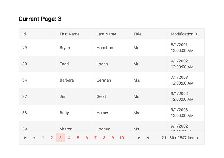
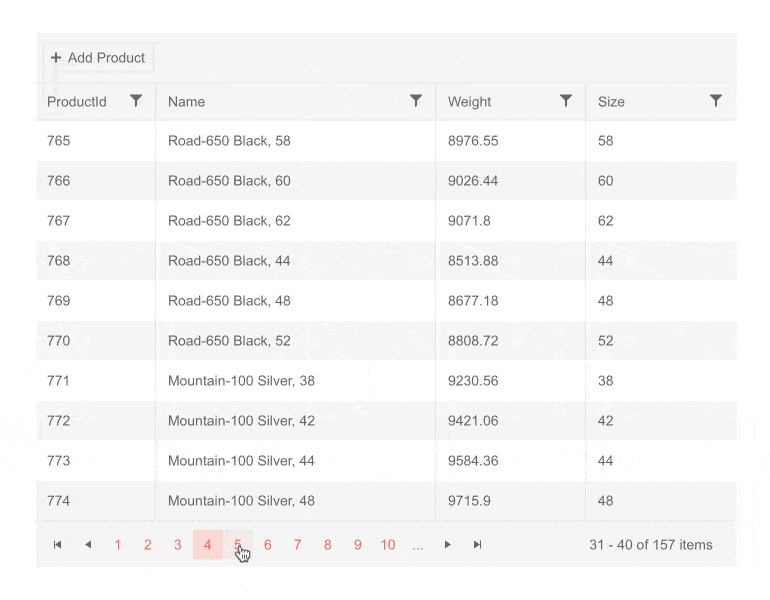
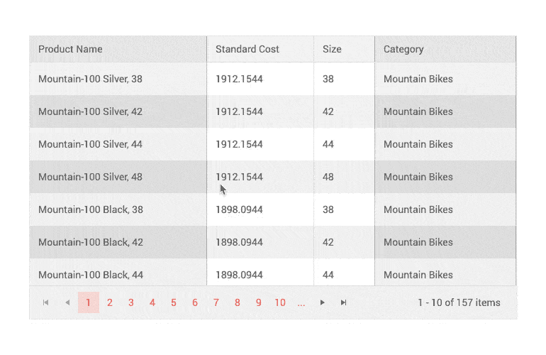
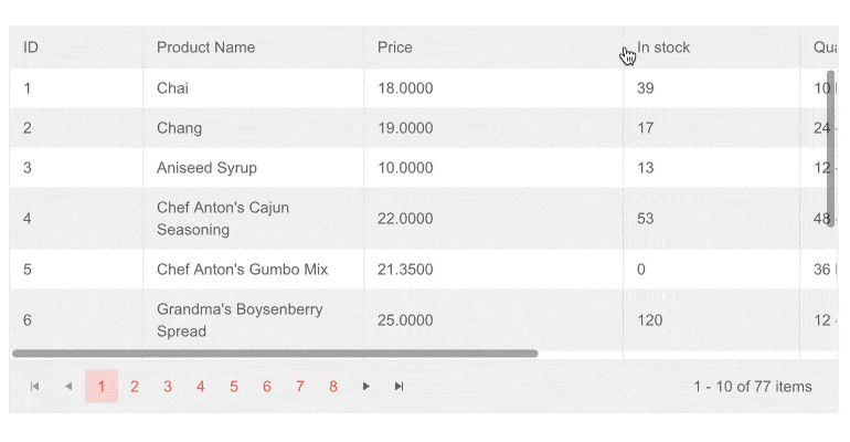
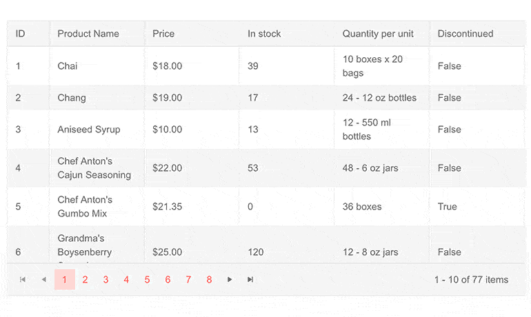
Grid Paging
Large datasets are commonly split into pages for the convenience of your end-users and to improve your app performance. The grid can do this for you automatically, just enable a single property.
Customization of the Grid Paging is also available and includes showing the page size, configuring the input type, choosing different Buttons count, and defining the pager position – bottom or top.
-
Search Box
The Search Box is an additional method of filtering records in a Grid, complementary to the Grid Filtering options but much simpler. To add a Search Box to your Grid, simply add a GridSearchBox to its children. Once done, users will be able to type text to immediately and intuitively filter grid elements. The Search Box also features a small X button to easily clear its contents which can also be triggered programmatically.
See Telerik UI for Blazor Grid SearchBox demo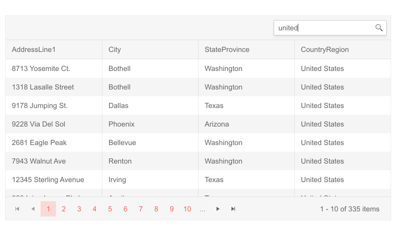
-
Multi-Checkbox Filters
Through the Multi-checkbox Filters, users can easily filter Grid data by a chosen value. This type of filter functions similarly to Microsoft Excel filtering and has many applications—from finding all sales made by an employee to finding all inventory items in a given category.
See the Telerik UI for Blazor Grid Multi-checkbox Filters demo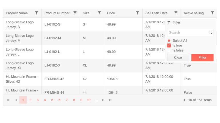
-
Compact Grid
Leverage the Compact Grid feature, implemented via the Size parameter configuration—also called a High-Density Grid—to display as much information as possible on a single screen by reducing the padding and margins used by the elements that comprise the Blazor Data Grid component. The end-result is a data table with a more condensed look-and-feel that gives the opportunity to display more data at once.
The Compact Grid feature is offered through the configuration options and can be used in combination with any of the built-in Default, Bootstrap, Material and Fluent themes.
See the Telerik UI for Blazor Compact Grid demo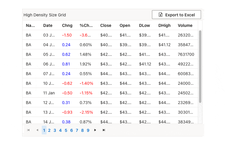
-
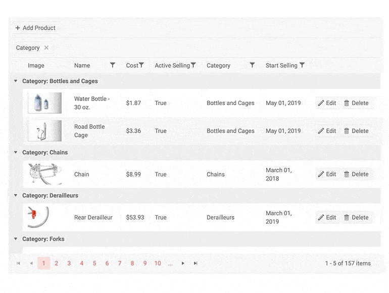
Grid Hierarchy
The row has a lot of details, but not all of them are important. Hide them in the Detail Template so the user can expand the row and see them when needed, without cluttering the main table.
The hierarchy feature of the grid is flexible and lets you drill down into data, expand and collapse the rows you want to look into and show data on demand. You can devise any layout you want and put a grid there to showcase hierarchical relationship between the nested grid and its parent row.
See Telerik UI for Blazor Grid Hierarchy Demo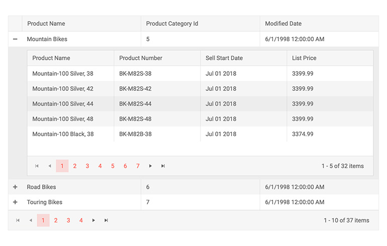
-
Grid Performance
You can improve performance by loading only the current page of data on demand using an IQueriable collection powered by EntityFramework (for a server-side Blazor app), or implementing your own data operations through the OnRead event (applies to both WASM and server-side Blazor). The custom data loading also applies to all other grid features such as paging, filtering and virtual scrolling, so you can make the most efficient database queries.
Examples of optimizing the data operations in the grid for better performance
-
Rebind Method
You can refresh the Grid data by using the Rebind method. With just one call, you can invoke processing of data and refreshed rendering. If you have manually defined the OnRead event, then the business logic defined in its event handler will be executed.
Check out an example of how the Rebind method works in the context of the Telerik UI for Blazor Grid component
-
Loading Animation
Sometimes it takes a while for your Grid to update some data on a heavily overloaded server. If you don’t want your users to stare at a blank screen during the operation, you can use the build-in Grid loading indicator to visually indicate that the data is being processed. The Grid is smart enough to show busy indicator when it detects detect a slow-running async data operation.
Check out the Teleri UI for Blazor Grid Loading Animation demo page for an example on how to implement it.
-
Load Groups on Demand
This time-saver feature is designed to enable you and your users to selectively process only a fraction of the information in your Grid that is needed at a given moment. If your Grid has grouping applied to it (either by the user or through the grid state) and the LoadGroupsOnDemand parameter is set to true, the Grid will collapse all groups by default and ask your data source for the data only when that specific group is expanded. If your groups are large, this one parameter can dramatically improve your performance and the discoverability of a specific group.
See Telerik UI for Blazor Grid Load Groups On Demand demo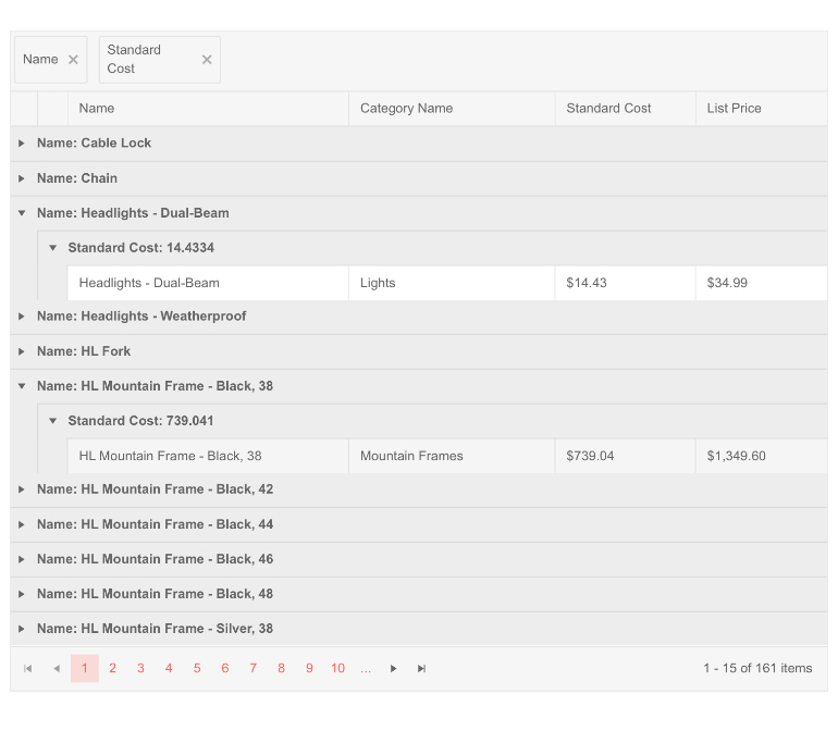
-
Grid support for dynamic ExpandoObject
The Telerik UI for Blazor Grid can also use data from a weakly-typed ExpandoObject. This is often the case when connecting to a backend based on older technologies and usually makes integration much harder the Grid takes care of it.
Check out Telerik UI for Blazor Grid Expando Object documentation
-
Grid State Management
At the end of the day, people want to shut down their computers, then come back tomorrow exactly where they left off. The Telerik Blazor grid lets them have this experience in a web app by saving and loading its state from any storage. Every user action that changes the grid display (such as paging, filtering, even editing) fires up an event that you can use to record its state so you can restore it as-is when the user logs back in, or even on the click of a button.
Grid State also lets you invoke these operations from other places in your app logic. For example, if something else happens in the app, you can tell the grid to filter by a certain field and value, or to go back to the first page.
Grid State Management examples - persist (save and load), and change programmatically.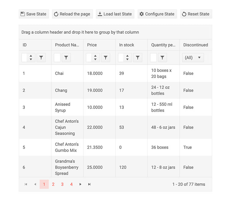
-
Blazor Grid Nested Models
Thanks to the out-of-the-box support of complex (nested, navigation) properties, the Telerik Blazor Grid can be bound to both primitive types and complex model objects.
An example on how to use complex models with navigation properties in Blazor Grid. -
Grid Data Binding
In the simplest case, you just point the data parameter of the Blazor Grid to your data collection and define the columns you want in it. The grid will do everything else for you (paging, sorting, filtering and so on).
Grid Data Binding examples
-
Bind Grid to DataTable
The Telerik UI for Blazor Grid can also use data from a DataTable object. This makes it easier to connect with legacy code which is still using DataTables.
-
Pass Context to Command Buttons
The Telerik UI for Blazor Grid component now allows you to have conditional command buttons depending on the properties of the row item. This is achieved by adding the current row item as a context (of type object) to the current ChildContent parameter. -
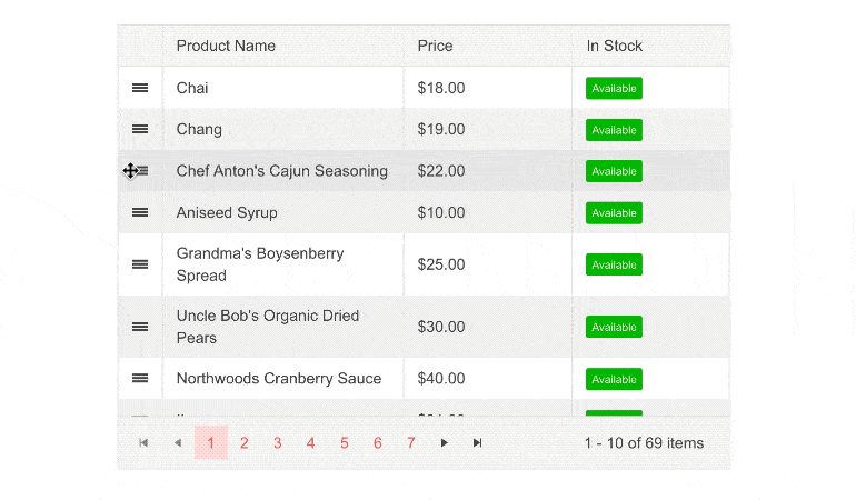
Row(s) Drag and Drop
To facilitate reordering items in the Grid or moving rows from one Grid to another, the control supports dragging and dropping. Enable the RowDraggable attribute and this will add a special column at the beginning of the table for users to hold on to while dragging.
-
Grid Custom Filter Rows and Menus
Custom filter rows and Custom filter menus are two more ways to tailor the Grid for your specific needs. They provide you with the ability to replace the built-in filters on top of each column in the Grid with a more user-friendly filter for your specific case. For example, instead of the general built-in feature for numbers which can be overwhelming, you might want to simply give the user options to pick min and max values without too much thinking.
Additionally, you can customize the Filter Menu buttons by modifying or completely removing the default Filter and Clear buttons.
See the Telerik UI for Blazor Grid Filter Template documentation
-
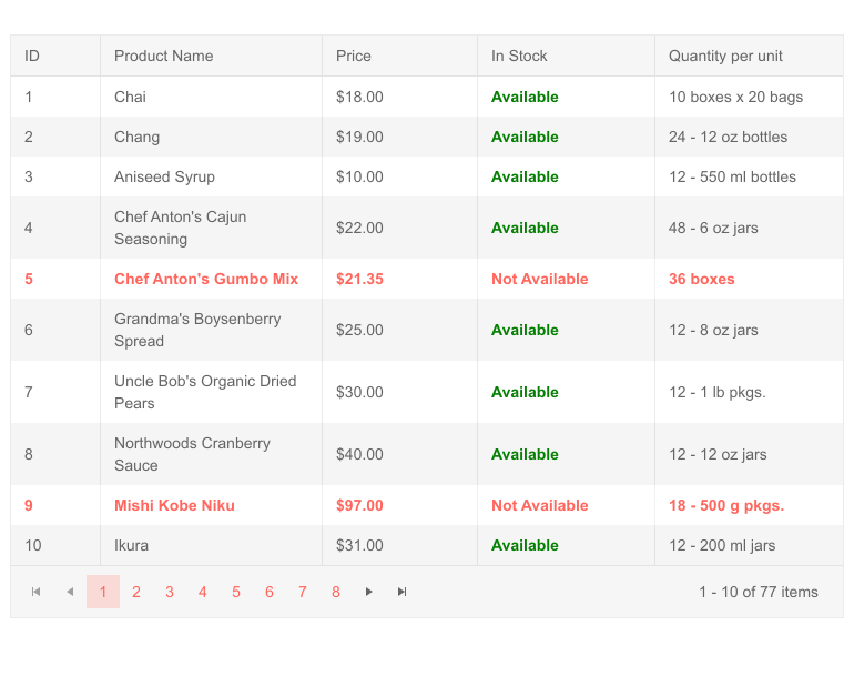
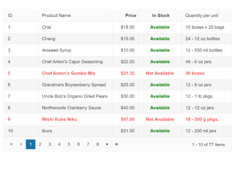
Conditional Formatting of Grid Cells
The Telerik UI for Blazor Grid component dispatches the OnCellRender event when any of the Grid columns is rendered. The event is raised for every cell in the column and is given information about the items for which the current cell is being used. Use this event to conditionally format the styling classes of the cell.
-
Conditional Formatting of Grid Rows
The OnRowRender event is fired whenever a Grid’s row is rendered. It is called once per row and in the handler you receive information about the current item being rendered. Use this method to conditionally format the styling of different rows.
-
Grid row click and double click events
Whenever a row in the Grid is clicked or double-clicked, the corresponding event is fired and you can handle it to do interesting things like showing a detailed view of that row in a separate control or fetching/sending more data about this particular item to the server.
-
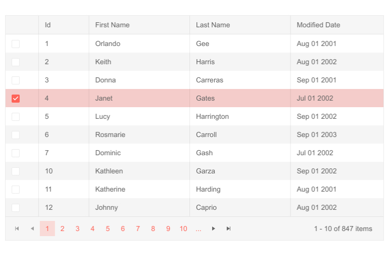
Grid Row Selection
When users highlight a certain row, you can use that information to show more data, other components or simply collect a list of their choices. The grid exposes all of this through single and multiple row selection modes, and also lets you select all items on the current page or across the entire grid, which comes in handy for batch operations like deleting many records at once, or moving data from one place (or state) to another. Select rows by clicking them or add a checkbox for selection to preserve the click interaction for cell editing.
The selected items offer a lot of flexibility – you can use two-way binding to predefine items or get your collection updated automatically; or you can consume an event so you can react to user activity and update your app.
-
Alignment of Cell Values
The grid columns provide a way to specify horizontal alignment for the content through the TextAlign parameter. You can choose from Left, Right or Center column alignment to structure your data in the most convenient way for your needs.
Explore the Different Formatting Options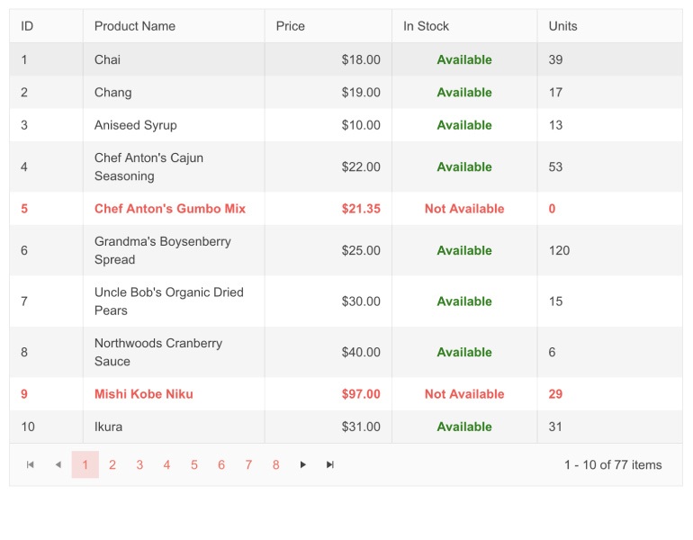
-
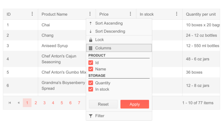
Column Menu
The Column Menu feature simplifies access to common operations and provides your app’s users with a convenient way to apply sorting, filtering, and toggle the visible and lock states of the columns from a central spot. You also have the ability to group columns within the menu and configure it further via the GridColumnMenuSettings tag.
-
Multi-Column Headers
In many scenarios, your tables will contain columns that represent several parts of a whole. For example, you might have a First and Last name columns, both of which store information about the person’s name. In these cases, the Grid component provides multi-column headers to help you visually represent the relationship between these columns.
Check out the Blazor Grid Multi-Column Headers demo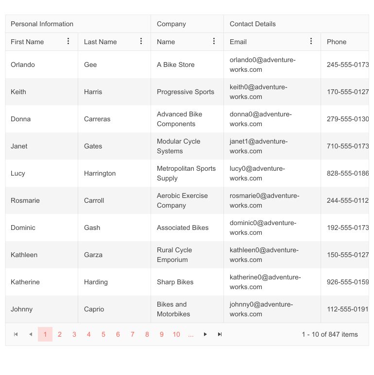
-
Multi-Column Sorting
With the Grid SortMode property, you can enable data sorting based on multiple grid columns. The SortMode accepts two values:
- Single (default value): Only one sort criteria can be applied to the data
- Multiple: Sorting on multiple columns. Sorting on a column and then sorting another one applies both sort criteria in the specified order.
-
Column Visible Property
Use the Grid column Visible property to programmatically control which Grid columns are visible. When a column needs to stay hidden at all times, you can directly set the column property Visible to false. However, you can also dynamically manage the column’s visibility in other cases when you need to provide conditional visibility. Check out more code samples on how to control column visibility in the Telerik UI for Blazor Grid.
-
Blazor Data Grid Header Cell CSS Class
To customize the appearance of any Blazor Grid column header, you can take advantage of the exposed HeaderClass parameter in the GridColumn tag. This would allow you to define custom CSS classes for the column header cells and easily bold their text, change their alignment or style them to make them stand out.
-
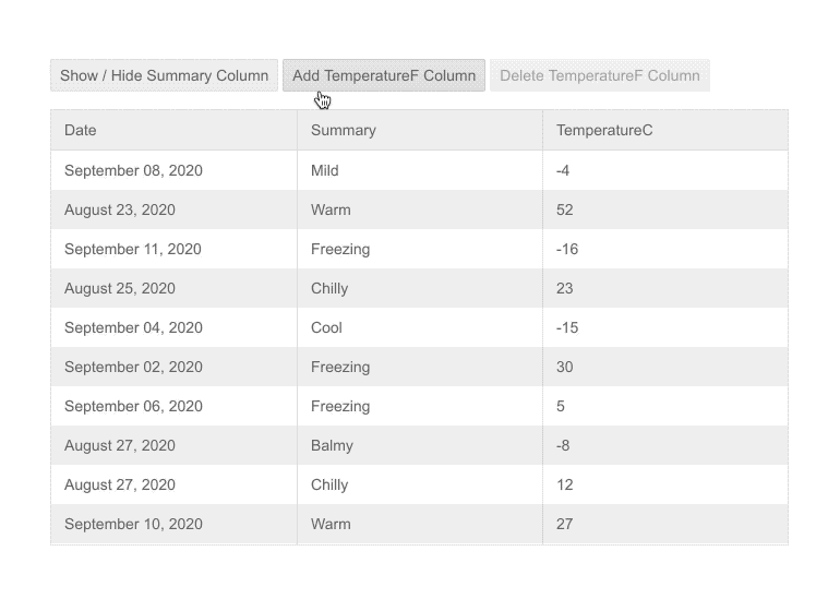
Grid Column Display Format
The Grid can print any value type with a custom display format to improve the readability of values. The display format can be specified either by adding an attribute on the data member in the class or by adding an attribute to the GridColumn tag.
-
Grid Column Scrolling
In addition to the row virtualization, you can add easily enable virtualization of the Grid columns. And the great thing is that you can have both rows and columns simultaneously virtualized for optimal performance when dealing with large volume of data rows and columns in your Blazor Grid.
Grid Column Virtualization Example -
Grid Column Resizing
You can define the desired width of each column in the grid according to the data you expect, or other business logic. Your users, however, may have a different preference, or a weird screen resolution, and they may want a new size for the columns. The Telerik Grid has you covered – it lets the users resize the columns and you can even store that state for each individual, so they don’t have to repeat it.
The Grid allows column resizing both programmatically (via methods) by developers and manually by end-users. End-users can resize columns by dragging the column border and dropping it to their desired location. As a developer, you can use three methods to resize the Data Grid columns:
AutoFitColumn adjusts the width of a column of your choice
AutoFitColumns adjusts the width of multiple columns of your choice
AutoFitAllColumns adjusts the width of all columns
-
Grid Column Reordering
When you declare the columns in a grid, you would usually put the most important ones first. A user may have a different need, task or preference, though, and the Telerik Blazor Grid lets them rearrange columns to fit their needs.
Column Reordering Demo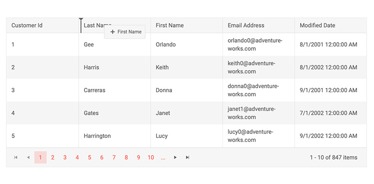
-
Grid Automatically Generated Columns
To simplify Grid columns definition, you can benefit from the automatic column generation feature. For cases when you want to display a list of columns in a Grid that are an exact match to your data model you can visualize, update, delete and insert records without extra overhead – all you have to do is set the Grid AutoGenerateColumns parameter to “true”.
Example of Grid Automatically generated columns.
Grid automatically generated columns work well together with column virtualization in Blazor Grid.
Check out an example of how to enable auto generated virtualized columns in Blazor Grid.
-
Grid Frozen Columns
In a grid with many columns, the users often scroll to the left and right and want to keep certain important columns visible at all times – such as IDs, command column to edit, selection column, or anything else of value. The Telerik Blazor grid brings the Excel Frozen Columns feature to the web with even more flexibility – you can keep columns frozen in the beginning, at the end, and even columns from the middle of the grid can be always visible and stick to one end.
-
Frozen Columns With Column Virtualization
Columns can be frozen even if column virtualization is enabled! Imagine a Grid full of sales data for a shop which has been operating for 20 years – the first column may contain the list of items while all the others store sales on a monthly basis for each item. That’s 20 * 12 = 240 columns! Browsing this data is trivial if you virtualize the columns but freeze the item names – this way you users can easily check the sales for a specific month without performance hitches.
-
Fit Column Width To Content
Columns can be automatically resized so that their width equals width of the widest cell in the column, similar to how MS Excel and other spreadsheets operate.
-
Custom Filter
You can customize the filter editor rendered within the FilterRow, FilterMenu and ColumnMenu of the Blazor Data Grid component. Using the FilterEditorType parameter within the GridColumn tag you can easily set it and render a DateTime picker rather than the default Date picker.
See how to customize the default row filter editor in Telerik Blazor Grid.
-
Custom Editors via EditorType Parameter
The Blazor Grid component exposes an EditorType parameter, which provides a simple way to change the default field editors without using templates. To do that, simply provide your preferred editor in the GridColumn tag. You have the flexibility to choose between a DatePicker or DateTimePicker for the DateTime type, TextBox or TextArea for the string fields, and Checkbox or Switch for the Booleans.
See how to add custom editor Date and Time in Blazor Data Grid.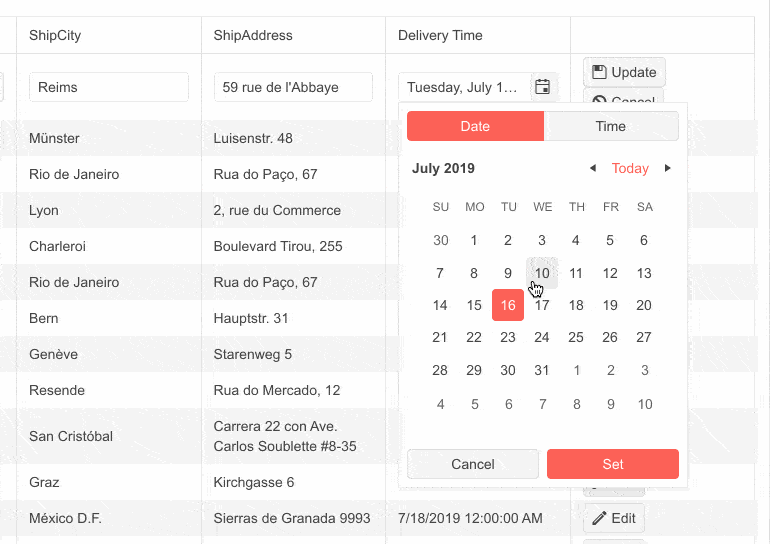
-
Customize Default Filter
In addition to using a filter template, you have at hand a couple of parameters that let you customize the built-in filtering in the Blazor Data Grid component. You can set the default filter operator and control whether the filter dropdown and clear buttons are visible. The configuration of the ShowFilterCellButtons and DefaultFilterOperator parameters is done within the GridColum tag.
-
Custom Popup Editing Window
The Blazor Data Grid component exposes multiple settings for its popup editor. You can set the (max)width, (max) height, CSS class. In addition, we provided GridPopupEditFormSettings tag that allows you to configure the orientation of the form (either horizontal, or vertical), the columns, and columnspacing layout parameters of the form, and the horizontal alignment of the Buttons in the form through ButtonsLayout.
-
Custom FilterOperators in Blazor Data Grid
The list of filter operators within the filter row and filter menus of the Blazor DataGrid component can be customized on a per-column basis. To add your own list of filter operators, you need to set the FilterOperators parameter within the <GridColumn> tag. If not explicitly defined, a default list of available operators will be used based on the field type.
-
Customization Based on Screen Space
Thanks to the Telerik UI for Blazor MediaQuery component, the Grid can be easily configured to accommodate a vast array of devices – you can hide or show columns depending on how much screen real estate you have available! Any customization option can be used together with the MediaQuery to serve as many users as possible.
-
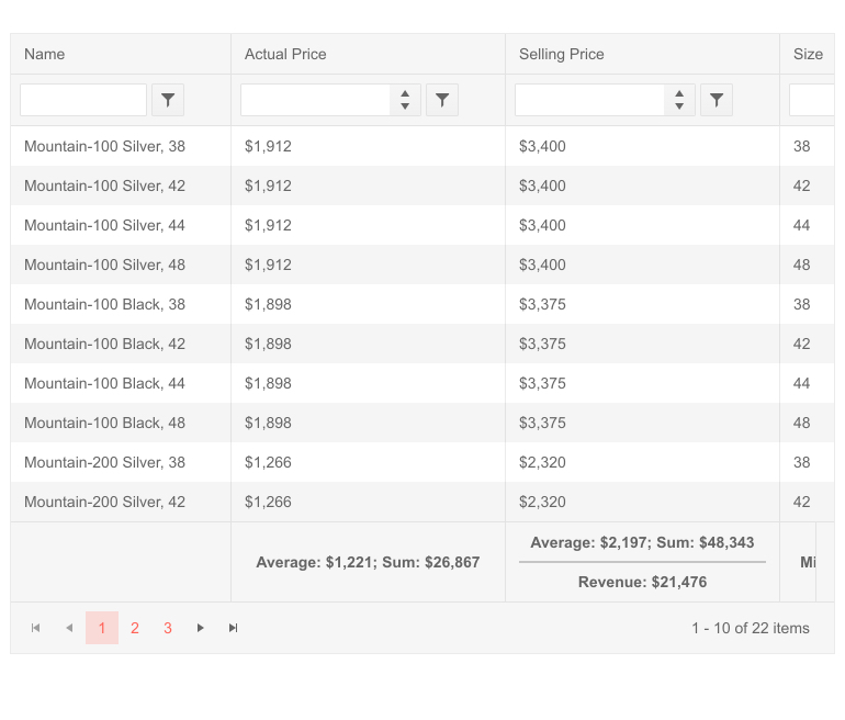
Footer Template for Aggregates
Display aggregated results in the Grid footer template for each data-bound column, commonly referred to Grand Total. This is especially useful in finance apps or internal reports where you can quickly give a summary of the data. Both of those examples aggregate values of each column and can show custom content. The footer template will always remain visible regardless of the vertical scrolling of the Grid.
-
Customizing Grid with Templates
The Telerik UI for Blazor Data Grid lets you customize the content rendered in its cells, editors and various headers and footers so you can tweak it according to your needs and to also show extra data.
You can define:
- Special content for the cells – from specific formatting for a string or number to entire components like charts and tooltips can go into each data cell.
- Your own editors – while the grid offers built-in editors according to the field type, you can define your own where you can implement further logic, rendering and appearance.
- Column header – when the field name is not enough and you want to add more context – you can add anything, from multiline text to actionable buttons.
- Column Group footer – a great place to add aggregates information (which the grid provides for you).
- Group header – more descriptions about the current grouping level, including data aggregates.
- The entire row rendering – you can render your own HTML, down to the elements, instead of the grid.
- Pager appearance – completely replace the pager with your own custom markup.
- Popup Edit Form – the template allows you to modify or render custom content in the create/edit Popup window.
- Popup Buttons – you can personalize the appearance and behavior of the buttons in the create/edit Popup window of the grid.
-
Grid Theming
The Telerik Blazor Grid component has several built-in themes such as Default (our own styling), Material (based on the Material Design guidelines), Bootstrap (which looks like the Bootstrap styling to integrate better) and Fluent (based on Microsoft Fluent UI). You can easily customize any of out-of-the-box themes, style a specific component instance or create new theme to match your colors and branding by using the Telerik SASS ThemeBuilder application.
-
Right-to-Left (RTL) Support
The Telerik UI for Blazor Grid component supports right-to-left configuration. The RTL functionality is supported by most of our components to accommodate users who communicate in a right-to-left language script, such as Arabic and Hebrew.
Learn more in our Blazor Right-to-Left Support documentation

-
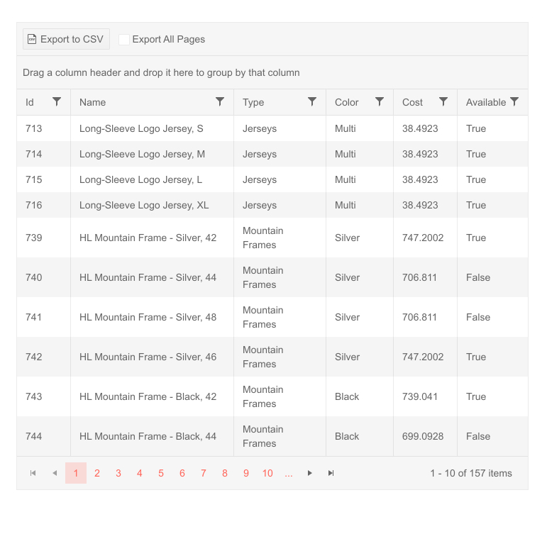
CSV Export
The Telerik Blazor Grid now has the functionality to be exported to a CSV format. It is easily configured in the toolbar by adding a dedicated command button. After exporting, you will have all applied filters, sorting, paging, grouping and column ordering transferred to the CSV file. You have the option to export only the current page, or all the data.
-
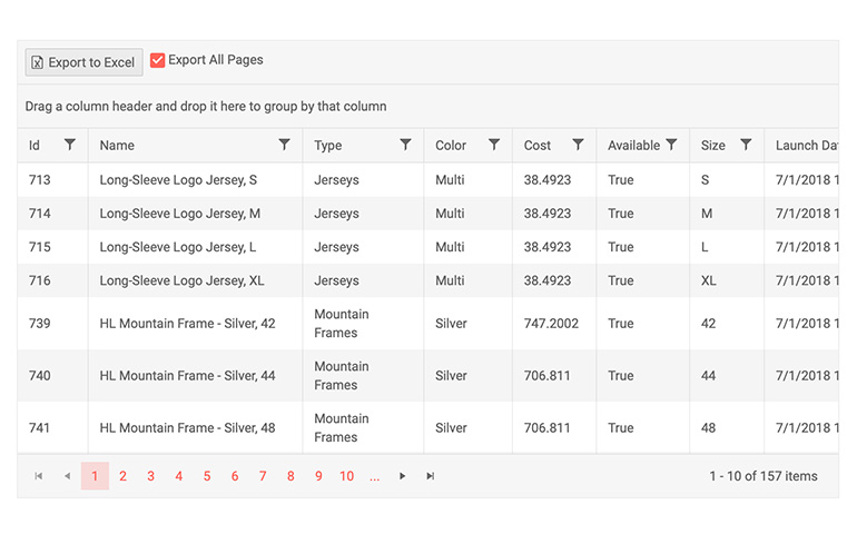
Grid Export to Excel
Users in both Blazor server-side and WebAssembly applications can easily export Grid data to Excel with a click of a button. The exported file will preserve the Grid settings, so that filtering, sorting, paging, grouping, column order and column size are applied to data in the xlsx document. The export allows developers to set the resulting file name and configuration of the data to be exported – current shown page or all pages in the grid. Developers also control which data items or columns to be included in the exported file (via the OnBeforeExcelExport event) and the exported columns’ width seamless support. Excel and CSV exports can be triggered programmatically (via the newly exposed methods in the API).
-
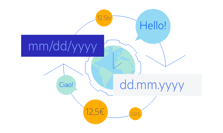
Grid Globalization and Localization
The Telerik Blazor Grid responds to the user culture automatically – for example, formats in numeric inputs and date inputs use the current user culture, and strings such as pager tooltips and command buttons’ texts can be easily translated.
-
Grid Accessibility and Keyboard Navigation
Users with disabilities need to use your site as well, and the Telerik Grid component helps in that regard – it uses semantic markup and covers the current accessibility standards (including WCAG, Section 508 and WAI-ARIA attributes for screen readers). Moreover, you can navigate around the grid and invoke all actions with the keyboard alone.

-
Keyboard Navigation with Column Virtualization
This feature enables users to use keyboard navigation with virtual columns in the Grid component. As the standard shortcuts are still applicable, there are some differences. The Home and End buttons move focus to the first or last cell in the virtual column range for a cell not in edit mode. The combination of Alt + Home/End button results in moving focus to first/last cell in a row, also not in edit mode. Pressing F2 puts the row in edit mode, if inline edit mode is enabled and Tab focuses the next focusable element in the virtual column range.
