UI for Blazor
Blazor Filter
- The Blazor Filter component allows users to quickly build filter expressions using a point-and-click approach.
- Part of the Telerik UI for Blazor library along with 110+ professionally-designed UI components.
- Includes support, documentation, demos, virtual classrooms, Visual Studio Code Extensions and more!
-
Overview
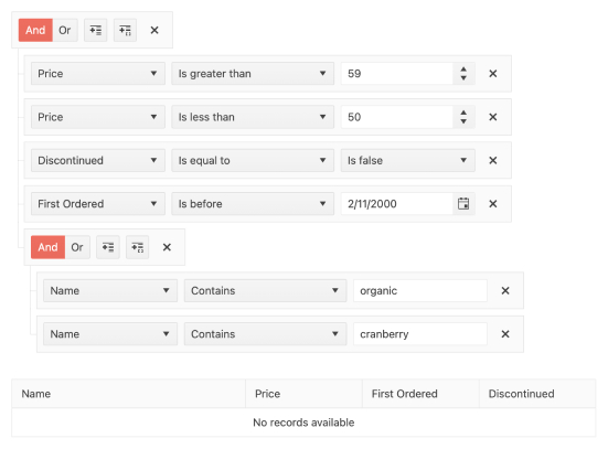
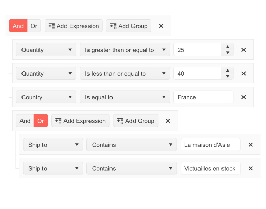
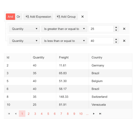
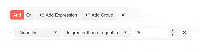
The Blazor Filter component (also known as a query builder) allows users to build filter expressions using a point-and-click approach. The filtering rules can contain multiple logical operators and expressions and can be applied to any data-bound component such as the Grid, ListView and TreeList.
-
Filter Operators
You can configure the Blazor Filter component by adding custom operators per field using the Operators parameter.
-
Expressions and Group of Expressions
Using the Telerik UI for Blazor Filter, users can easily add and remove new expressions or groups of expressions with the provided built-in buttons.
-
Localization
The Filter UI component comes with built-in localization of the logical AND & OR operators, the Close button of each group/filter and the Add Expression and Add Group texts. The translated text is available for customization through the Resource file.
-
Customization of the Filter Default Operator
The DefaultOperator parameter of the Blazor Filter component allows you to customize the default filter operator on a per-field basis (the filter that is preselected each time you add a new field). If unassigned, the default operator will be set based on the data type.
See an example of custom filter operators in the Blazor Filter component.
-
Theming
The Telerik Blazor Filter component has several built-in themes such as Default (our own styling), Material (based on the Material Design guidelines), Bootstrap and Fluent. You can easily customize any of out-of-the-box themes with a few lines of CSS, or create a new theme to match your colors and branding by using the Telerik SASS ThemeBuilder application.
-
Right-to-Left (RTL) Support
The Telerik UI for Blazor Filter component supports right-to-left configuration. The RTL functionality is supported by most of our components to accommodate users who communicate in a right-to-left language script, such as Arabic and Hebrew.
Learn more in our Blazor Right-to-Left Support documentation