UI for Blazor
Blazor DatePicker
- Effortlessly edit and select values directly into the input area or from a calendar popup with the Blazor DatePicker Control.
- Part of the Telerik UI for Blazor library along with 110+ professionally-designed UI components.
- Includes support, documentation, demos, virtual classrooms, Visual Studio Code Extensions and more!
-
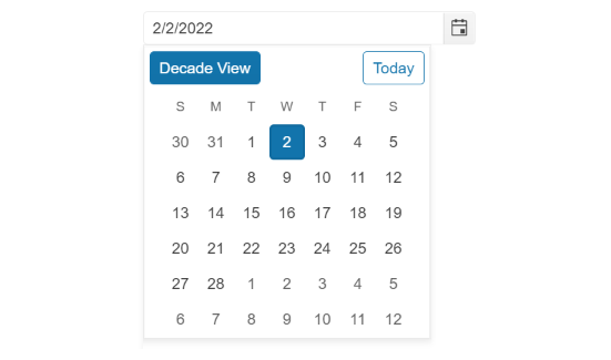
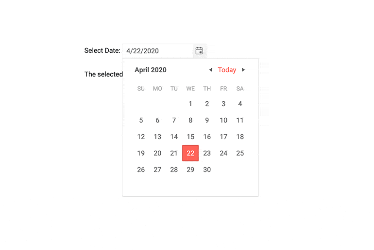
Display a Popup Calendar for Date Selection in Your Blazor App
The Blazor DatePicker component enables the user select and enter only a valid date from a calendar panel that conforms to the specified format, culture, min and max settings. The DatePicker works in both (WASM) and Server-side Blazor apps and also supports forms validation, keyboard navigation and provides events.
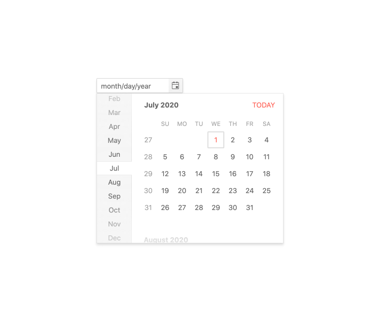
The user is presented with a calendar popup they can use to navigate in a visual manner to choose the desired date.
Check out the Blazor DatePicker demo
-
DatePicker Step Interval
Each of the component’s segments (e.g. the hours segment) can be incremented or decremented with the arrow keys. By default, increments occur at a rate of 1 but if you would rather control that step you can. For example, if you are a building an interface for making appointments and your time slots are 30min long, you make the minutes segment change by 30minutes.
-
DatePicker TabIndex
The Blazor DatePicker component, just like all other Telerik UI for Blazor input components, supports keyboard navigation to switch between components thanks to the HTML TabIndex property. Pressing Tab will normally focus the next available input component, the same way your users are accustomed to when standard HTML inputs are used. Having the TabIndex setting lets you customize that order. -
DatePicker Disabled Dates
If there are dates the user must not pick, because they are a bank holiday or otherwise a special day, you can disable them by providing a simple list of them to the Telerik DatePicker.
-
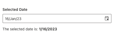
DatePicker Supported Date Formats
The Telerik Blazor DatePicker restricts input to the format specified by the developer. This ensures a valid date, and full control over the display.
You can choose from the standard .NET format specifiers, and to also write your own – just like you would with any C# code.
-
DatePicker Week Number Column
Leverage the Week Number Column feature in the Telerik UI for Blazor DatePicker component to quickly add the corresponding week number (one through 52) to any date or date range.
-
DatePicker Popup Settings
The DatePicker allows you to simply configure popups from a single tag. In addition to that, the Open and Close methods allow you to toggle the popup visibility without triggering the OnOpen/OnClose events.
-
DatePicker Configuration Options
The two auto-tabbing Telerik UI for Blazor DatePicker properties named AutoSwitchParts and AutoSwitchKeys give you more options while editing year, month and date values. Additionally, users can benefit from copy-and-paste functionality to copy a date format and directly paste it into the DatePicker component.
The Telerik UI for Blazor DatePicker also supports a TwoDigitYearMax property, an AutoCorrectParts property and an AllowCaretMode property to further improve and optimize your and your users’ experience with the component.
-
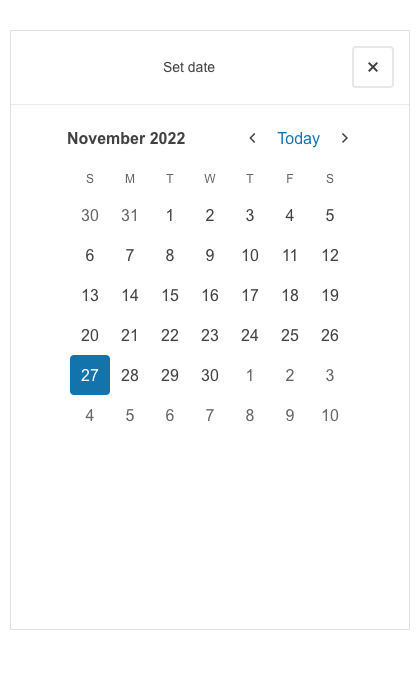
DatePicker Adaptive Rendering
Enable a mobile-friendly rendering of the DatePicker popup by setting the AdaptiveMode parameter to AdaptiveMode.Auto. The picker component automatically adapts to the current screen size and changes its rendering accordingly. In auto adaptive mode, the DatePicker component also allows you to define the title text rendered in the header of the popup.
-
DatePicker Validation
Form validation through DataAnnotation attributes comes out-of-the-box with the Telerik Blazor Date Picker.

-
DatePicker Validation Modes
The DatePicker comes with validation modes which allow you to configure whether to trigger validation on change, blur or while typing, which let’s set the right one for a particular use case.
-
DatePicker Events
The DatePicker offers the standard ValueChanged event and also an OnChange event that still lets you react to the user choosing a new date, but does not prevent two-way binding.

-
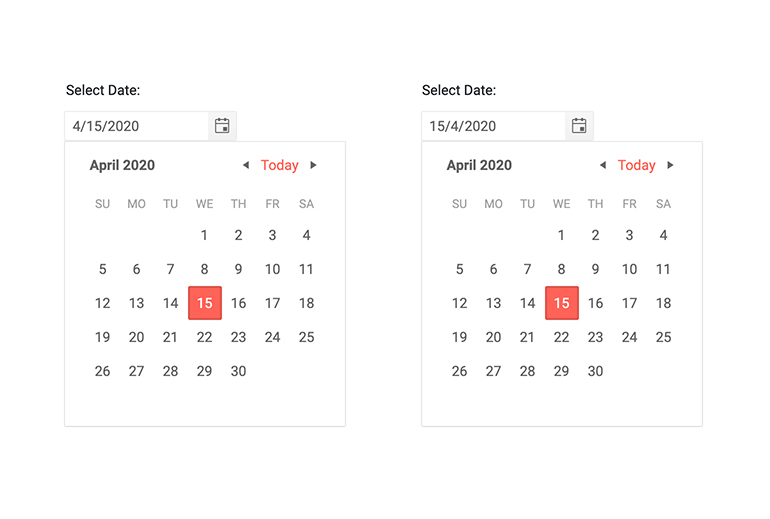
DatePicker Globalization and Localization
The Telerik DatePicker automatically carries culture-aware formats to the client so users see the dates they are used to – for example, if you set the format to “d” people in the US can see MM/dd/yyyy while people in the UK can see dd/MM/yyyy. Days of the week and button texts are easily translatable to any language.
Example of Telerik UI for Blazor DatePicker Globalization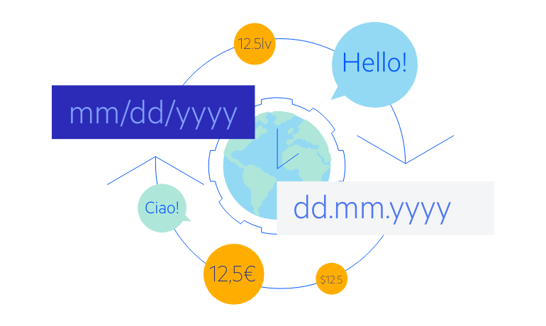
-
DatePicker Accessibility and Keyboard Navigation
The Telerik DatePicker component honors web accessibility standards (WCAG, Section 508 and WAI-ARIA attributes for screen readers) and lets you enter values with the keyboard only – not only by typing, but also by pressing the arrow keys, which includes navigation in the calendar popup as well – all without ever touching the mouse.

-
DatePicker Theming
The Telerik Blazor DatePicker has several built-in themes such as Default (our own styling), Material (based on the Material Design guidelines), Bootstrap (which looks like the Bootstrap styling to integrate better) and Fluent (based on Microsoft Fluent UI). You can easily customize any of out-of-the-box themes with a few lines of CSS, or create new theme to match your colors and branding by using the Telerik SASS ThemeBuilder application.
-
Also Available...
-
Right-to-Left (RTL) Support
The Telerik UI for Blazor DatePicker component supports right-to-left configuration. The RTL functionality is supported by most of our components to accommodate users who communicate in a right-to-left language script, such as Arabic and Hebrew.
Learn more in our Blazor Right-to-Left Support documentation
-
Blazor DatePicker Header Template
Using the <HeaderTemplate> you can add custom buttons or render your own content in the Blazor DatePicker header.
See custom Blazor DatePicker header content.