
UI for Blazor
Blazor Context Menu
- The Blazor Context Menu component features flexible integration with its target element and powerful data binding.
- Part of the Telerik UI for Blazor library along with 110+ professionally-designed UI components.
- Includes support, documentation, demos, virtual classrooms, Visual Studio Code Extensions and more!
-
Apply Menu with Blazor Context Menu
The Telerik UI for Blazor Context Menu component serves to provide you with an easy method for implementing what’s usually a long and difficult process – a context menu which pops when a user right-clicks on your UI. It’s best used when you want to add advanced commands for the user to execute while preserving screen space for more important information. The Context Menu isn’t limited to a flat list – it might as well render a hierarchical structure of commands.
Check out the Blazor Context Menu Demo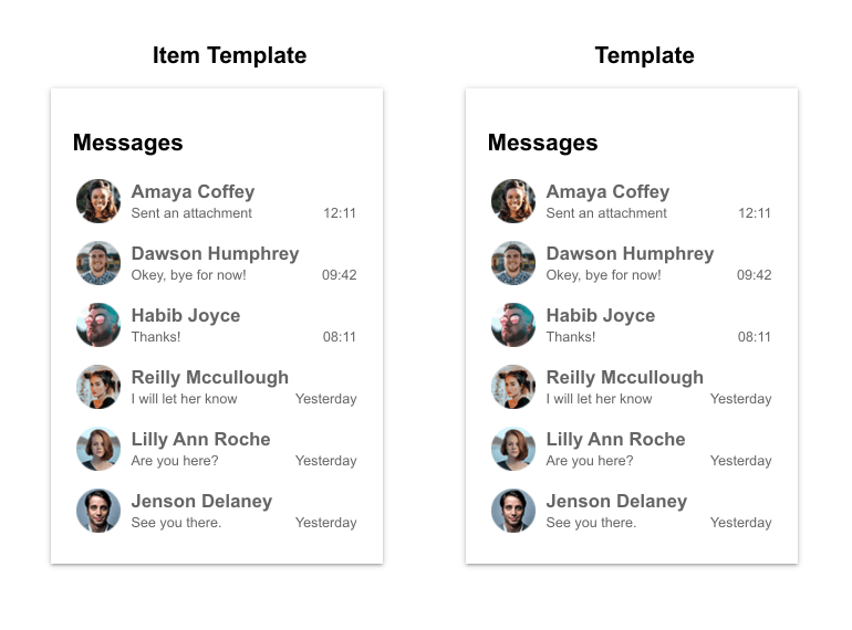
-
Blazor Context Menu Data Binding
The Context Menu is can be fully data bound. If your Context Menu only contains a flat list of items, you only need to provide a description of those items in a list. For each item, pass relevant information like the text to display to the user or a URL to take them to. When you want to create a tree-like Context Menu, there are 2 approaches you can take. Method 1 is similar to the first one in that you provide a flat list, but every item also has an assigned a parent which determines where it should be rendered. Method 2 allows you to pass a tree-like object which stores all of the items as its children. Detailed explanation and examples can be found in our documentation.

-
Navigation
It’s not a requirement for the items in your Context Menu to always do something on your page – they can similarly act as links to navigate the user to a more relevant page. For example, when someone right-clicks on the “Financial results for a given Q” in a Grid column, you might want to give them the option to load another page which visualizes the list of deals which happened during that Q.
-
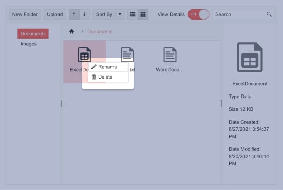
Blazor Context Menu Icons
Context Menu items can be accompanied by an icon to help the user pick the right one. Icons can be specified via an image, an icon class or a font icon (we offer a large set of built-in icons you can use too). You can add an icon to every single item or to avoid doing that all together.
Check out the Blazor ContextMenu Items demo -
Blazor Context Menu Templates
The Context Menu component works with 2 separate types of templates – one allows you to override the look of the separate items (perhaps you want to display more than text and an icon?), and the other allows you to change the entire popup altogether (and use something different than the default unordered list?).
-
Appearance
Customize the appearance of the Telerik UI for Blazor ContextMenu, using the OnItemRender event. It enables you to apply conditional styling on its items based on specific criteria. The OnItemRender event fires when each Context Menu item renders and allows you to set a Class for each li element based on an arbitrary condition.
-
Context Awareness
While you can easily attach the same menu to many targets through its Selector parameter, you can also customize it for each target and each time it shows.
You can further make it show up at a designated position relative to the viewport, and you can then handle the DOM event yourself (such as hooking to the @oncontextmenu of your own elements).
This also allows you to integrate it with complex components like the grid so you can put additional commands in it, instead of having a command column take up screen real estate.
-
Events
When a menu item is clicked, the component will broadcast an OnClick event which you can handle to execute whatever is needed for your command to function.
Learn more about Context Menu Events
-
Context Menu Themes
The Telerik Blazor Context Menu component has several built-in themes such as Default (our own styling), Material (based on the Material Design guidelines), Bootstrap (which looks like the Bootstrap styling to integrate better) and Fluent (based on Microsoft Fluent UI). You can easily customize any of out-of-the-box themes with a few lines of CSS, or create new theme to match your colors and branding by using the Telerik SASS ThemeBuilder application.
-
Right-to-Left (RTL) Support
The Telerik UI for Blazor Context Menu component supports right-to-left configuration. The RTL functionality is supported by most of our components to accommodate users who communicate in a right-to-left language script, such as Arabic and Hebrew.
Learn more in our Blazor Right-to-Left Support documentation

