UI for Blazor
Blazor CheckBox
- The Blazor CheckBox control features three states, events, accessibility, keyboard navigation and powerful theming.
- Part of the Telerik UI for Blazor library along with 110+ professionally-designed UI components.
- Includes support, documentation, demos, virtual classrooms, Visual Studio Code Extensions and more!
-
Utilize, Style and Customize CheckBoxes Seamlessly with Blazor CheckBox
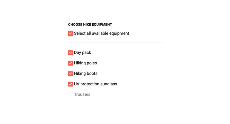
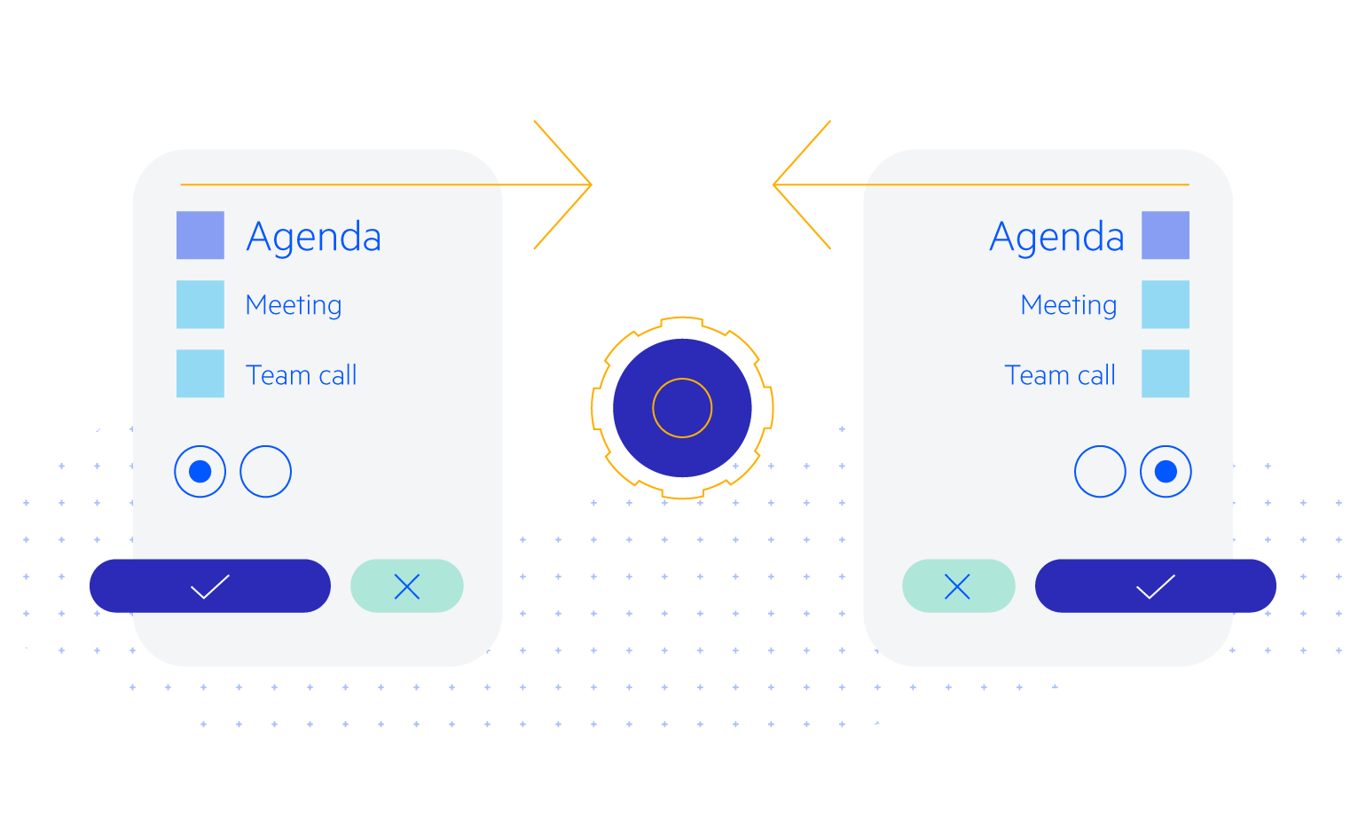
The Blazor Checkbox component will let you add styled and customized Checkboxes to WebAssembly (WASM) and Server-side Blazor apps. App users can select one, many or all of the listed options.
-
CheckBox TabIndex
The Blazor CheckBox component, just like all other Telerik UI for Blazor input components, supports keyboard navigation to switch between components thanks to the HTML TabIndex property. Pressing Tab will normally focus the next available input component, the same way your users are accustomed to when standard HTML inputs are used. Having the TabIndex setting lets you customize that order. -
Checkbox Events
The Telerik Blazor Checkbox component exposes multiple events like ValueChanged, OnChange and InderminateChanged that let you easily handle the flow of checkbox selection and determine the next steps in your app logic.

-
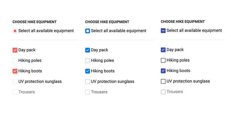
Checkbox Styling
Need to go out of the ordinary and add a fancy Checkbox to your Blazor app? You can add custom style, icons and change the default checkmark.

-
Checkbox Theming
The Telerik Blazor Checkbox has several built-in themes such as Default (our own styling), Material (based on the Material Design guidelines), Bootstrap (which looks like the Bootstrap styling to integrate better) and Fluent (based on Microsoft Fluent UI). You can easily customize any of out-of-the-box themes with a few lines of CSS, or create new theme to match your colors and branding by using the Telerik SASS ThemeBuilder application.
-
Right-to-Left (RTL) Support
The Telerik UI for Blazor CheckBox component supports right-to-left configuration. The RTL functionality is supported by most of our components to accommodate users who communicate in a right-to-left language script, such as Arabic and Hebrew.
Learn more in our Blazor Right-to-Left Support documentation
-
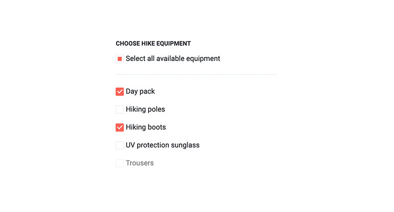
Checkbox States
The Telerik Checkbox component provides the basic checked and unchecked states, along with a third state - Indeterminate (something in between - neither checked, nor unchecked). The indeterminate is commonly used for states for “Check All”/ “Select All” top level Checkboxes that include sub-options with different states, or when you need to present a third ‘undefined’ option such as Yes/No/Maybe. The Checkbox also includes a disable option to prevent toggling of a checkbox values in Blazor apps.