
UI for Blazor
Blazor Carousel
- Add effortless scroll-through functionality to an image gallery or any other rich-content element with the Blazor Carousel.
- Part of the Telerik UI for Blazor library along with 110+ professionally-designed UI components.
- Includes support, documentation, demos, virtual classrooms, Visual Studio Code Extensions and more!

-
Navigate Through a Collection of Images with Blazor Carousel
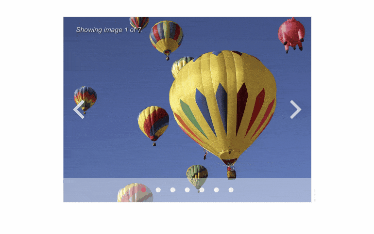
The Telerik UI for Blazor Carousel component allows you to beautifully display and scroll through a collection of images or any other rich content. It comes with various configuration options for paging, automatic page change, time interval setup and out-of-the-box keyboard navigation support.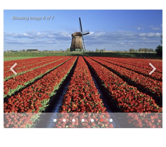
-
Configuration
The component can be configured in several ways. You can display a pager, navigation arrows or a combination of both. You can also enable infinite scrolling and have the carousel pages change automatically or manually. If you choose automatic navigation, you can specify the change interval in seconds.
Check out the demo for Blazor Carousel configuration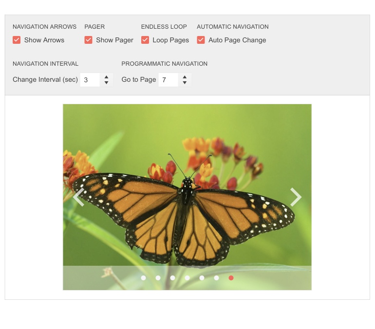
-
Keyboard Navigation
The Blazor Carousel is one of the many components in the Telerik UI for Blazor suite with out-of-the-box support for keyboard navigation. Users can scroll through the displayed images or content cards using the arrow keys.
-
Theming
The Telerik UI for Blazor Carousel has 20+ built-in themes and swatches. Explore the Default (our own styling), Material (based on the Material Design guidelines), Bootstrap (which looks like the Bootstrap styling to integrate better) and Fluent (based on Microsoft Fluent UI) themes and choose the swatch that best suits your application. You can easily customize any theme with a few lines of CSS or create a new one to match your colors and branding with the Progress SASS ThemeBuilder application.
-
Right-to-Left (RTL) Support
The Telerik UI for Blazor Carousel component supports right-to-left configuration. The RTL functionality is supported by most of our components to accommodate users who communicate in a right-to-left language script, such as Arabic and Hebrew.
Learn more in our Blazor Right-to-Left Support documentation

