
UI for Blazor
Blazor Breadcrumb
- Allow users to navigate hierarchically arranged structures and trace back their original location with the Blazor Breadcrumb.
- Part of the Telerik UI for Blazor library along with 110+ professionally-designed UI components.
- Includes support, documentation, demos, virtual classrooms, Visual Studio Code Extensions and more!
-
Navigate Locations Easily with Blazor Breadcrumb
The Telerik UI for Blazor Breadcrumb is a navigational component, indicating the user’s current location in your application. Breadcrumb navigation enables users to swiftly and easily navigate apps and websites with complex structure You can customize the component through the available templates or by applying one of our professionally designed built-in themes.
Check out the Blazor Breadcrumb demo
-
Item Templates
Customizable templates are available for every breadcrumb item to have it match your application’s visual style and user experience.
-
Collapse Modes
The Breadcrumb features three collapse modes to accommodate scenarios when the total width of the Breadcrumb items exceeds the width of the component: the Auto mode displays the first and last items only, the Wrap mode displays all items and aligns them in a column and the None mode does not change the Breadcrumb look.
Check out the Blazor Breadcrumb collapse modes demo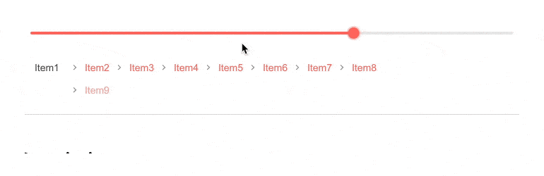
-
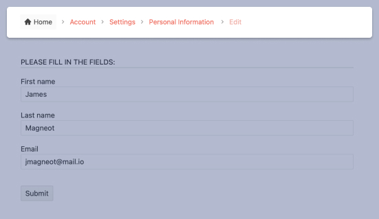
Breadcrumb for Navigation
The Blazor Breadcrumb component can be used as a navigation between different pages in an application. You can either let the component generate the needed links itself through the UrlField or dynamically generate them based on the current application.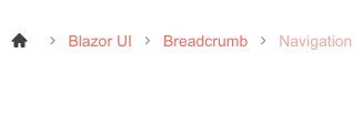
-
Separator
You can easily define a visual separator between Breadcrumb items through the SeperatorIcon parameter and further customize it using the Separator template. -
Events
The Telerik UI for Blazor Breadcrumb component raises the OnItemClicked event, through which you can execute any code that handles clicks. You can additionally configure the event behavior rules.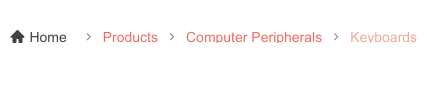
-
Keyboard Navigation
The Breadcrumb is one of the many components in the Telerik UI for Blazor suite with keyboard navigation support. You can use the Tab and Enter keys to navigate the component and select any item.
Explore the Breadcrumb Keyboard Navigation in this demo

-
Theming
Leverage 20+ built-in themes and swatches to style the Breadcrumb component, including Default (our own styling), Material (based on the Material Design guidelines), Bootstrap (which resembles the Bootstrap styling for seamless integration) and Fluent (based on Microsoft Fluent UI). You can easily customize the available themes with a few lines of CSS or create a new one with the Progress SASS ThemeBuilder application.

-
Right-to-Left (RTL) Support
The Telerik UI for Blazor Breadcrumb component supports right-to-left configuration. The RTL functionality is supported by most of our components to accommodate users who communicate in a right-to-left language script, such as Arabic and Hebrew.
Learn more in our Blazor Right-to-Left Support documentation

