# Getting Started with the TabStrip

This tutorial explains how to set up a basic Telerik UI for ASP.NET MVC TabStrip and highlights the major steps in the configuration of the component.

You will initialize a TabStrip component with several items and a basic content definition.
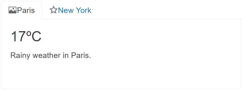
![Sample Telerik UI for ASP.NET MVC TabStrip](https://www.telerik.com/aspnet-mvc/documentation/assets/676d160903cc85279f577f97de874501/tabstrip-getting-started.png)

## Prerequisites

To successfully complete the tutorial, you need a project that is already configured to use the Telerik UI for ASP.NET MVC components:

* To create a new pre-configured project for the Telerik UI for ASP.NET MVC components, you can [use a project template](https://www.telerik.com/aspnet-mvc/documentation/getting-started-mvc/first-steps).

* To manually configure an existing project by using NuGet, see the [Adding Telerik UI through NuGet](https://www.telerik.com/aspnet-mvc/documentation/getting-started/setup-with-nuget).

## 1. Prepare the CSHTML File

The first step is to add the required directives at the top of the `.cshtml` document:

* To use the Telerik UI for ASP.NET MVC HtmlHelpers:

  ```cshtml
  @using Kendo.Mvc.UI
  ```

Optionally, you can structure the document by adding the desired HTML elements like headings, divs, paragraphs, and others.

```Razor HtmlHelper
    @using Kendo.Mvc.UI

    <h4>TabStrip with cities</h4>
    <div>

    </div>
```

## 2. Initialize the TabStrip

Use the TabStrip HtmlHelper  to add the component to a page:

* The `Name()` configuration method is mandatory as its value is used for the `id` and the name attributes of the TabStrip element.
* The `Selected()` configuration of a TabStrip's item specifies which tab is selected initially.
* The `Image()` property of a TabStrip's item determines the icon or logo path in front of its text.

```Razor HtmlHelper
@using Kendo.Mvc.UI

<h4>TabStrip with cities</h4>
<div>
@(Html.Kendo().TabStrip()
    .Name("tabstrip")
    .Items(tabstrip =>
    {
        tabstrip.Add().Text("Paris")
            .Selected(true)
            .ImageUrl(Url.Content("https://demos.telerik.com/aspnet-core/shared/icons/16/photo.png"))
            .Content(@<text>
            <div class="weather">
                <h2>17<span>ºC</span></h2>
                <p>Rainy weather in Paris.</p>
            </div>
            <span class="rainy"> </span>
            </text>);

        tabstrip.Add().Text("New York")
            .ImageUrl(Url.Content("https://demos.telerik.com/aspnet-core/shared/icons/16/star.png"))
            .Content(@<text>
            <div class="weather">
                <h2>29<span>ºC</span></h2>
                <p>Sunny weather in New York.</p>
            </div>
            <span class="sunny"> </span>
            </text>);
    })
)
</div>
```

## 3. Setting the Tab Position

The next step is to demonstrate how you can set the `TabPosition()` option which allows you to dictate where the tabs are rendered. The default setting is `Top`, but you can also use `Left`, `Bottom`, etc.

```Razor HtmlHelper
    @using Kendo.Mvc.UI

<h4>TabStrip with cities</h4>
<div>
@(Html.Kendo().TabStrip()
    .Name("tabstrip")
    .TabPosition(TabStripTabPosition.Top)
    .Items(tabstrip =>
    {
        tabstrip.Add().Text("Paris")
            .Selected(true)
            .ImageUrl(Url.Content("https://demos.telerik.com/aspnet-core/shared/icons/16/photo.png"))
            .Content(@<text>
            <div class="weather">
                <h2>17<span>ºC</span></h2>
                <p>Rainy weather in Paris.</p>
            </div>
            <span class="rainy"> </span>
            </text>);

        tabstrip.Add().Text("New York")
            .ImageUrl(Url.Content("https://demos.telerik.com/aspnet-core/shared/icons/16/star.png"))
            .Content(@<text>
            <div class="weather">
                <h2>29<span>ºC</span></h2>
                <p>Sunny weather in New York.</p>
            </div>
            <span class="sunny"> </span>
            </text>);
    })
)
</div>
```

## 4. Handle a TabStrip Event

The TabStrip component provides convenient events for implementing your desired logic. In this tutorial, you will use the exposed `Select()` event to log a new entry in the browser's console.

```Razor HtmlHelper
    @using Kendo.Mvc.UI

<h4>TabStrip with cities</h4>
<div>
<script>
    function select(e) {
        console.log("Selected old value :: " + this.value());
    }
</script>

@(Html.Kendo().TabStrip()
    .Name("tabstrip")
    .TabPosition(TabStripTabPosition.Top)
    .Events(e=>e.Select("select"))
    .Items(tabstrip =>
    {
        tabstrip.Add().Text("Paris")
            .Selected(true)
            .ImageUrl(Url.Content("https://demos.telerik.com/aspnet-core/shared/icons/16/photo.png"))
            .Content(@<text>
            <div class="weather">
                <h2>17<span>ºC</span></h2>
                <p>Rainy weather in Paris.</p>
            </div>
            <span class="rainy"> </span>
            </text>);

        tabstrip.Add().Text("New York")
            .ImageUrl(Url.Content("https://demos.telerik.com/aspnet-core/shared/icons/16/star.png"))
            .Content(@<text>
            <div class="weather">
                <h2>29<span>ºC</span></h2>
                <p>Sunny weather in New York.</p>
            </div>
            <span class="sunny"> </span>
            </text>);
    })
)
</div>
```

## 5. (Optional) Reference Existing TabStrip Instances

You can reference the TabStrip instances that you have created and build on top of their existing configuration:

1. Use the `id` attribute of the component instance to establish a reference.

   ```JS script
   <script>
       var tabstripReference = $("#tabstrip").data("kendoTabStrip"); // tabstripReference is a reference to the existing TabStrip instance of the helper.
   </script>
   ```

2. Use the [TabStrip client-side API](https://docs.telerik.com/kendo-ui/api/ui/tabstrip#methods) to control the behavior of the widget. In this example, you will use the `select` method to select an item.

   ```JS script
   <script>
       var tabstripReference = $("#tabstrip").data("kendoTabStrip"); // tabstripReference is a reference to the existing TabStrip instance of the helper.
       tabstripReference.select(3); 
   </script>
   ```

## Next Steps

* [Binding the TabStrip Items](https://docs.telerik.com/aspnet-mvc/html-helpers/navigation/tabstrip/binding/items-binding)
* [Configuring the TabStrip Content Area](https://www.telerik.com/aspnet-mvc/documentation/html-helpers/navigation/tabstrip/content)
* [Configuring the Animation Effects of the TabStrip](https://www.telerik.com/aspnet-mvc/documentation/html-helpers/navigation/tabstrip/animation)

## See Also

* [Using the API of the TabStrip for ASP.NET MVC (Demo)](https://demos.telerik.com/aspnet-mvc/tabstrip/api)
* [TabStrip Client-Side API](https://docs.telerik.com/kendo-ui/api/ui/tabstrip)
* [Server-Side API of the TabStrip](https://www.telerik.com/aspnet-mvc/documentation/api/tabstrip)
* [Knowledge Base Section](https://www.telerik.com/aspnet-mvc/documentation/knowledge-base)
